16.02.2017 by Anete Ezera
Maps have the power to tell incredible stories. They simplify complex geographical datasets in a way that is compelling and memorable. We’ve selected nine maps that visualize global corruption, climate change, Facebook friends, and so much more:
1) NOAA Science On a Sphere – Earthquakes
Science On a Sphere is an animated globe that can show dynamic, animated images of the atmosphere, oceans, and solar system invented by the National Oceanic and Atmospheric Administration (NOAA). Their hugely popular Facebook page constantly shares amazing maps. Check out this dataset of all the earthquakes from 2001 – 2015.
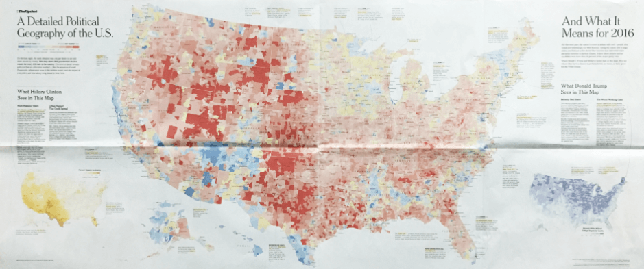
2) The New York Times – Election Results
There are many ways to map election results, and the New York Times has tried most of them. Below you’ll find the most detailed election map they’ve ever produced: ZIP-code level results for the 2012 presidential race spread across four pages. Click here to see more election maps from the New York Times over the years.
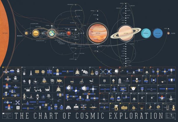
3) Pop Chart Lab – Space Exploration
Probe the solar system from Mercury to Pluto with this space exploration map. From the Luna 2 in 1959 to the DSCOVR in 2015, this color-coded chart traces the trajectories of every orbiter, lander, rover, flyby, and impactor to ever slip the surly bonds of Earth’s orbit and successfully complete its mission.
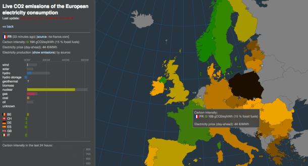
4) Tomorrow – Electricity Map
This open source mapping project by Tomorrow shows in real-time where the EU’s electricity comes from and how much CO2 was emitted to produce it – taking into account electricity imports and exports between countries. Click the image below to explore the full interactive map.
5) NASA – Hottest Year on Record
Earth’s 2016 surface temperatures were the warmest since modern recordkeeping began in 1880. NASA’s Scientific Visualization Studio created this mind-blowing animation showing global temperatures since 1880. Watch as Earth moves from a cool blue and yellow to an alarming red and orange.
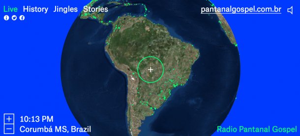
6) Radio Garden – Share Music
Radio Garden is a cool site that lets you listen in to live radio stations around the globe. Curious what people are listening to in Alaska, the UK, or South Africa? Simply click from country to country to navigate this interactive experience.
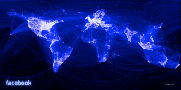
7) Facebook – Visualizing Friendships
It’s no secret that Facebook’s reach spans the globe, but you’ve never seen it quite like this. Paul Butler was interested in seeing how geography and political borders affected where people lived relative to their friends on Facebook. He was surprised to see a surprisingly detailed map of the world.
8) Transparency International – Corruption
Transparency International mapped 2016’s Corruption Perceptions Index using Infogram. Top-scoring countries (yellow) are far outnumbered by orange and red countries where citizens face the tangible impact of corruption on a daily basis.
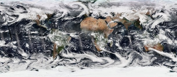
9) NOAA – Daily Real-Time Satellite Imagery
Nobody makes maps quite like NOAA. NOAA’s satellites provide constant monitoring of global weather events around the world. The GOES East and West satellites provide frequently updated visible and infrared images of the U.S. territories every 30 minutes.
Infogram has a wide variety of design options you can use to craft the perfect interactive map. Watch the video below to see our mapping tool in action!
Get data visualization tips every week:
New features, special offers, and exciting news about the world of data visualization.