25.01.2018 by Anete Ezera
We love helping our customers succeed and sharing their stories. That’s why we’ve gathered some of the most engaging tales of data visualization success from our customers for this series: Infogram Customer Spotlight. From the classroom, to the newsroom, to the boardroom — this is how real people are using Infogram to change the way they visualize data.
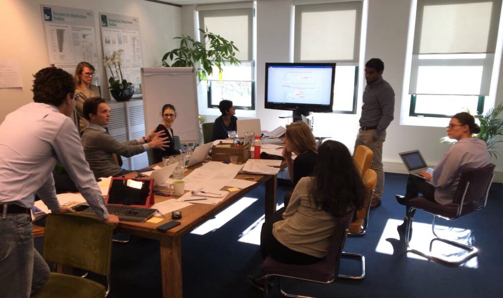
In this piece, we spoke with Andreas Oszkiel, the Operations Manager of the Access to Medicine Foundation.
The Problem
2 billion people in the world don’t have access to medicine. Even with the proper resources and funds, many people who need help can’t buy the medicines they need because pharmaceutical companies don’t make all of their medicines available to all parts of the world.
The Access to Medicine Index gives insight into what the pharmaceutical industry is doing to improve this situation. Funded by the Bill & Melinda Gates Foundation and the UK and Dutch governments, the Index has been published every two years since 2008 by the Access to Medicine Foundation, an independent nonprofit organization.
Based in the Netherlands, the Access to Medicine Foundation has over 10 years of experience collecting, analyzing, visualizing, and publishing data about how pharmaceutical companies are addressing access to medicine. In 2016, the Foundation used Infogram to help visualize and share its latest findings with the world.
Andreas Oszkiel simply wants to bring about change. “Our aim is to inspire and guide a sense of urgency within their organizations to improve access to medicine. We want to spur pharmaceutical companies to change themselves. We do this by measuring and comparing their performances and then publishing and sharing our findings,” he said.
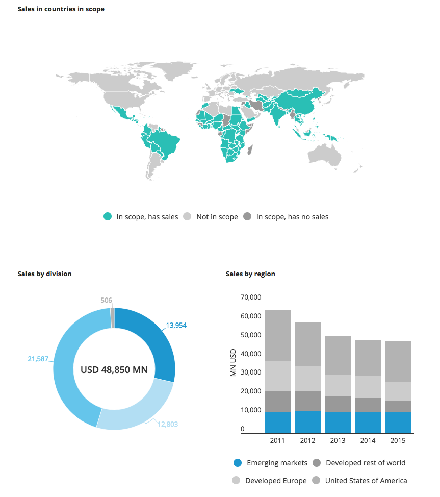
The Access to Medicine Index is a comprehensive report that looks at 20 of the world’s largest research-based pharmaceutical companies researching, developing, producing and marketing medicine. The Index research team collects data from the companies and also gathers publicly available data.
The Solution
In order to share the 2016 report online, the Foundation needed a tool to create data visualizations in line with the graphs it uses in the full print version of the report, which is available to download as a PDF on its website. They wanted to automate the process of creating graphs, standardizing it across the board.
Infogram was a good choice for their team based on its pricing, publishing options, chart selection, interactivity and easy team collaboration.
Infogram was also used to help pinpoint the best option for visualizing the data in question. “Our researchers are very data-driven but also visual. With Infogram, for each finding and dataset, we were able to test different visualizations and then choose the best option. We were able to quickly develop the look and feel of our graphs.”
The Access to Medicine Index is published online and in print. This brings about its own set of unique design challenges. Infogram offers a wide variety of export options, including interactive online embeds and high-quality downloads.
“We like being able to embed figures directly onto our website using the Infogram WordPress plugin. This makes the figures interactive – which was one of our requirements. At the same time, we could choose to export some charts as high-quality images, which was important when designing versions of the print report.”
Team collaboration is crucial for the creation of the Index. Andreas loved Infogram’s ability to help the team increase the quality and speed of their visualization process. “We liked the fact that you can invite multiple people to look at what you’re working on while also keeping all data completely secure, private and offline. We kept a work stream hidden in the spreadsheet itself. So when it went from one department to another we were able to sign off on it and add comments.”
The Results
Infogram helped the Access to Medicine Index team create charts and graphs quickly and beautifully. As Andreas put it himself: “It’s about a simple approach, very fast, with select options, that gets you to an end result in minutes.”
Our Customer Success team was also there every step of the way, offering guidance and solutions as challenges arose. “I’d also like to point out the speed at which we could get answers. We got quick responses from customer support which was a huge bonus in the workflow.”
The best part? Their online visualizations helped them toward their mission of improving access to medicine for the poorest and most vulnerable people around the world. View the 2016 Access to Medicine Index Report Cards in full – or their recently released Antimicrobial Resistance Benchmark.
If you’d like to learn more about how Infogram has helped businesses visualize and communicate with data, visit our Customer Stories page.
Get data visualization tips every week:
New features, special offers, and exciting news about the world of data visualization.