13.07.2017 by Anete Ezera
The Infogram team has a lot of fun sharing cool new data visualizations we find online. We stumble upon so many wonderful data visuals courtesy of data scientists, artists, journalists, and business professionals. Take a look at these amazing projects we’ve enjoyed over the past few months.
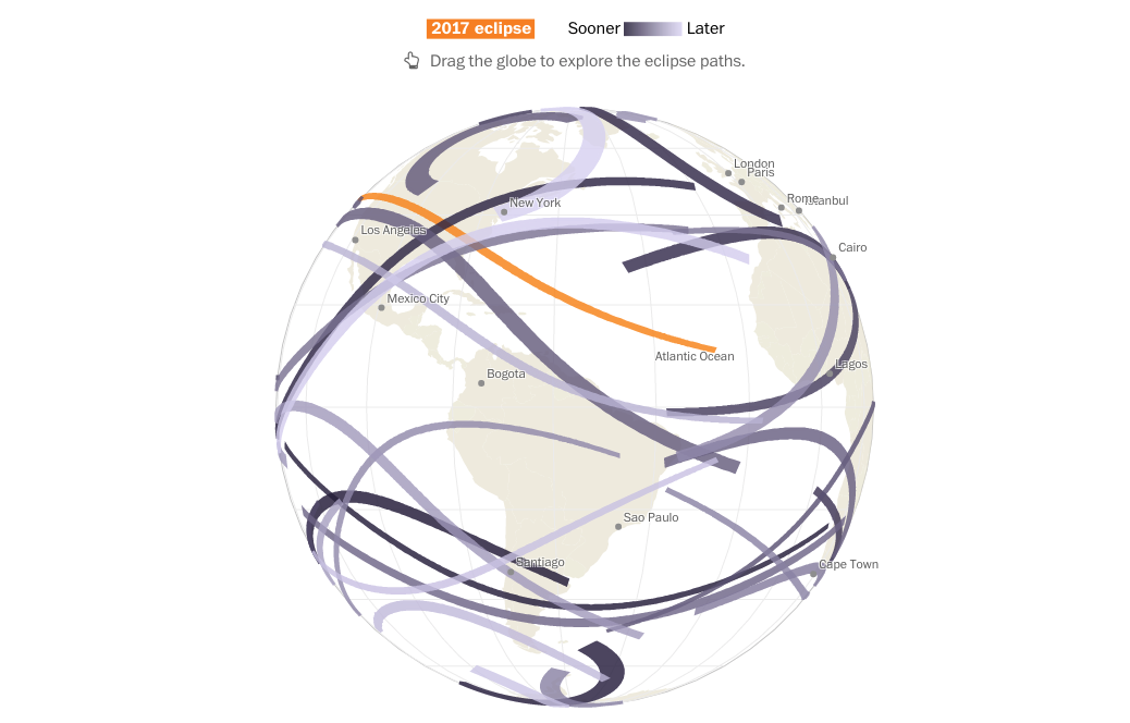
1) Total Solar Eclipse Countdown
On Aug. 21, a total solar eclipse will be visible from the contiguous United States. The Washington Post created this interactive clickable map to show you how many total solar eclipses are left in your lifetime. Simply type in the year of your birth and explore.
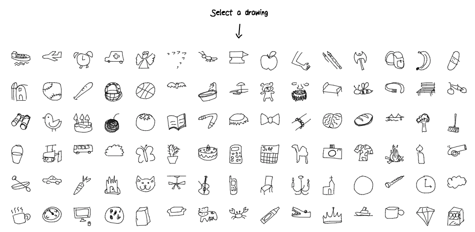
2) Quick, Draw! The Data
Data doesn’t get any cuter than this. Over 15 million players have contributed millions of drawings playing Quick, Draw! Now the data is open for you to play with. Click any icon to view thousands of drawing made by real people online.
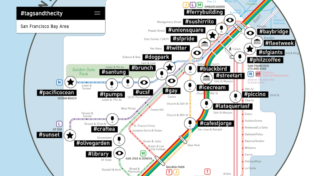
3) #Tags and the City
Parisian architect and map designer Jug Cerović has developed a pretty clever, universal standard for subway maps. He renames subway stations after the Instagram hashtag which is most popular around them. Which hashtag is popular near you?
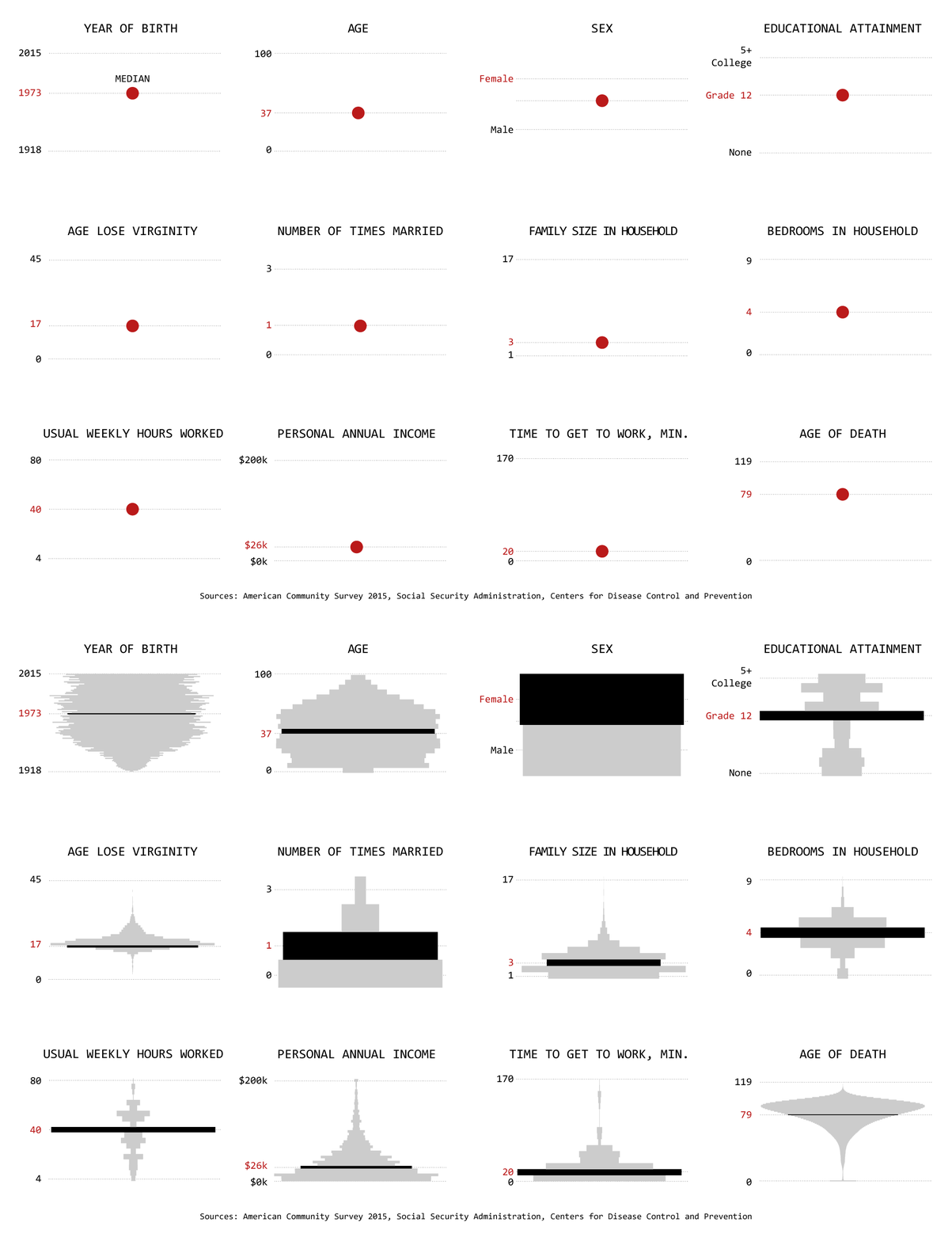
4) Summary Statistics
Flowing Data’s Nathan Yau is concerned about the presence of generalized numbers in the media, which often don’t show the whole picture. Summary statistics can only tell you so much about a dataset. This GIF shows you just how much is lost when you focus on the mean, median, and mode.
5) Social Media 2017
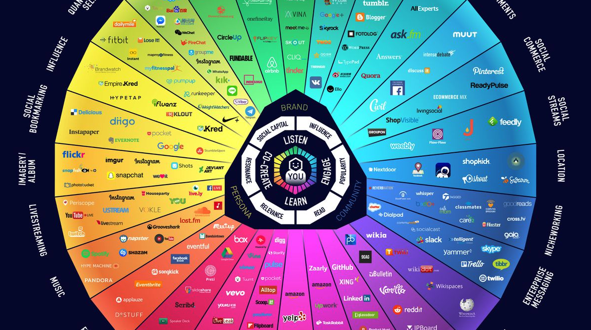
The term ‘social media’ can be a difficult one to define. The social media landscape changes dramatically every year, which is why Brian Solis, author and digital analyst at Altimeter Group, first launched the aptly-named “Conversation Prism” back in 2008. The latest version is available now.
6) Data Portraits at TED
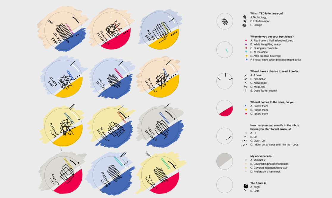
During TED 2017, data design studio Accurat created and distributed more than 500 data portraits – visual designs based on answers to simple but evocative questions that were turned into wearable buttons, to spark conversations and connections for the five days of the event.
7) Babies Born at 8:00 A.M.
Data visualization engineer Zan Armstrong and data designer Nadieh Bremer took a closer look at human birth patterns, shared by Scientific American. They found that 3.5 times as many babies are born at exactly 8:00 A.M., the most common minute to be born, than at the least common, 3:09 A.M.
8) Google Travel Searches
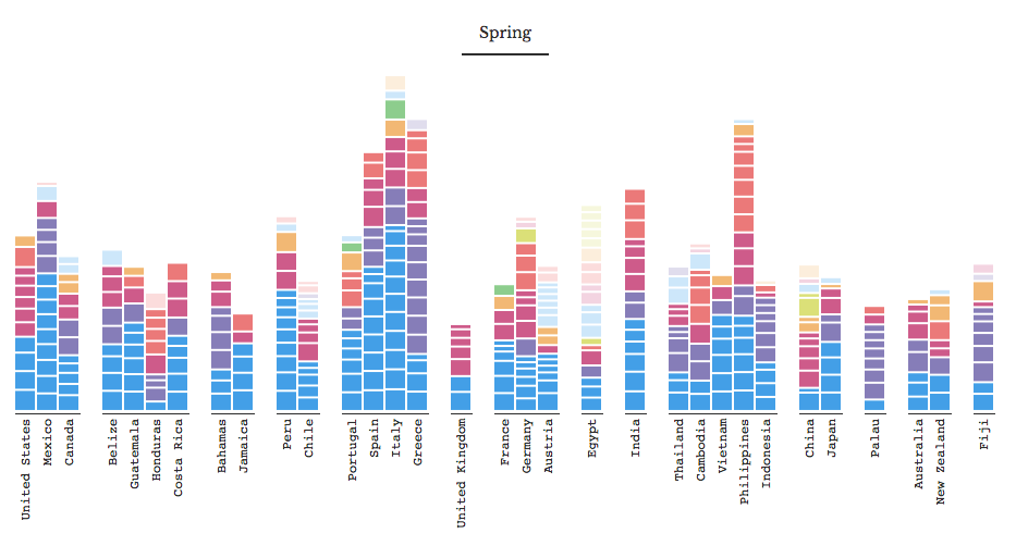
In the last decade, people around the world have searched for more than 1,634 travel destinations across 85 countries. Data artist Shirley Wu dug into the search data for Google News Lab. She then turned that data into beautiful interactive visualizations.
9) Baseball’s Heavy Hitters
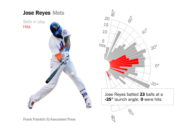
With more sophisticated sports data available, major league hitters are focusing on getting the ball higher in the air. The idea is that their swing will increase the launch angle of the ball, possibly producing more fly balls that can turn into doubles, triples and home runs. But, is it true? The New York Times took a close look.
10) How Britain Voted in 2017
The 2017 general election was swung by young voters and high turnout according to the Ipsos Mori How Britain Voted survey. The Guardian’s Datablog created a series of crafty visualizations to show just how Britain voted in 2017.
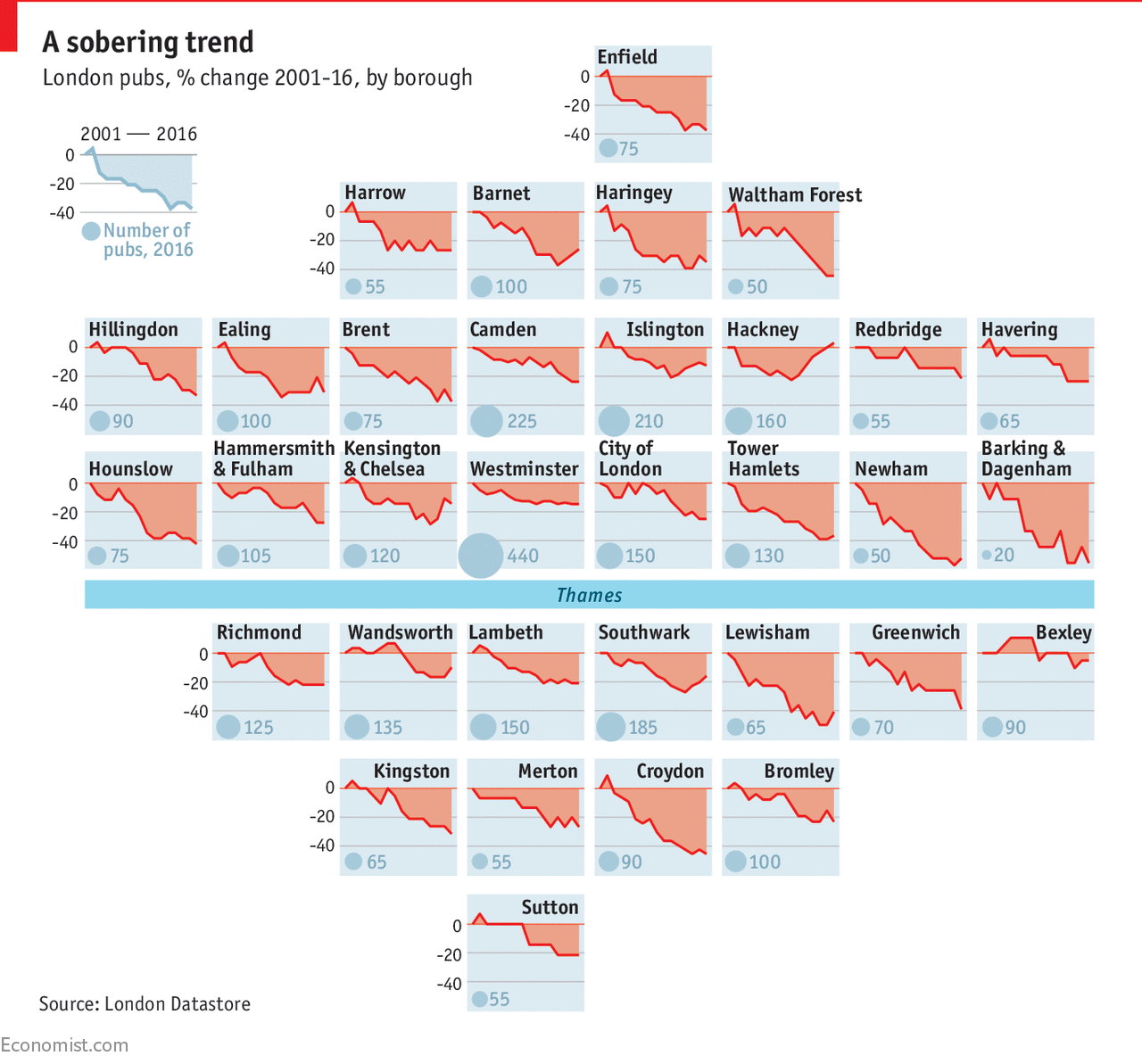
11) London’s Pubs Closing
It appears British pubs are falling out of favor. Britain’s population is on the rise, but according to the British Beer and Pub Association, the total number of watering holes in Blighty has fallen by 25% since 1982, to 50,800. The Economist designed this creative visualization to show the stats.
12) Space, Time and Groceries
Grocery-delivery app Instacart delivers a lot of groceries. This is why Jeremy Stanley, VP Data Science at Instacart, decided to visualize their massive amount of GPS data. Visualizations like the ones below help his team build intuition about their system, identify best practices, and improve operations.
Are there any awesome data visualizations we missed? We want to hear from you! Reach out to us on Facebook and Twitter to share your favorite projects from 2017.
Get data visualization tips every week:
New features, special offers, and exciting news about the world of data visualization.
