
Turn Data into Interactive Stories for Your Classroom
Help students grasp complex ideas through visuals that engage and stick - whether you're teaching K-12 basics or university-level analysis.


4.7 out of 5 stars


Overview
Why
Types
Examples
Reviews
Tips
FAQ
Captivate Students' Attention
In today's classrooms, you face the daily challenge of holding students' attention while breaking down tough topics. Infogram gives you simple tools to create visuals that turn raw data into clear, interactive stories. Think of mapping historical events or charting scientific trends to make lessons come alive.
Our tool lets you build charts, maps, and infographics that adapt to different learning needs. Visual learners can explore clickable elements, while others dive into supporting text or animations. This approach helps every student connect with the material on their terms.
As you use Infogram, you'll find ways to weave these visuals into your lesson plans, group projects, or lectures. It saves time on prep and boosts how well students retain what they learn.
6 Reasons Why Educators Choose Infogram
Here are practical ways Infogram supports your teaching, from daily lessons to research presentations.

Boost Student Engagement
Interactive maps and animated charts transform lessons into hands-on experiences that captivate students across all levels. For example, K-12 teachers can create a clickable map of historical events, letting students explore timelines, while university professors can design data explorers for seminars, encouraging deeper analysis.
With Infogram’s library of over 35 chart types and 800 maps, you can craft visuals that spark curiosity and make abstract concepts memorable. From elementary lessons to graduate-level discussions, these tools keep students engaged and eager to learn.
Simplify Tough Topics
Complex subjects like science, economics, or sociology often involve dense data that can overwhelm students. Infogram helps you turn spreadsheets into clear, engaging visuals, such as charts of economic cycles or maps of environmental trends for high school classes.
University professors can visualize research findings for lectures or publications, making insights accessible to diverse audiences. AI-powered chart suggestions and direct data imports from PDFs or spreadsheets streamline the process, saving you time while ensuring clarity.

Collaborate on Projects
Infogram’s real-time collaboration features let educators and students work together seamlessly on lesson plans or research visuals. K-12 teachers can guide group projects, helping students co-create charts for science fairs or history reports, fostering teamwork skills.
Professors can collaborate with colleagues on interdisciplinary studies, building visuals for grant proposals or conference presentations. Team templates ensure consistency, making group work efficient and aligned with your goals.

Streamline Your Prep Time
Busy educators need tools that save time without sacrificing quality, and Infogram delivers with quick-to-build visuals for lessons or lectures. Create a science chart for a K-12 class in minutes or a data slide for a university talk, enhanced with animations like zooms or fades to guide attention.
AI handles repetitive tasks, like converting images to editable data or suggesting layouts, freeing you to focus on teaching. This efficiency helps you adapt materials for multiple classes or research talks with ease.

Adapt to All Learners
Every classroom includes diverse learners, and Infogram’s visuals cater to their needs with features like custom tooltips, video embeds, and GIFs. Visual learners or neurodiverse students benefit from clear graphics and interactive elements that explain concepts on hover.
Accessible, screen-reader-friendly designs ensure inclusivity, while auto-updating embeds work seamlessly on learning platforms or school websites. This flexibility helps you reach every student, whether in person or online.

Share Insights Easily
Infogram makes sharing data stories simple by letting you embed charts in school websites, learning platforms, or lecture slides without coding. Auto-updating visuals keep parent newsletters, course pages, or research presentations current, saving you effort.
For example, K-12 teachers can share interactive graphs in school reports, while professors can embed data visuals in academic blogs or conference slides. This ensures your insights reach parents, students, or colleagues clearly and professionally.
Explore Most Loved Features

Chart Library
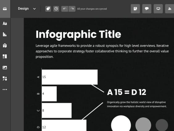
Choose from a diverse range of chart types in Infogram's extensive library. Customize colors and labels to present your data in a visually compelling way, making complex information easily understandable.

Map Library
Visualize geographic data effectively with Infogram's map library. Select from various map styles and formats to enhance the impact of your storytelling and showcase regional insights.

Data Import
Effortlessly import data from various sources into Infogram, ensuring accurate and up-to-date visualizations for your reports. Streamline your data management process and focus on analyzing insights.

Annotations and Callouts
Add explanatory text, highlights, and insights to your data visualizations with Infogram's annotation and callout features. Provide context and enhance audience understanding of your nonprofit's impact.

Real-Time Collaboration
Collaborate seamlessly with your team members, editors, and contributors in real-time. Share projects, leave comments, and track changes, facilitating efficient teamwork and content creation.

Auto-Aligning Content
Simplify the layout of your projects with Infogram's auto-align feature. With just a click, you can easily change the alignment of objects on your canvas, enabling you to create image galleries or dashboards with ease.

Project Embeds
Enhance your website or blog with interactive visualizations by seamlessly integrating them through Infogram's project embeds. Create an engaging and immersive experience for your audience.
Get Inspired by Infogram User Created Projects

Health to the plants

Automation & jobs

10 Plus Grands Fonds Axés sur l’Extraction Minière Fermés Historiquement

10 Largest Mining-Focused Funds to Have Closed Historically

FiveThirtyEight: Looking to November

A (Very) Different 4 Th of July

A Different Earth Day

Tesla Roadster
Customer Reviews
Here is what our customers have to say about us.
2022 Summer & Fall and 2023 Winter leader in Data Visualisation Software 4.7 out of 5 stars
See reviews on G2 ›Empowering 30,000+ Companies Worldwide
From startups to established enterprises, our platform has been embraced by a diverse range of businesses seeking to captivate audiences and simplify complex data. Here are just a few examples of the 30,000+ companies that use Infogram.


Learn More Practical Tips
Design
How to Create Accessible Charts and Graphs With Infogram
Media
4 Tips for Telling an Effective Data Story
Marketing
Data storytelling: Ingredients to an effective data story
Design
Data visualization trends you should look out for in 2023
Education
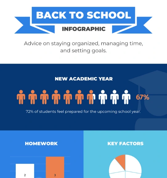
How to use infographics in the classroom: 10 infographics examples for students
Design
Information design: definition, tips & examples
Frequently Asked Questions
How does Infogram help teachers and professors present educational content effectively?
Infogram provides a wide range of charts, interactive options, and easy customizations for educators. You can build visuals that draw students in and clarify ideas, whether for a K-12 lesson or a university seminar.
Why use interactive content in teaching?
It draws students in by letting them explore, which improves focus and retention. You can tailor it to fit individual needs, making lessons more personal and effective overall.
How do educators create interactive content with Infogram?
Start by picking from our educational templates or building from scratch. Add elements like graphs, maps, or animations to make it clickable and engaging. It's straightforward - no coding needed.
Can educators collaborate using Infogram?
Yes, real-time collaboration lets you team up with colleagues or students. Share materials, get input, and create together to make content that fits your class goals.
How does Infogram improve sharing educational data and concepts?
With diverse charts and interactive tools, you turn data into stories that are easy to follow. This helps students relate to topics and build analytical skills.
What are content engagement analytics, and how do they help in education?
These track how students interact with your visuals, like views or clicks. Use the insights to adjust your teaching, spot what works, and improve outcomes. Infogram includes these to give you clear feedback on your content's impact.
Didn't find the answer? Check our FAQs

Try Infogram Now!
Are you ready to unleash the power of data visualization? Get started with Infogram today and create stunning, interactive content that captivates your audience. Elevate your projects and bring data to life.