20.02.2025 by Infogram
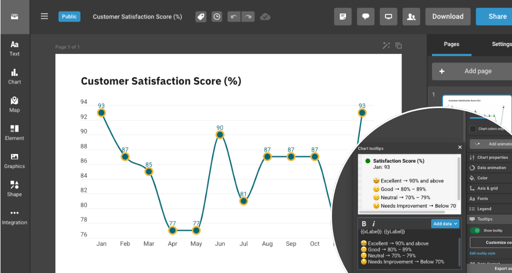
Line chart tooltips in Infogram are now more flexible and customizable, giving you better control over how you present information when users hover over data points. Whether you want to add context, highlight key trends, or structure details more clearly, the updated tooltip options help you share insights in a more meaningful way.
Tooltips play a crucial role in making data more accessible and engaging. Instead of displaying only basic values, you can now customize what appears when users hover over data points. This helps create more informative, visually engaging, and user-friendly experiences in your reports, dashboards, and presentations.
What you can do with tooltip customization:
- Add extra context. Include additional text to explain trends, insights, or highlight key points.
- Show additional data points. Display more than just the default values – add X-axis labels, categories, or related data for deeper insights.
- Format with bold & italics. Make important details stand out for better readability.
- Use emojis for emphasis. Enhance tooltips with emojis to make data storytelling even more engaging.
And with the March release, you can now do even more:
- Create colored headers. Use color to guide attention or categorize information.
- Build lists. Display bullet points or numbered steps to group related details.
- Show source information. Add data sources or references directly inside the tooltip.
- Insert horizontal lines. Separate content clearly for better structure.
- Add line breaks. Organize text into readable sections.
Examples of tooltips in use. Hover over a data point to see the tooltip.
How these features help you:
- Data Analysts & Business Professionals: Provide clearer insights in reports by displaying key trends with well-structured tooltips.
- Marketers & Content Creators: Enhance storytelling in presentations and infographics with customized tooltips that highlight important data points.
- Journalists & Reporters: Add context to data visualizations, making complex information easier for readers to understand.
With tooltip customization, your interactive charts become more than just visuals – they become a guided storytelling experience. Start customizing your tooltips in Infogram today!
Get data visualization tips every week:
New features, special offers, and exciting news about the world of data visualization.