25.07.2018 by Infogram
School might be out for summer, but the need for amazing charts is year-round. You might think you know a thing or two about building beautiful, effective data visualizations – but a lot can go wrong. There are many things you need to take into account, like axes intervals, strong titles, gridlines, legends, and color palettes that help you tell a great data story.
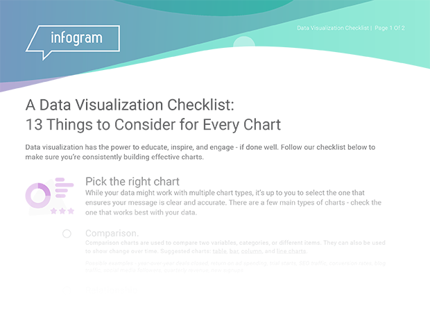
As chart experts, we’ll show you 13 things to consider when building your next chart.
Get the Data Visualization Checklist to Learn:
- What to include and what’s too much
- How to use color and design effectively
- How to make sure your chart makes sense
To download the checklist today, fill out the form below!
Learn more: How to choose the right chart for your data
Interested in discovering how Infogram can enhance your team’s work? Join a brief Zoom session with our Infogram representative to explore key features, get answers to your questions, and understand how we can assist. It’s quick, informative, and just like a coffee break chat. Schedule your call now!
Get data visualization tips every week:
New features, special offers, and exciting news about the world of data visualization.