12.12.2022 by Infogram
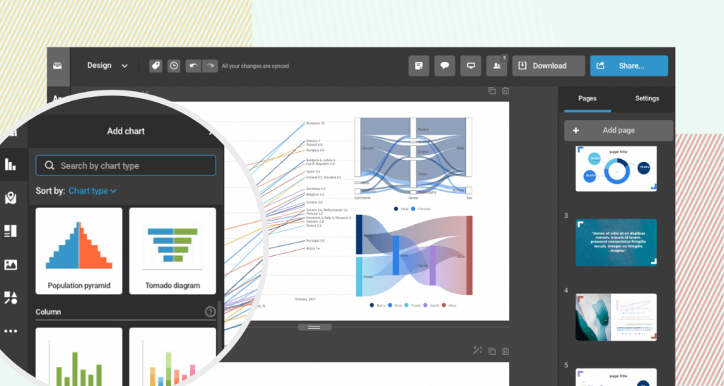
We’re excited to announce that we have added several new chart types to our library, including the sankey chart, alluvial chart, slope chart, tornado chart, population chart, radar or spider chart, sunburst chart, and the tornado chart. Each of these charts offers unique ways to visualize and analyze data, making it easier for you to understand and communicate your findings.
Try out the sankey chart for visualizing material or traffic flow, cost breakdowns, and more. The alluvial chart is great for multi-dimensional data analysis and showing changes in group composition over time. The slope chart simplifies line charts and is perfect for highlighting “before and after” stories or changes over a time period. Use the tornado chart for sensitivity analysis, risk assessment, and the population chart to analyze demographics and forecast the future.
In addition to these new chart types, we have also added the radar or spider chart, sunburst chart, and population chart to our library. With these options, you can create more detailed and accurate visualizations of your data, making it easier to identify patterns and trends.
Try out these new chart types today and take your data analysis to the next level!
Get data visualization tips every week:
New features, special offers, and exciting news about the world of data visualization.