08.06.2017 by Infogram
Creating effective data visualizations, and presenting them in a way that is engaging and memorable can feel like an impossible task. Not only do you need to craft a compelling story, you also have to pick the right charts, follow best practices, and figure out a way to present to a group without putting your audience to sleep.
It turns out this task isn’t impossible. We’re here to help! This small bundle of amazing resources will put you straight on the path to success.
You’ll learn how to:
- Craft the perfect visualization
- Make powerful charts
- And present to an engaged and eager audience
1) Free eBook: Data Visualization Techniques
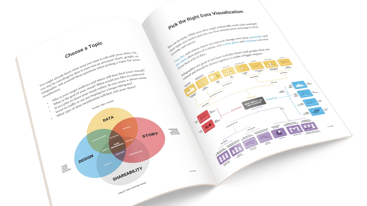
We want to help you make better charts. That’s why we wrote this helpful eBook, ‘Simple Data Visualization Techniques to Make Your Charts 110% Better.’
Here we show you how to pick a topic, organize your data, choose the right chart, and avoid common design mistakes. Once you’ve mastered the basics, you can go on to learn how to make your data even more impressive.
2) 10 Ways to Make Your Data Compelling

Simple charts may be easy to make, but they often don’t have that ‘wow’ factor. This article from HubSpot shows you how to take your reporting to the next level. In order to present the true value of your work, you need to focus and fine tune the details. Here you’ll learn how to make simple changes that have a huge impact.
3) Webinar: Snore-Proof Your Data Stories

Infogram recently joined the Prezi family on a mission to help people communicate better with visuals and data. Prezi published this webinar featuring presentation design experts Alison Macondray and Matt Clark of Alimat. Here you will learn the true power of telling an amazing ‘snore-proof’ data story.
Now that you know how to create and present data visualizations, it’s time to put that knowledge to work. Log in to Infogram and design your own chart, map or infographic.
Get data visualization tips every week:
New features, special offers, and exciting news about the world of data visualization.