
Turn Data into Clear Stories for Smarter Decisions
Create interactive visuals that simplify complex data, impress stakeholders, and drive strategic business outcomes.


4.7 out of 5 stars


Overview
Why
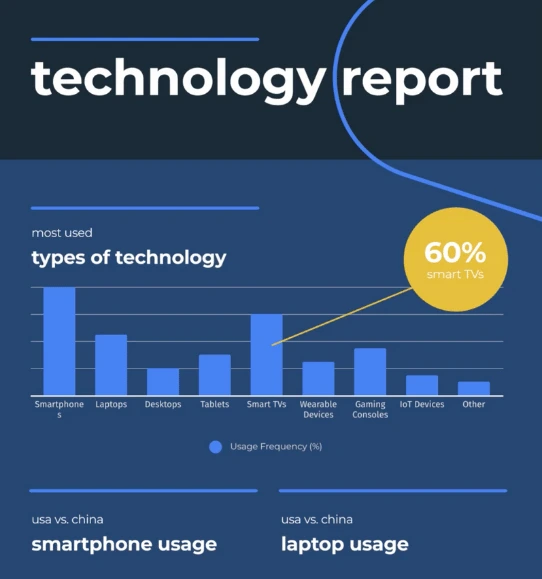
Types
Examples
Reviews
Tips
FAQ
Make Data Work for Your Business
As a business analyst, financial controller, operations manager, or sales director, you deal with complex data daily - whether it’s financial forecasts, supply chain metrics, or sales performance. Infogram helps you turn that data into clear, interactive stories that make insights accessible to executives, teams, or clients. No more struggling with dense spreadsheets or static reports.
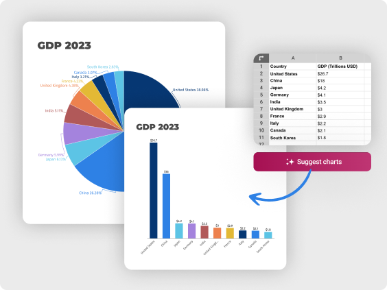
Import data from Excel, databases, or PDFs, and let AI suggest the best charts to save you time. Create dashboards, maps, or infographics that highlight trends, like revenue growth or operational bottlenecks, and embed them in presentations or company portals with no coding. Responsive, auto-updating visuals ensure your reports stay current across devices.
With Infogram, you can focus on analyzing insights and presenting actionable recommendations, not formatting charts. Explore how it streamlines your reporting and elevates your impact.
5 Reasons Why Business Professionals Choose Infogram
Discover practical ways Infogram helps you communicate insights and drive decisions.
Simplify Complex Insights
Turn dense data into clear, interactive visuals that make trends and patterns obvious. For example, financial analysts can create a clickable dashboard showing budget variances, while operations managers map supply chain efficiencies. With 35+ chart types and 800+ maps, Infogram’s AI suggests the best visuals, and data imports from Excel or PDFs save time. This clarity helps stakeholders grasp insights quickly. Use custom tooltips to explain key metrics, ensuring even non-experts understand your findings.
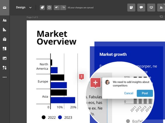
Engage Stakeholders with Interactive Stories
Craft visuals that keep executives, clients, or teams engaged. Create an animated sales trend chart for a board meeting or an interactive map showing market expansion for a client pitch. Features like custom tooltips and animations (zoom, fade) make data exploration intuitive. These stories boost understanding and retention, driving better decisions. Add videos or GIFs to highlight critical insights, making your presentations more dynamic and memorable.
Share Reports Effortlessly
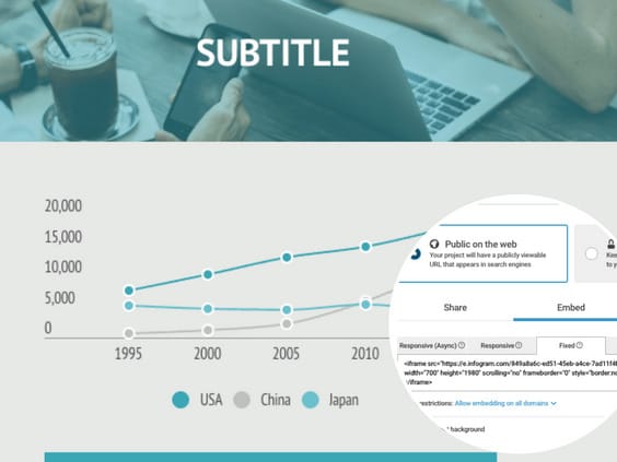
Embed visuals in presentations, company website, or client reports without coding. Auto-updating dashboards, like a live sales performance tracker, stay current without manual refreshes. Responsive designs look sharp on any device, from boardroom projectors to mobile screens. This makes sharing insights seamless for sales directors or analysts. Export as MP4 or GIF for engaging client demos or internal updates.
Collaborate Across Teams
Work in real time with finance, operations, or sales teams to build reports. Share team templates to keep visuals consistent, like a standardized financial report for compliance. Commenting features streamline feedback, so business analysts and managers align quickly. This teamwork saves time and ensures polished outputs. Real-time updates let remote teams stay in sync, speeding up decision-making across departments.
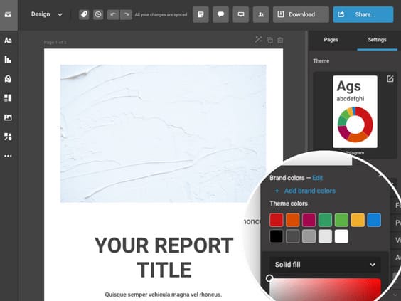
Deliver Professional, Branded Reports
Create polished visuals that match your company’s brand without design skills. Use your brand kit to customize charts with logos and colors, like a sleek budget forecast for executives. Royalty-free assets and features like color gradients or image masking add professional flair. This helps financial controllers and sales managers impress stakeholders with credible reports. Content auto-align ensures layouts are clean, saving you time on final tweaks.
Explore Most Loved Features

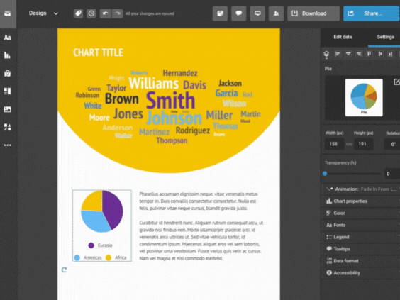
Chart Library
Choose from a diverse range of chart types in Infogram's extensive library. Customize colors and labels to present your data in a visually compelling way, making complex information easily understandable.

Data Import
Effortlessly import data from various sources into Infogram, ensuring accurate and up-to-date visualizations for your reports. Streamline your data management process and focus on analyzing insights.

Annotations and Callouts
Add explanatory text, highlights, and insights to your data visualizations with Infogram's annotation and callout features. Provide context and enhance audience understanding of your nonprofit's impact.

Customizable Templates
Infogram offers a collection of customizable templates designed specifically for reporting purposes. Start with a professionally designed template and tailor it to your needs, saving time and ensuring a polished look.

Interactive Elements
Engage your audience with interactive elements such as tooltips, clickable legends, and drill-down functionality. Allow your stakeholders to explore the data in more detail and interact with the report for a deeper understanding.
Get Inspired by Infogram User Created Projects
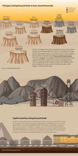
10 Largest Mining-Focused Funds to Have Closed Historically

Health to the plants

Automation & jobs

10 Plus Grands Fonds Axés sur l’Extraction Minière Fermés Historiquement

10 Largest Mining-Focused Funds to Have Closed Historically

Customer Survey Report

The Not Enough Impact Report 2018

The Impact of the Better Care Reconciliation Act on Employment
Customer Reviews
Here is what our customers have to say about us.
2022 Summer & Fall and 2023 Winter leader in Data Visualisation Software 4.7 out of 5 stars
See reviews on G2 ›Empowering 30,000+ Companies Worldwide
From startups to established enterprises, our platform has been embraced by a diverse range of businesses seeking to captivate audiences and simplify complex data. Here are just a few examples of the 30,000+ companies that use Infogram.


Learn More Practical Tips
Business
Best Ways to Visualize and Analyze Polling Data
Design
18 Surprising Data Visualizations in Your Everyday Life
Finance
A Practical Guide to Creating Financial Reports
Business
Comprehensive guide to creating annual business reports
Design
Data visualization trends you should look out for in 2023
Design
Information design: definition, tips & examples
Frequently Asked Questions
How can Infogram help me create financial reports for compliance?
Infogram’s 35+ chart types and AI-driven suggestions let you build clear financial reports, like budget breakdowns or revenue forecasts, for compliance needs. Import data from Excel or PDFs to avoid manual entry, and use custom tooltips to explain variances. Embed auto-updating visuals in compliance documents to ensure accuracy. This saves financial controllers time while meeting regulatory standards.
How does Infogram improve presentations for executives or clients?
Create interactive stories, like animated sales charts or clickable market maps, to engage executives or clients during presentations. Features like zoom animations and royalty-free assets make visuals dynamic and professional. Content engagement analytics show which parts resonate, helping sales directors refine pitches. Embed visuals in PowerPoint or portals for seamless sharing.
Can Infogram help analyze operational data for process improvements?
Yes, operations managers can create dashboards or maps to visualize supply chain metrics or efficiency trends. For example, map delivery delays or chart production bottlenecks to identify issues. AI suggests the best visuals, and real-time data imports keep insights current. This helps you propose data-driven process improvements.
How does Infogram support team collaboration on reports?
Real-time collaboration lets business analysts, finance, and sales teams co-create reports, like a shared sales forecast or operational dashboard. Team templates ensure consistent branding, and commenting streamlines feedback. This saves time and aligns teams on critical insights for strategic decisions.
How can Infogram save time for busy analysts and managers?
Infogram’s AI tools, like chart suggestions and image-to-data conversion, cut down on design and data entry time. Import data from databases or spreadsheets, and use content auto-align for polished layouts. Free tutorials and support help you create professional visuals quickly, letting you focus on analysis and strategy.
What insights do Infogram’s analytics provide for business reporting?
Engagement analytics track how stakeholders interact with your visuals, like clicks on a financial dashboard or views of a sales report. For example, see which metrics executives focus on to tailor future reports. This helps business analysts and sales managers optimize presentations and drive impactful decisions.
Didn't find the answer? Check our FAQs

Try Infogram Now!
Are you ready to unleash the power of data visualization? Get started with Infogram today and create stunning, interactive content that captivates your audience. Elevate your projects and bring data to life.