09.07.2025 by Infogram
A strong visual impression can make your data more impactful. With this update, Infogram allows you to add solid or gradient fills beneath lines in supported charts – bringing more depth, emphasis, and visual clarity to your visualizations. Fill styles are available for line, slope, and various line-combo chart types.
Why It’s Useful
Line charts are great for showing trends over time, but sometimes the line alone isn’t enough to draw attention to key patterns or highlight changes. With fill styles, you can emphasize areas of growth or decline, show intensity, or simply create more visually engaging charts.
This update also makes it easier to align data visuals with your brand style or presentation design. Whether you’re building reports, dashboards, or infographics, fill styles help your line charts stand out without overwhelming the rest of your content.
What You Can Do With It
- Writers and researchers can make timelines or trend lines easier to interpret by visually filling the space under key data curves.
- Designers can use solid or gradient fills to match color palettes, create visual balance, or add contrast to layouts.
- Managers and analysts can highlight performance dips or spikes more effectively in presentations or data overviews, improving clarity for stakeholders.
How It Works
You can apply fill styles to the following chart types:
- Line chart
- Column & line chart
- Line & line chart
- Grouped column & line chart
- Stacked column & line chart
- Slope chart
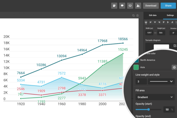
To add a fill:
- Select your chart in the editor.
- In the right-hand settings panel, go to the Line section.
- Toggle on the Fill under line option.
- Choose a solid color or set up a gradient fill using the color pickers.
- The chart will update automatically, showing the filled area beneath each line.
You can adjust the opacity, gradient direction, and color to match your project’s style.
Try It Out
Fill styles are now available for all supported line-based charts. Whether you’re visualizing trends, comparing performance, or building presentations, this small addition can make a big visual difference. Add depth and clarity to your charts – and give your story more visual impact – with just a few clicks.
Get data visualization tips every week:
New features, special offers, and exciting news about the world of data visualization.