18.06.2025 by Infogram
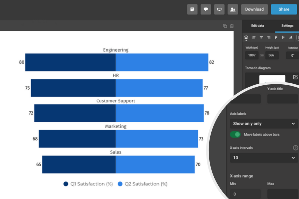
You can now place labels above bars in tornado and population pyramid charts in Infogram. This new option gives you more control over how your data is displayed and helps make your charts quicker to read – especially when comparing two groups side by side.
When labels are placed inside bars, they can sometimes be harder to see – especially if the bars are short or the values are close together. Putting labels above the bars keeps your chart clear and easy to follow, without needing extra layout adjustments.
What You Can Do With It
- Writers and researchers can make demographic or survey data easier to interpret, especially when presenting balanced or similar values across two groups.
- Designers can fine-tune label positioning to improve readability and visual hierarchy, without needing to manually adjust layouts.
- Managers and analysts can display population distributions or comparison data more clearly in dashboards or reports, improving clarity for quick reviews.
How It Works
To use the new label positioning option:
- Open your tornado or population pyramid chart in the Infogram editor.
- Select the chart to open the settings panel on the right.
- Find the Axis & Grid option.
- Scroll down to Move labels above bars and activate it.
The chart will update instantly, and you can adjust the layout or bar spacing to match your design.
This update makes it easier to create clear, balanced charts when comparing grouped data. Whether you’re working with population data, survey responses, or distribution comparisons, adding labels above bars gives you more control over how your data is read and understood.
Get data visualization tips every week:
New features, special offers, and exciting news about the world of data visualization.