
Create Interactive Pyramid Charts
Create interactive pyramid charts to visualize hierarchical data, compare different levels, and uncover insights.


4.7 out of 5 stars


Overview
Why
Types
Examples
Reviews
Tips
FAQ
A Visual Guide to Hierarchical Data Representation
Pyramid charts, also known as triangle charts or funnel charts, are a type of data visualization that represents data in the form of a pyramid or a triangle. They’re used to show the hierarchical structure of data or the progressive reduction of data as it moves through different stages. The pyramid shape is wider at the top and narrows down towards the bottom, representing the decreasing quantity or size of data points at each stage.
Pyramid charts are visually engaging and allow viewers to easily grasp the hierarchical or progressive nature of the data being presented. They’re commonly used in various fields, including demographics, sales, marketing, and project management, among others. If you're looking to create a pyramid chart, Infogram can help simplify the process. Understanding how to create a pyramid chart is essential for effectively communicating data that follows a hierarchical structure or involves progressive reduction. Whether you're working on a presentation or report, knowing how to make a pyramid chart can enhance your ability to convey complex information clearly and visually.
Explore Why Pyramid Charts Are Useful
Explore the power of visual storytelling and understand why pyramid charts are a must-have.

Comparing Hierarchical Data
Pyramid charts are particularly useful when you want to compare data that follows a clear hierarchical structure. For example, if you have data about the age distribution in different countries, you can use a population pyramid chart to compare the age groups' proportions within each country.
The pyramid shape visually emphasizes the differences between the age groups and makes it easy to identify which countries have larger or smaller populations within specific age brackets.

Illustrating Progression or Funneling
When you need to show the data flow through various stages, a funnel-style pyramid chart works well. For instance, in sales, you can create a pyramid chart to display the number of leads at each stage of the sales process, from initial prospects to converted customers. The funnel shape helps visualize the progressive reduction in the number of leads as they move through the different stages of the sales pipeline.
Understanding how to create a pyramid chart can be particularly useful in this context, as it allows you to effectively communicate the flow and reduction of data at each stage. Whether you're aiming to make a pyramid chart for a presentation or report, this visualization technique can clearly illustrate the sales funnel or any other process that involves a step-by-step reduction.

Visualizing Percentages or Proportions
Pyramid charts are highly effective when it comes to visualizing data as percentages or proportions. By using a pyramid structure, each segment's area is proportional to the data it represents, allowing viewers to easily comprehend the relative sizes of different categories. This visual approach makes it much simpler to see which segments are larger or smaller, without needing to analyze complex numerical data.
This is especially helpful when working with data where proportions carry significant meaning, such as the distribution of votes in an election, market shares of different companies, or the breakdown of age groups within a population. Pyramid charts provide a clear and immediate understanding of these divisions, helping audiences grasp key insights at a glance.

Presenting Top-Heavy Data
Pyramid charts are also ideal for presenting datasets that are "top-heavy," where a large portion of importance or value lies within a smaller subset of data. When you need to emphasize how a small group contributes disproportionately to a whole, pyramid charts are an excellent visual aid. By narrowing towards the top, the chart naturally draws the viewer's attention to these crucial segments while maintaining a complete picture of the data distribution.
For instance, consider a company’s organizational structure, where the top management positions carry far greater salaries and influence compared to the rest of the employees. Using a pyramid chart, it becomes easy to show this skewed distribution, emphasizing both the significance and relative scarcity of higher-level positions.

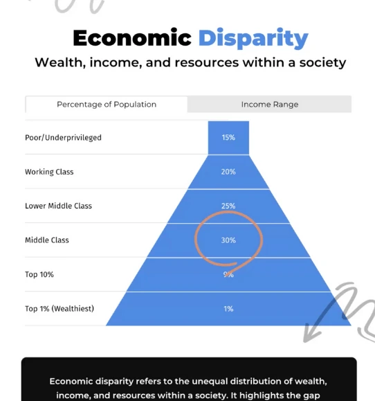
Highlighting Disparities
One of the strongest advantages of using pyramid charts is their ability to highlight disparities or imbalances between different groups. Whether comparing income levels across various social classes or analyzing educational achievements across demographic segments, pyramid charts visually emphasize these differences in a clear and striking way. The gradual narrowing of the pyramid makes contrasts between different levels immediately apparent, making it easy for viewers to identify significant gaps.
For example, when depicting the difference in educational attainment between urban and rural populations, a pyramid chart can effectively display the lower number of graduates at the base and the narrowing proportion of higher degrees as you move up. This format makes inequalities obvious, inviting viewers to understand and perhaps question why these disparities exist. Similarly, it can be used to depict population health data - showing the distribution of health outcomes across different demographics.

Emphasizing Key Data Points
By placing essential data points at the top or bottom of the pyramid, you can draw attention to the specific information you want your audience to focus on. For example, when you create a pyramid chart, such as a population pyramid, you might want to highlight the age group with the highest population. Understanding how to create a pyramid chart allows you to effectively emphasize the most important data, making it easier for your audience to grasp the key insights. Whether you aim to make a pyramid chart for demographic analysis or other purposes, this technique ensures that the critical information stands out clearly.

Encouraging Data Exploration
Pyramid charts can encourage viewers to explore the data further. The visual hierarchy allows you to compare different sections easily, identify patterns, and draw insights from the data. When you create a pyramid chart, this structured format enables your audience to quickly grasp relationships within the data. Understanding how to create a pyramid chart is essential for designing visuals that facilitate deeper analysis. Whether you're looking to make a pyramid chart for a report, presentation, or analysis, this approach helps in uncovering meaningful insights and promoting a better understanding of the data.
Pyramid Chart Types to Explore

Population Pyramids
Display the age and gender distribution of a population, commonly used in demographic studies to show the population structure.

Funnel Chart
Visualize stages in a process to illustrate conversion rates at different stages.

Hierarchical Pyramid
Present organizational structures or hierarchical data, which is beneficial for showing levels within an organization or processes.

Sales Pyramid
Visualize different levels of sales targets and achievements to help track sales performance.
Get Inspired By Infogram User Created Projects

World Blood Donor Day

Top 100 Most Valuable Us Brands

Deep Look at National Parks in the U.S.

Healthcare Consumer Insights

The Most Popular Ice Hockey Leagues

Market Report - Portland

Buying Coffee Vs Making It

The Scope and Impact of Free-Roaming Dogs and Cats
Customer Reviews
Here is what our customers have to say about us.
2022 Summer & Fall and 2023 Winter leader in Data Visualisation Software 4.7 out of 5 stars
See reviews on G2 ›Empowering 30,000+ Companies Worldwide
From startups to established enterprises, our platform has been embraced by a diverse range of businesses seeking to captivate audiences and simplify complex data. Here are just a few examples of the 30,000+ companies that use Infogram.


Learn More Practical Tips
Marketing
3 Unique Ways to Optimize Your Landing Pages with Charts
Data
How to choose the right chart for your data?
Data
The complete guide to different types of charts
Design
Do This, Not That: Funnel Charts
Design
Chart Dos and Don’ts: The Ultimate Data Visualization Guide
Design
Beyond the Food Pyramid: How Pyramid Charts Build the Foundation for Success
Frequently Asked Questions
When to use a pyramid chart?
Pyramid charts are commonly used in sales, marketing, project management, and for educational purposes to:
- Visualize important steps of a process
- Illustrate funnel activities
- Show the structure of an organization in a simple manner
- Arrange quantity or size
- Display survey or research results in a visual manner
How do I create a pyramid chart?
Infogram's chart creator allows you to quickly make a pyramid chart in just 5 steps:
- Log in to Infogram
- Select the pyramid chart type
- Upload or paste your data
- Customize the labels and adjust the design by changing the background, colors, and fonts
- Download your pyramid chart, add it to your project, embed it on your website, or share it on social media
Infogram is super easy to use and made with non-designers in mind. Even if you don't have any programming, coding, or design experience, you'll be able to make pyramid charts in just a couple of steps.
What are some best practices for creating pyramid charts?
Here are some general tips to keep in mind to make an effective pyramid chart:
- Create a clear title: Giving your pyramid chart a clear name will help the reader understand from a glance what he or she is looking at.
- Figure out the value and status: Organize the subcategories based on their hierarchical value.
- Don't overdo it: Create no more than 5-6 sections for easy readability.
Label each stage: This will improve the readability of your pyramid chart. Make the labels brief, otherwise, it will just confuse the reader.
Are pyramid charts similar to funnel charts?
Yes – a funnel chart is essentially an inverted pyramid chart. Like pyramid charts, a funnel chart is also divided into horizontal sections. Each section can have a different width and length based on the significance and size of the covered topic and its values.
How can I style my pyramid chart?
You can customize the pyramid chart to your liking. Pick the right color palette and font, adjust the labels, and even add animations. To edit your chart, click on it, then go to Settings and make the necessary changes.
What kind of integration is Infogram providing to create live-updating charts and maps?
With Infogram, you can create dynamic charts and maps that update live and in real time. We support two integrations for live updates:
- Google Sheets
- JSON feeds
As soon as the data changes in the Google Sheet or JSON file, the chart or map it is linked to will automatically update, even when embedded.
Note: Infogram doesn't support formulas, only raw data. If you use formulas or other scripts in your Google sheet, the calculations may not show on Infogram after the import.
How do I create a live-updating chart or map via a JSON feed?
- Add a chart or map to your project canvas by clicking the Add chart or Add map buttons in the left side panel.
- Double-click the chart to open its editor. Above the data table, you will see data import buttons. Choose the Add JSON feed option.
- Now, when you edit the information in your JSON feed, it will automatically update in your Infogram chart. The chart refreshes data every 30 seconds to a minute. These changes will automatically apply to your embeds and shared URL link.
Didn't find the answer? Check our FAQs

Try Infogram Now
Are you ready to unleash the power of data visualization? Get started with Infogram today and create stunning, interactive content that captivates your audience. Elevate your projects and bring data to life.