22.10.2024 by Infogram
We’re happy to share that we launched a feature that will allow you to adjust chart corners, providing you with greater control over the design of your data visualizations.
Create cohesive visuals
Designing effective charts can be challenging, especially when it comes to maintaining a consistent look across your visuals. The adjustable chart corners feature addresses this challenge by allowing you to easily customize your charts. This means you can create a cohesive look throughout your project, improving clarity and engagement for your audience.
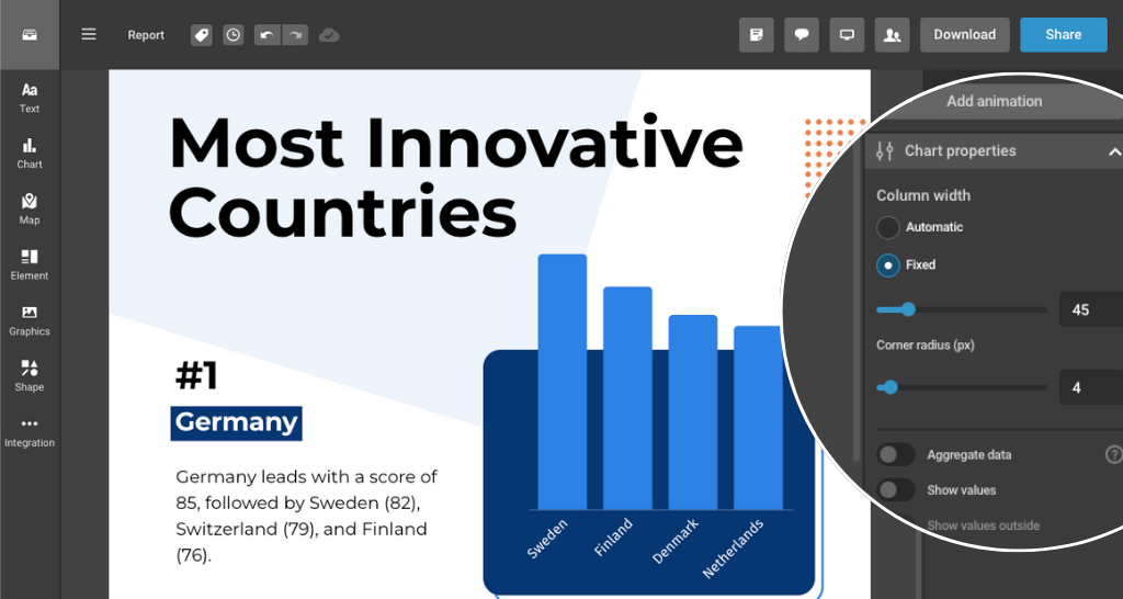
With adjustable chart corners, you can tailor the look of your charts to match your brand or presentation style. This level of customization helps ensure that your data visualizations not only convey important information but also align with your overall aesthetic. By modifying the corners of your charts, you can create a more polished and professional appearance that enhances your presentations and reports.
Log in to try out the new feature!
Get data visualization tips every week:
New features, special offers, and exciting news about the world of data visualization.