11.03.2025 by Infogram
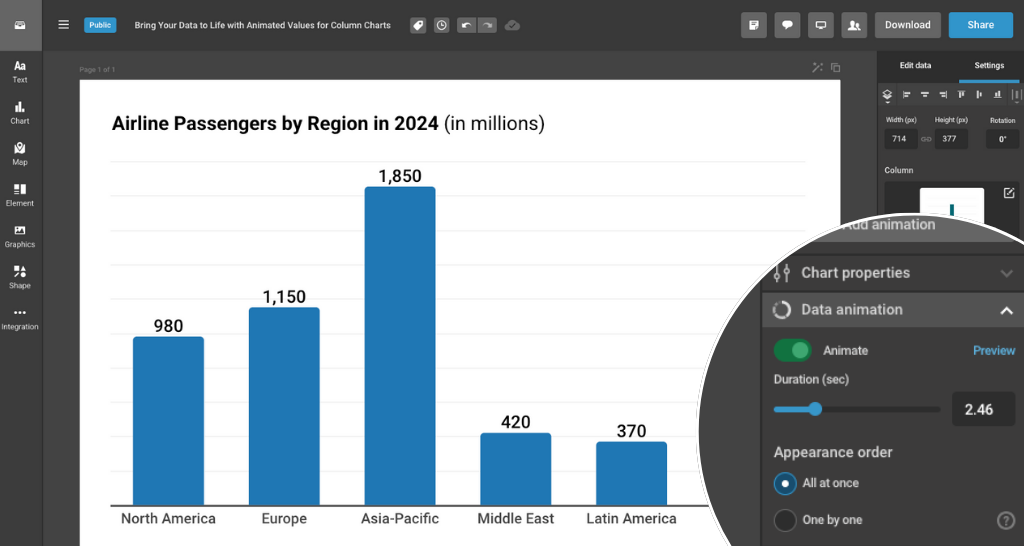
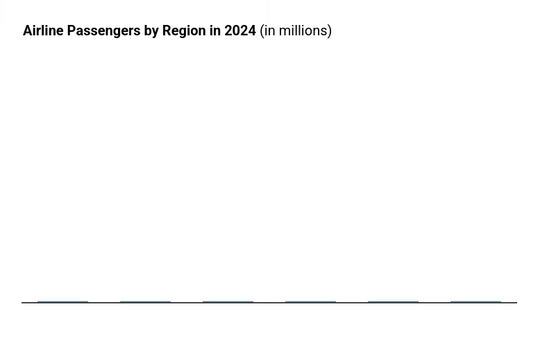
Say hello to motion: column charts in Infogram can now display animated values for extra visual impact. This new feature adds smooth, eye-catching transitions to the values displayed on your columns – making your visualizations even more dynamic and engaging.
At Infogram, we believe that great data storytelling is not just about accuracy – it’s also about experience. Animated values help guide your audience’s attention, emphasize key data points, and create a more polished, professional impression in your reports, dashboards, and infographics.
With this update, values on your column charts now animate into view, counting up to the final value as the chart loads. Whether you’re presenting quarterly results, survey responses, or campaign metrics, this motion draws the eye and makes your story more memorable.
How Can This Feature Help You?
- Struggling to grab attention? For presenters and marketers, animated values turn heads – whether in meetings or on social media – ensuring your audience stays focused on the data that matters.
- Trends getting lost in the noise? Data analysts and business pros can highlight growth or shifts – like a 25% sales spike – by letting the values build visually, making patterns pop.
- Static reports feeling dull? Journalists and content creators can breathe life into stats, turning a simple “75% approval rate” into a moment of anticipation as the value climbs on screen.
What Can You Do with Animated Values?
- Captivate in Presentations: Wow stakeholders with values that animate into view – perfect for boardroom dashboards or client pitches.
- Amplify Key Insights: Emphasize standout metrics – like a campaign’s ROI – without extra effort.
- Elevate Your Visuals: Add a layer of motion to infographics and reports, making them feel modern and alive.
Who Benefits from This Feature?
- Data Analysts & Business Professionals: Cut through the clutter of performance reports with animations that spotlight critical figures.
- Marketers & Content Creators: Hook your audience with engaging campaign recaps or social media visuals that demand a second look.
- Journalists & Reporters: Turn hard-hitting stats into compelling narratives that resonate with readers.
With animated numbers for column charts, your data doesn’t just inform – it performs. Try it out in Infogram today and elevate the way you present numbers.
Get data visualization tips every week:
New features, special offers, and exciting news about the world of data visualization.