26.11.2024 by Infogram
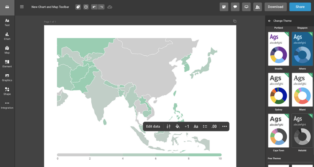
At Infogram, we recognize the importance of creating data-driven content that is not only insightful but also visually engaging. With our latest update, we’ve introduced a new chart and map toolbar designed to simplify editing and navigation. This feature saves you time and effort, enabling you to focus on delivering your message rather than struggling with formatting tools.
What is the new chart and map toolbar?
The chart and map toolbar is an intuitive editing panel that appears whenever you click on a data element in your charts or maps. It centralizes essential editing tools, making it easier than ever to format text, align content, and manage data.
Instead of navigating through multiple menus, you now have all the necessary tools at your fingertips. This improvement reduces complexity, particularly when working on dynamic visuals like maps or charts, where quick adjustments are essential.

Addressing common challenges
For professionals like analysts, marketing specialists, content writers, and designers, time is a precious resource. Editing and fine-tuning visual content often involves repetitive tasks such as resizing, aligning, or modifying data labels. Previously, these steps required navigating through multiple menus, slowing down workflows.
The new toolbar solves these challenges by consolidating key editing functions into one convenient interface. With this update, you can:
- Quickly format text without switching between tabs or menus.
- Align elements precisely to ensure professional-looking designs.
- Add or update data directly from the toolbar, minimizing disruptions to your design process.
How this feature helps you
This update is tailored to the diverse needs of our users. Here are some practical examples of how it can make a difference:
- For analysts. Preparing quarterly reports often involves fine-tuning charts to ensure clarity. With the new toolbar, analysts can quickly adjust chart labels or update data points, reducing the time spent on formatting.
- For marketing managers. Campaign presentations frequently require last-minute tweaks. The toolbar allows marketing managers to edit map visuals or chart annotations efficiently, enabling faster turnarounds and more impactful presentations.
- For journalists. Data-driven stories need to be both accurate and visually appealing. The toolbar enables journalists to refine charts and maps quickly, helping them meet deadlines with less stress.
- For content writers. Writers embedding visual elements into blogs or articles can now easily adjust font styles, text placement, or alignment without requiring design expertise.
- For designers. Creating team assets demands precision and consistency. Designers can refine charts and maps to align with brand guidelines using the toolbar, without juggling multiple tools.
Empowering smarter workflows
This update isn’t just about convenience – it’s about enabling you to work smarter. By eliminating unnecessary steps and presenting essential tools where you need them, the chart and map toolbar helps users focus on crafting content that connects with their audience.
Ready to see the new toolbar in action? Visit our help center or explore the feature guide. Log in to your Infogram account today and start creating impactful visuals with greater ease.
Get data visualization tips every week:
New features, special offers, and exciting news about the world of data visualization.