13.08.2024 by Infogram
When creating charts and graphs, we know it’s important to make them accurate, readable, visually appealing, and accessible. We can ensure accuracy through data evaluation and improve readability by selecting the most suitable chart type and appropriate formatting. This formatting also contributes to the visual appeal, complemented by interactive and animated elements. But how can we ensure chart accessibility? That’s the question we address in this article.
At Infogram, we believe that data visualization is a tool for everyone. We’re committed to creating an inclusive experience where anyone can easily understand and interact with data. That’s why we’ve invested in notable improvements to our platform’s accessibility features.

In this guide, we’ll walk you through practical tips and guidelines on creating accessible charts and graphs on Infogram. We’ll cover essential topics like screen reader compatibility and keyboard navigation to ensure your visualizations are inclusive and user-friendly.
Let’s dive in and learn how to create accessible charts and graphs that truly empower everyone.
Understanding chart accessibility
Data visualization is a powerful tool for communicating complex information, but it can also be a significant barrier for people with disabilities. Inclusive design ensures that everyone can access and understand the data presented. By prioritizing inclusivity, we not only uphold ethical responsibilities but also expand our audience and improve understanding, making information accessible to all.
Accessible charts are designed to be perceivable, operable, and understandable for users with disabilities. By prioritizing accessibility, you create a more equitable experience for everyone.
Data visualization accessibility goes beyond compliance with legal standards; it’s about creating a positive user experience. When you design with accessibility in mind, you broaden your audience and improve the overall effectiveness of your data storytelling.

How to create accessible charts and graphs
Designing accessible charts and graphs requires a thoughtful approach. By considering the needs of users with disabilities from the start, you can create visualizations that are both effective and inclusive.
Color blind friendly charts
Color is often used to differentiate data points in charts and graphs. However, people with color blindness may struggle to distinguish between certain colors. To ensure your charts are easily readable, use color palettes with high contrast and avoid relying solely on color to convey information. Consider using shapes or different shades to differentiate data points.
Here, take advantage of Infogram’s pre-set theme options that also include a color blind friendly theme, perfect for any data visualization project striving for an accessible design on all accounts.
Chart and graph elements
Clear and concise chart elements are essential for understanding the data.
The foundation of any visualization is its title, which should summarize the data presented. Also, clear and descriptive labels for axes, data points, and categories are essential for understanding the relationships between variables. A well-placed legend helps to differentiate between data series or categories, while gridlines can improve readability by providing visual reference points.
To ensure optimal understanding, the font and font size of text elements should also be legible and contrast sufficiently with the background. Plus, avoid overwhelming the viewer with excessive details. Instead, prioritize the most critical information and eliminate unnecessary elements.
By carefully considering these aspects, you can create chart and graph elements that are visually appealing, highly informative, and effective in communicating insights from your data.
Elements to consider:
Title: A concise and informative summary of the chart’s content.
Axes: Clearly labeled horizontal and vertical axes with appropriate scales.
Labels: Descriptive text for data points, categories, or series.
Legend: A key to differentiate between data sets or categories.
Gridlines: Optional lines for visual reference and data alignment.
Font and font size: Legible text with sufficient contrast for easy reading.
Visual clutter: Minimize unnecessary elements to focus attention on essential data.
Keyboard navigation
Keyboard navigation is essential for users with motor impairments who cannot use a mouse. To make your charts accessible to these users, make sure that all interactive elements can be navigated and activated using the keyboard.

Keyboard focus indicators: Clearly visible keyboard focus indicators help users understand where they are in the interface.
Logical tab order: The order in which elements receive focus should follow a logical sequence, allowing users to navigate through the chart efficiently.
By prioritizing keyboard navigation, you’ll ensure that users can easily interact with your charts without relying on a mouse.
Screen reader accessibility
For users with visual impairments, screen readers are crucial tools for daily interaction with technology. To ensure accessibility, it’s essential to provide detailed and descriptive information within your charts. Here’s what you should consider:
- Descriptive Alternative Text: Write clear and concise alternative text that accurately describes the chart or graph, including data points, trends, and key insights. However, make sure to avoid generic or overly complex descriptions.
- Chart structure and semantics: Use appropriate HTML elements and attributes to structure your charts, providing semantic information to screen readers. This helps screen reader users understand the chart’s components and relationships.

By considering these elements and optimizing your charts for screen reader compatibility, you ensure that people with visual impairments can access and understand the information presented.
Data visualization best practices
Effective data visualization is key for accessibility. By carefully selecting appropriate chart types that align with the nature of the data, you lay a solid foundation for clear communication.
It’s also important to maintain simplicity throughout the visualization process, avoiding unnecessary complexity that can compromise meaning.
Furthermore, considering the cognitive load of the intended audience is crucial for creating visuals that are easily digestible. By establishing clear visual hierarchies, you guide viewers toward the most important information, improving overall understanding and interpretation.
Create accessible charts with Infogram
At Infogram, we constantly strive to improve the user experience and promote data literacy. To simplify and broaden access to creating and sharing accessible data visualizations, we’ve implemented significant accessibility improvements. Here’s what Infogram offers:
Keyboard navigation improvements
We understand the importance of keyboard navigation for users with motor impairments. To this end, we’ve implemented:
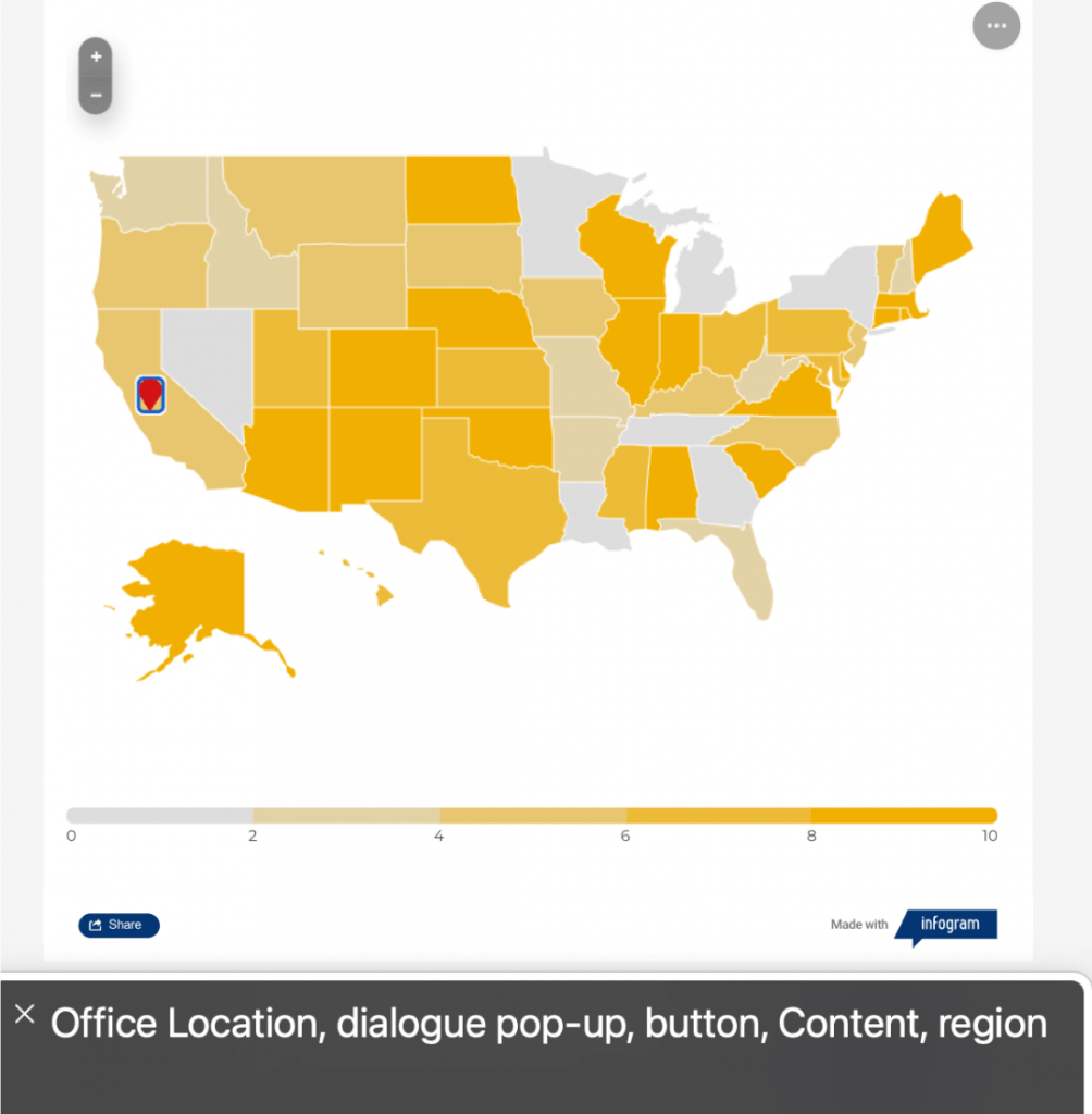
- Callout accessibility: Users can now effortlessly open and close callouts using their keyboard, without relying on a mouse. Interactive elements within callouts are also accessible via keyboard navigation, providing a seamless user experience.
- Visual focus indicators: To improve clarity, callout entities (shapes, images, icons) display a visible focus outline when selected using the keyboard. This makes it easy for users to track their position within the project.
- Tooltips and links: You can easily focus on items using tooltips and links, with clear visual indicators.
Explore keyboard shortcuts in our support article.
Screen reader compatibility
Optimizing for screen reader compatibility is key. Here’s what you can expect at Infogram:
- Chart accessibility: All charts can be configured to be fully accessible to screen reader users. By enabling the “Screen reader compatibility” option in chart settings, you ensure that data points, labels, and chart descriptions are accurately conveyed to users relying on screen readers.
- Alt text descriptions: To further improve accessibility, Infogram offers an alt text feature that allows you to add descriptive text to images and other visual elements. This text is read by screen readers, providing essential context for users who cannot see the image.
And here’s what’s improved:
- Callout content accessibility: All elements within a callout, including the callout entity itself, are easily readable by screen readers. This is crucial for understanding the project’s content.
- Links and tooltips: Links now include clear descriptive labels, and these, along with tooltips, are grouped within a single focusable element for easier navigation.
- Accessibility settings: Even when accessibility settings are disabled, callout entity elements remain accessible to screen readers. While the content of shapes, images, and icons might not be read in detail, essential informative attributes are provided.
- Popup and dialog accessibility: We’ve implemented multiple accessibility improvements to web-view popups and dialogs, allowing users with screen readers and keyboard-only navigation to fully interact with them.
Explore more about making your content visible to screen readers in this support article.
Accessibility matters
Creating accessible charts and graphs is not just a legal requirement; it’s a matter of inclusivity and user experience. By following the guidelines outlined in this article, you can create data visualizations that are easily accessible to everyone, broadening your audience.
Infogram is committed to supporting you in creating accessible content. We encourage you to explore our platform’s accessibility features and continue learning about best practices in data visualization.
Together, we can make data accessible to all. Try Infogram today!
Get data visualization tips every week:
New features, special offers, and exciting news about the world of data visualization.