29.05.2025 by Infogram
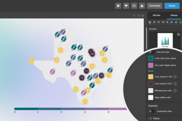
We’re excited to introduce a highly requested update: customizable colors for icon map clusters in Infogram. This feature gives you a greater control over how your geographic data is displayed – whether you want to align with brand colors, improve visual clarity, or emphasize specific data points.

With This Feature, You Can:
- Choose your own colors for smaller and larger clusters.
- Match cluster colors to your branding or specific color logic.
- Make maps easier to read by using distinct, intentional colors for each group.
This update applies to icon map clusters, where grouped values are automatically summarized into colored bubbles, perfect for showing concentrations of activity, reports by location, or geographic trends at-a-glance.
How It Works
- Open your project with an icon map.
- In the settings panel, scroll down to color settings where you’ll see individual color options.
- Click on the color swatches to select or input your own color codes.
- Your icon map will instantly update to reflect your new color choices.
Whether you want to use bright, contrasting colors for emphasis, or apply a custom palette that fits your reports, it’s never been easier to make your data maps look exactly how you want.
Example of customized icon map cluster color
This feature is live and ready to use in the Infogram editor. Log in to Infogram now to explore the update!
Get data visualization tips every week:
New features, special offers, and exciting news about the world of data visualization.