27.08.2025 by Infogram
Infogram now lets you add backgrounds to line, bar, and column charts. You can set a background color, adjust padding, blur the background, and round the corners of the chart area. These options give you more control over how your charts look and how they fit into your overall design.
Why It’s Useful
Background customization makes charts easier to read and more adaptable to different layouts. Adding padding or rounded corners can help charts fit seamlessly into a design, while color and blur options can highlight important sections or improve contrast with surrounding content. These controls help ensure your charts are both clear and visually consistent across projects.
What You Can Do With It
- Writers and researchers can improve readability by setting chart backgrounds that separate data from surrounding text.
- Designers can align chart styles with brand colors and visual themes, using backgrounds to create a polished look.
- Managers and analysts can use background settings to make dashboards and reports easier to scan by visually grouping or separating charts.
Example of background color
Example of rounded corners
Example of blur effect
How It Works
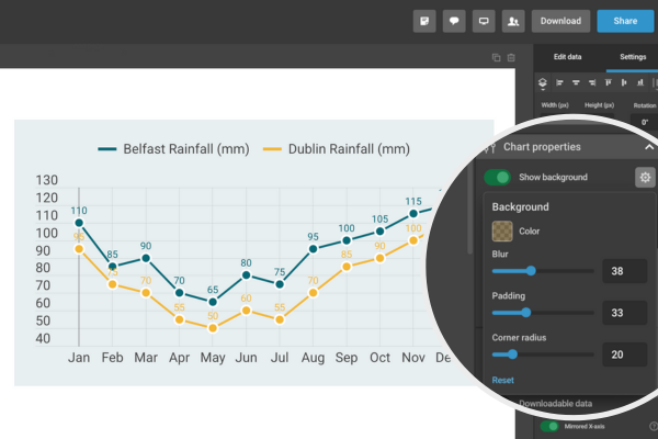
- Open a line, bar, or column chart in your Infogram project.
- In the right-hand menu, go to Chart properties.
- Scroll to the Background settings section.
- Adjust the following options:
- Background color – choose any solid color.
- Padding – add space around the chart content.
- Blur – apply a subtle blur effect to the background.
- Corner radius – round the corners of the chart background.
- Preview your changes instantly and fine-tune them as needed.
This update is part of Infogram’s ongoing commitment to expanding editing and customization options for charts. Background settings are now available for line, bar, and column charts, with support for more chart types to follow.
Get data visualization tips every week:
New features, special offers, and exciting news about the world of data visualization.