30.03.2016 by Infogram
We are surrounded by charts, graphs, and infographics on a daily basis. But, what makes a data visualization memorable, informative, and easy to understand?
Researchers from MIT’s Computer Science and Artificial Intelligence Laboratory (CSAIL) and Harvard University conducted a first-of-its-kind study to help answer the following questions:
- What visual elements do people actually pay attention to when examining a
visualization? - What are the differences in memorability when given more time to view a visualization?
- What information do people use to recognize a visualization?
- What exactly do people recall about a visualization?
By integrating multiple research methods, including eye-tracking, text recall, and memory tests, the team was able to conduct the ‘largest and most comprehensive user study to date on visualizations.’
We will explain how they conducted their research and highlight a few key takeaways for you to think about before designing your next data visualization.
Experiment Design
For this study, researchers labeled a dataset of 393 visualizations taken from newspapers, blogs, scientific journals and government reports.
33 Participants were shown each visualization for 10 seconds and then given a memory test to determine which ones they could remember. Researchers also tracked their eye-movements to decide which elements of the visualizations were helping the subjects recall information.
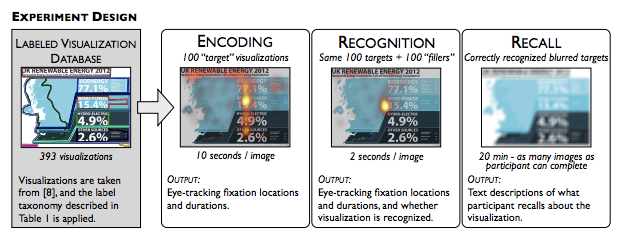
Image: Beyond Memorability: Visualization Recognition and Recall. 2015.
To make it even harder, the team showed participants blurry versions of the original visualizations and asked them to write down everything they remembered about each one.
Research intern Daniel Borkin told MIT News, “A key insight was to break memory down into these three core cognitive principles of encoding, recognition, and recall… This allowed us to tease apart what it is that makes a given visualization not just more memorable than another, but also what a reader can actively recall in detail, which is a much more accurate measure of its effectiveness.”
The team’s conclusions align with many accepted guidelines in the visualization community, with a few new insights. Here is what they learned:
Titles are Important
Across all textual elements, the title is among the most important. According to the study, the strongest visualizations had good titles. Good titles need to be concise, descriptive and sum up the key message in seconds. Also worth noting, titles were more likely to be fixated on if placed at the top of the visualization, as opposed to the bottom.
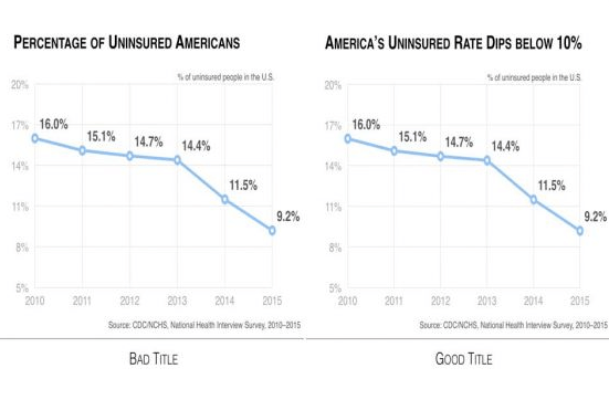
Image: MIT News. Nam Wook Kim. 2015
People often include titles that don’t add anything to what is already shown, which is a lost opportunity to engage your viewer and deliver a memorable visualization.
Pictures are King
Pictures give readers additional associations that help them retain and recall content. The big surprise? People like pictograms! Pictograms did not seem to distract participants during encoding and actually improved recognition.
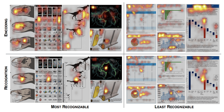
Image: Beyond Memorability: Visualization Recognition and Recall. 2015.
Pictograms can often get a bad rap for ‘dumbing down’ data, but the study proves people recall the message of a visualization with pictograms correctly, and in fact, often better.
Pictograms might also provide a form of message redundancy – which is another pro-tip discovered during the study.
Repeat Your Message
Data and message redundancy in visualizations help people grasp on to the main trends and messages, and improves visualization recognition and recall.
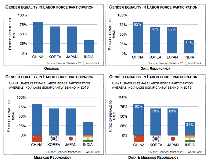
Image: Beyond Memorability: Visualization Recognition and Recall. 2015.
It seems that repetition is crucial to getting your message across effectively. Good visualizations offer multiple ways to convey and label information.
“Telling things once is often not enough: redundancy helps restore messages damaged by noise,” says author Jean-Luc Doumont.
It can be as a simple as writing out number values, adding relevant visuals, or altering the chart to better emphasize your message.
Memorable at a Glance = Effective
Importantly, the team learned that visualizations that were memorable “at-a-glance” (after only 1 second of encoding) were often the same ones that were memorable after “prolonged exposure” (10 seconds of encoding).
Therefore, visualizations memorable “at-a-glance” are also capable of effectively conveying the message of the visualization. Thus, a memorable visualization is often also an effective one.
The research team recently released MASSVIZ – one of the largest real-world visualization databases, scraped from various government reports, infographic blogs, news media websites, and scientific journals.

MASSVIZ consists of over 5000 static visualizations of which over 2000 contain visualization type information, including annotations, memorability scores, eye-movements, and labels for you to learn from.
Studies like these are reassuring for our team at Infogram, helping prove the effectiveness and importance of data visualizations. If you found this study as interesting as we did, share it with your friends and leave your thoughts in the comments below!
Would you like to experience the full power of data visualization? Try Infogram for Teams or Enterprise for free! With a Team or Enterprise account, you can create up to 10,000+ projects, collaborate with your team in real time, use our engagement analytics feature, and more. Request your free demo here.
Get data visualization tips every week:
New features, special offers, and exciting news about the world of data visualization.