26.11.2024 by Infogram
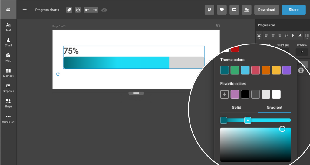
At Infogram, we continuously strive to help you communicate complex data in clear, engaging ways. With the latest update, we’ve introduced gradient color options for our new animated progress chart, giving you more flexibility and visual appeal when tracking progress, milestones, and key metrics in your reports or presentations. This new feature allows you to present data in a more dynamic and eye-catching manner, improving how your audience interprets your information.
What is a progress chart?
A progress chart is a type of visualization used to track progress toward a goal or milestone. It’s commonly used for displaying percentages, such as completion status, performance achievements, or sales targets. These charts help convey information in an easy-to-understand format, ensuring your audience grasps key insights quickly.
With the addition of gradient colors, you can now highlight specific parts of your progress charts in more vibrant, visually appealing ways. The gradient color options smoothly transition from one shade to another, offering a more nuanced and professional look to your charts.
Addressing common challenges
Many professionals face challenges when trying to communicate progress and milestones effectively. Traditional charts can appear static, making it harder for audiences to quickly grasp the significance of the data. Some of the issues that progress charts address include:
- Clarity: Regular charts may struggle to highlight key insights or trends effectively.
- Engagement: Static charts often fail to capture the audience’s attention.
- Focus: Simple progress charts can easily be overlooked without visual emphasis.
The new gradient color feature solves these issues by making progress charts more visually engaging, ensuring your data stands out and holds the attention of your audience.
Practical use cases
Here’s how the new gradient color options can improve your presentations, reports, and projects across various business roles:
- For data analysts. Presenting quarterly performance metrics becomes more dynamic. Use a bar chart with a gradient color scheme to show progress against revenue targets. The gradient effect makes it easy to visualize how close you are to your goal and adds a professional touch to your reports.
- For marketing managers. Track campaign progress with a doughnut chart that uses gradient colors to show the percentage of goals achieved. The gradient colors help distinguish between completed tasks and outstanding ones, making it easier for stakeholders to grasp performance and future strategies.
- For project managers. Pictorial progress charts, using relevant icons and gradient colors, can visually represent milestones. For example, a project manager could use a gradient color to show different stages of completion within a project, which not only clarifies the status but also encourages team involvement and focus on key objectives.
Take advantage of the new gradient color options in progress charts today. Visit our help center or explore the feature guide for more information on how to incorporate this update into your projects. Log in to your Infogram account now and start making your progress charts more visually compelling and effective!
Get data visualization tips every week:
New features, special offers, and exciting news about the world of data visualization.