19.05.2016 by Infogram
It’s time for our monthly Infogram feature update! Our team has been working hard to enhance our tool – helping you create superior charts, maps, and infographics.
Want to know what we’ve been up to? Scroll down to learn more!
1) Edit Chart Settings Per Sheet
Infogram users now have the ability to change chart settings per sheet of data. If you want to feature a chart with multiple data sets and smooth interactivity, you can adjust labels, colors, and the number format featured on each sheet of data.
This makes it easy to specialize your data sets and highlight specific points you want to make. Simply double-click to edit your chart, scroll to the bottom of the settings tab, and select the sheet you’d like to alter.
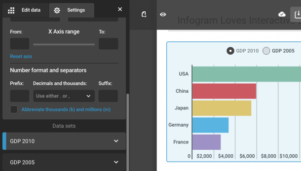
2) Updated Number Format
Make sure your numbers are displayed just how you want them. You can easily adjust the number format, adding a prefix or suffix to your data. This way you can add specific currencies, symbols or percentages to your charts. You can also abbreviate thousands (k) and millions (m) to keep your chart from becoming too cluttered.
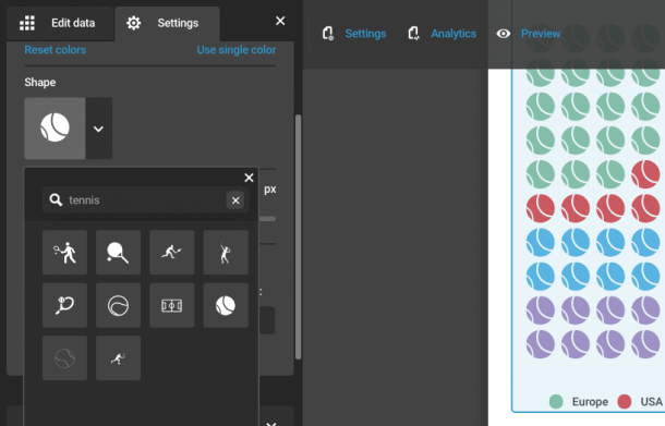
3) New Shapes and Icons
Who doesn’t love customizing their work? With our paid plans, you have unlimited access to hundreds of icons and shapes. These accounts are integrated with the Noun Project, the world’s most complete source of quality icons. You can also search for specific icons or themes to save time and explore all of Infogram’s icon offerings.
Would you like to experience the full power of data visualization? Try Infogram for Teams or Enterprise for free! With a Team or Enterprise account, you can create up to 10,000+ projects, collaborate with your team in real time, use our engagement analytics feature, and more. Request your free demo here.
4) High-Quality Logo Uploads
Business Plans have the ability to upload a company logo to appear at the bottom of their charts. Upload high-quality PNG and JPEG images of your logo to ensure your branding looks it’s best on retina displays and in print.
5) Custom ‘Share’ Button
Business users also have the ability change the color of the ‘share’ button, alter the button’s text or remove the button altogether. Open your chart’s settings, scroll down to the ‘share’ button menu, and you’ll see a text box and color editor for you to personalize like the example below.
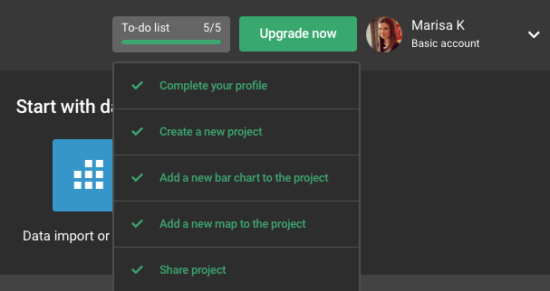
6) Achievement Checklist
New Infogram users are greeted with a five point achievement checklist to help guide them through the visualization process. They are shown how easy it is to create new projects, add elements, and share their work.
Are you ready to visualize your data, add fun new icons and upload high-quality images of your logo? Sign up or login to Infogram and start designing today. We have over 35+ chart types for you to customize and share.

Get data visualization tips every week:
New features, special offers, and exciting news about the world of data visualization.