12.01.2024 by Infogram
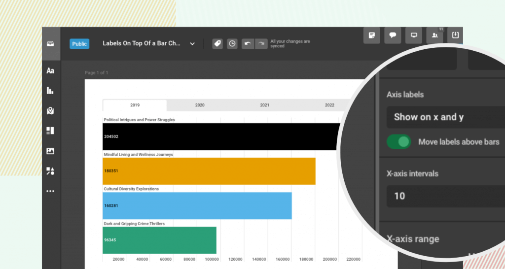
We are excited to introduce functionality to display labels on top of a bar chart. This new feature allows for a clearer and more direct presentation of data, making it easier for viewers to connect the information with its respective graphical representation.
How does it benefit you? Incorporating labels on top of a bar chart offers several benefits for creating more effective and interactive data visualizations:
- Enhanced clarity. Directly presenting key data points above each bar makes your charts more readable and understandable.
- Improved aesthetics. This feature allows for a cleaner and more organized look, making your charts visually appealing and professional.
- Versatile data communication. It provides a straightforward way to highlight the most important figures, ideal for summarizing complex information quickly.
What can you achieve with it?
- Enhance the impact of your storytelling by providing clear, easily digestible data insights. Use labels to directly emphasize key figures that support your narratives.
- Create more engaging and informative infographics and social media content. Utilize labels to make data points stand out, making your content more shareable and understandable.
- Simplify the presentation of complex data for broader audiences. Highlight critical data trends and comparisons with greater clarity to help with decision-making processes.
- Communicate the achievements and milestones of your projects more effectively. Use labels to draw attention to significant numbers that demonstrate your project’s impact.
How to?
For more tips on chart customization, have a look at the articles in the Charts section.
Get data visualization tips every week:
New features, special offers, and exciting news about the world of data visualization.