12.03.2025 by Infogram
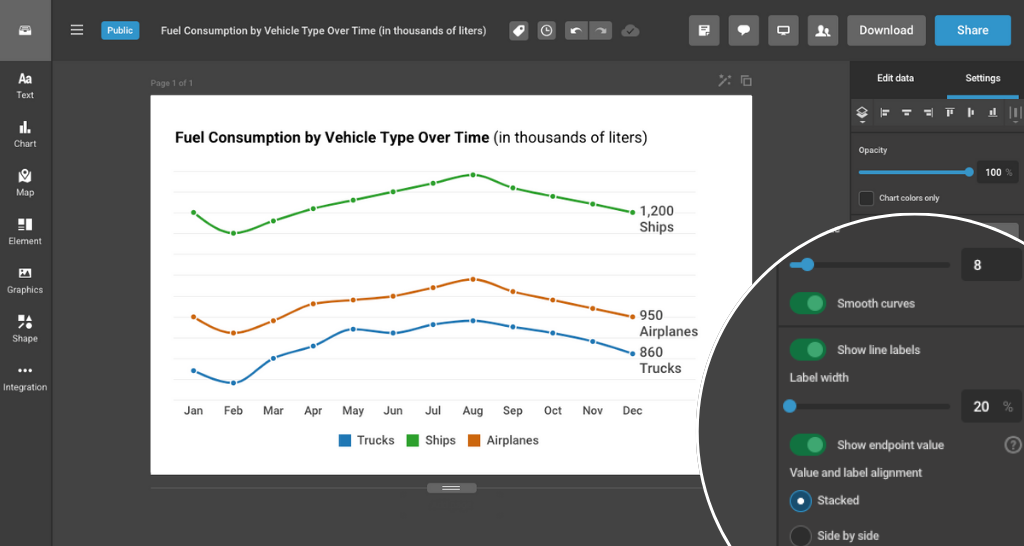
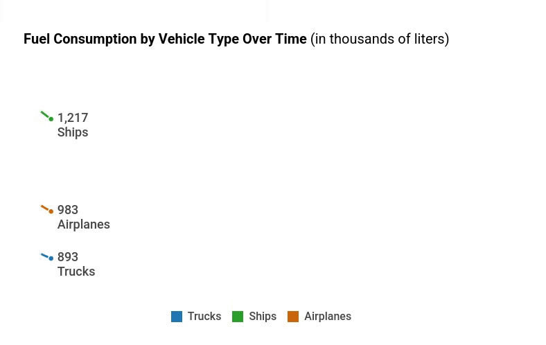
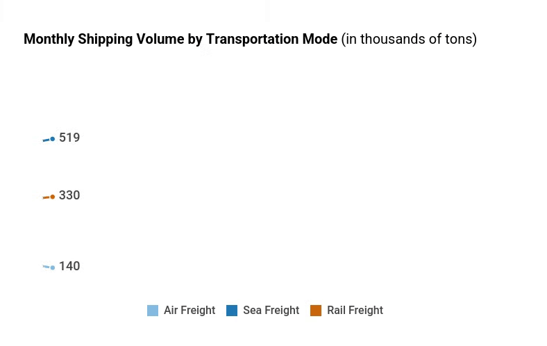
Say goodbye to chart clutter – Infogram now lets you add category and value labels at the end of your line charts. This new feature allows you to display either the name of each line (category label) or its final value (value label) at the end of the line – making your charts cleaner, easier to read, and more insightful at a glance.
At Infogram, we believe that visual clarity is key to impactful data storytelling. These end-of-line labels reduce clutter inside the chart area while helping viewers instantly understand what each line represents – without needing to trace back to a legend.
Whether you’re tracking sales by region, comparing KPIs across departments, or showcasing poll results over time, this feature ensures your insights don’t get lost in the lines.
How Can This Feature Help You?
- Tired of tangled legends? Use category labels to name each line directly – ideal for when you’re comparing multiple data sets and want viewers to identify them quickly.
- Need to spotlight the final results? Value labels make it easy to highlight the outcome at the end of each trend, perfect for emphasizing which product, region, or metric leads the pack.
- Want a cleaner look? By placing labels at the end, your chart remains spacious and easy to follow – especially useful when presenting on slides or small screens.
For example, if you’re comparing monthly revenue across regions, you can display “North America” and “Europe” next to the end of their respective lines – or show “$12.4M” and “$9.1M” to highlight who’s leading. This makes it easier for your audience to follow trends and identify winners at a glance, whether they’re viewing reports, dashboards or slides.
What Can You Do with End-of-Line Labels?
- Improve Readability: Make your line charts easier to scan without relying on legends.
- Emphasize Outcomes: Focus attention on final values – where trends ultimately lead.
- Simplify Presentations: Perfect for visual storytelling in meetings, reports, or dashboards.
Who Benefits from This Feature?
- Data Analysts & Business Professionals: Show KPI comparisons with minimal clutter and clear takeaways.
- Marketers & Content Creators: Highlight winning campaigns or product trends directly on your charts – no legend-hunting needed.
- Journalists & Reporters: Help readers instantly grasp polling results, economic trends, or public sentiment shifts over time.
With end-of-line labels for line charts, your trends don’t just look better – they speak louder. Try it in Infogram today and make every line tell a clearer story.
Get data visualization tips every week:
New features, special offers, and exciting news about the world of data visualization.