07.08.2015 by roberts
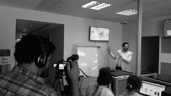
A group of digital, data and investigative journalists from Dotmsr, one of the most popular news portal in Egypt, gathered to learn the essentials of effective data storytelling with Infogram in the beginning of August.
The Dotmsr journalists created infographics about education, immigration and political situation. Here are some of them:
The best infographic was created by Dina Wadi and Khaled Youssef. Both decided to create an infographic about the number of refugees in Egypt. Dina and Khaled each received a three-month subscribtion to an Infogram Pro account.
The second group created an infographic about the number of journalists killed in Syria and the third group decided to explore the number of Instagram users around the world.
The workshop was organized by Amr Eleraqi our ambassador in Egypt to develop the skills of journalists in the data visualization field and to encourage them to use the maps/graphics for the daily stories. The participants learned about basic data mining and scraping, data driven journalism, data visualization and the use of Infogram to visualize data for educational, marketing or journalism purposes.
“The participants commented about their understanding of the work of a data journalist, finding the stories behind numbers, started doing their own infographics and expressed the need for more workshops,” Eleraqi said. “All of the participants liked the way Infogram allowed them to build their own interactive infographics very quickly without having any graphic design knowledge.”
Infogram Data Storytelling workshops aim to share best practices of powerful data storytelling with Infogram and enhance data literacy – the ability to “read” and “write” data. Infogram provides full support to make them happen, as well as gifts for participants. Learn more and apply to organize one in your city here.
Get data visualization tips every week:
New features, special offers, and exciting news about the world of data visualization.