29.05.2025 by Infogram
We’re excited to introduce one of our most requested features: the Total Stack Sum setting for stacked column charts. Whether you’re visualizing sales data, survey results, or budget breakdowns, you can now display the total value of each stacked column directly on your chart – either alongside individual bar values or on its own.
No more guessing or calculating totals manually – just turn on the setting, and your chart will clearly show both the individual segments and the overall total. It’s a simple, powerful way to make your charts clearer, more readable, and more insightful for your audience.
How It Helps You
Stacked column charts are great for showing how different components add up – but without a clear total, it’s easy to miss the bigger picture. That’s exactly what this feature solves.
With This Feature, You Can:
- See the big picture by displaying the total sum at the top of each column.
- Improve readability by making key insights instantly visible.
- Keep details visible by showing individual values and totals together.
- Stay flexible with options to show only totals, only values, or both.
Whether you’re breaking down data, comparing categories, or adding a professional touch, this feature helps you get your point across quickly with more clarity.
Writers and researchers can make their charts easier to follow by showing totals upfront, no math skills needed. Designers can tweak the look of totals to match their chart’s style, keeping visuals clean and on-brand. Managers and analysts can highlight key insights in reports with totals that make trends and comparisons pop, all without extra effort.
How It Works
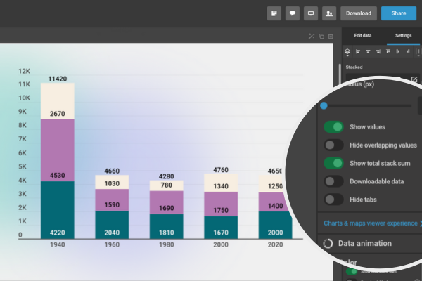
- Open your stacked column chart in Infogram.
- In the right-hand menu, click “Chart Properties.”
- You’ll see a new toggle labeled “Show Total Stack Sum” – turn it on.
- To display only the totals, turn off the “Show Values” toggle.
- Want both? Just leave both toggles on.
Your chart will update instantly – totals appear exactly where they should. You can also fine-tune the look: adjust font size, color, or position to match your design.
Examples of total stack sum with individual values and without.
Ready to show the full picture? With the Total Stack Sum setting, your charts aren’t just about the parts anymore, now you can highlight the whole story too. It’s clear, fast, and just one toggle away. Try it now. Log in to Infogram, open your project, and head to the “Chart Properties” section to get started.
Get data visualization tips every week:
New features, special offers, and exciting news about the world of data visualization.