02.09.2015 by roberts
Infogram is a data visualization tool that helps people create interactive charts and infographics in minutes. In our mission to create the best possible data visualization tool, we constantly look for ways to improve our product. As a result, today we’re launching a long awaited feature: side by side object placement.
This is how side by side layouts work:
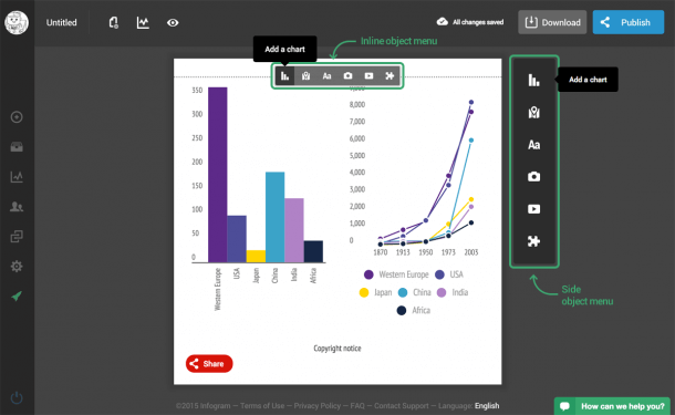
Adding a chart works as it has always: simply pick your desired chart from the inline menu or side panel.
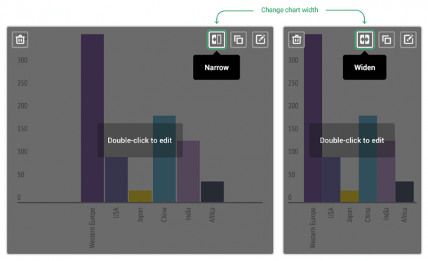
In order to place two charts next to each other, you need to make the first one narrow. Change the width of the chart with these icons:
Insert a second chart underneath the first one, and narrow that one too. The second chart will automatically be placed next to the first chart once it has been narrowed.
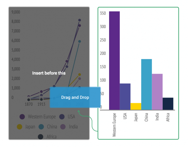
Rearrange the order of the objects by dragging and dropping them on other objects.

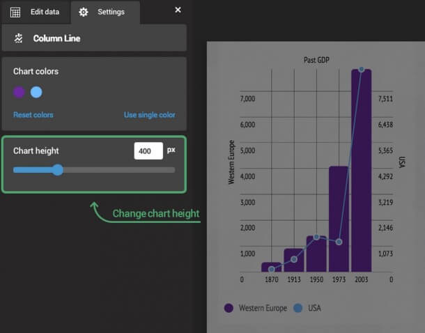
Resize the height of the charts manually in the chart settings. To do this, double-click on the chart to go to settings and choose the second tab.
To note, only charts and texts can be placed next to each other (the feature is not available for images and videos)
Would you like to experience the full power of data visualization? Try Infogram for Teams or Enterprise for free! With a Team or Enterprise account, you can create up to 10,000+ projects, collaborate with your team in real time, use our engagement analytics feature, and more. Request your free demo here.
Let us know what you think!
Get data visualization tips every week:
New features, special offers, and exciting news about the world of data visualization.


