31.01.2018 by Infogram
Stephanie Evergreen, PhD, is a self-proclaimed ‘die-hard data nerd.’ Rising through the highest ranks of academia, she holds a doctorate in interdisciplinary evaluation, which she eventually turned into a specialization in data visualization and design. Dr. Evergreen is now an internationally recognized speaker, author, designer, and researcher. She travels the world, teaching clients how to tell better data stories. As she puts it, “it’s a pretty good gig!”
I spoke with Stephanie while she was holed up in her snowy Michigan home to talk about her books, tips for mastering data communication, and her favorite chart (which changes monthly).
What motivated you to write Presenting Data Effectively, and what motivates you now?
I think it was really me taking note of my own problems. I was in that position of sitting at a computer with data trying to pull together a presentation, and I was bored and frustrated with how it was coming across. I knew it wasn’t effective but I didn’t know what else could be done. So, I started blogging. My blog began to get a lot of attention because I was one of the only people talking about this stuff at the time. Publishers saw enough interest there and saw new ground being broken, so they offered me a book deal.
What motivates me now is when people write me emails or tweet me, readers who contact me daily saying my writing has helped them and the way they work. I had someone come up to me at a conference who wanted to give me a high five. He said he had a new competitive edge over the other people in his department because he was involved in my work, and he now knew how to tell stories better than any of his peers.
How would you describe an effective data presentation?
I think the ultimate sign of a successful data presentation is when the audience understands what has been said and they can use that information to take action and make decisions.
Why do our brains love visuals?
We are in a picture-first world. That is how people operate – with pictures – through our eyes. Our bodies are built with 5 senses, but vision is our dominant one by far.
What are the top mistakes you see when it comes to visualizing data?
The biggest mistake I see, and this isn’t about the visual, is that people haven’t figured out what they are really trying to say. That takes interpretive brainwork, back in your office at your desk, long before you open Infogram or Prezi. This part shouldn’t be that hard, because most of the time, people have been up to their eyeballs in their data. They know it inside and out. They just don’t take the moment to sit down and think about what’s interesting or important or noteworthy about this particular dataset. What is the point in the data that will be good for your audience to know?
What tips do you have for using color effectively?
The number one thing to know is that we need to take control of color. We can’t just let software decide what colors are going to go where, because it will never know what the story is. Color is one of those things that is going to attract eyes, so we need to use action colors on the places on our data that need to grab our audience’s attention. Then we can put everything else in a shade of grey so that people will home in on the stuff that matters.
What advice do you have for people who struggle with picking the right chart?
It’s so hard. I hear it all the time – people want a decision tree about which chart to use – ‘if this then that.’ I tell people to consider their audience. What do they know? Are they data-savvy? Are they academic? If they are they might want a really serious-looking chart. Or are they data-scared? Knowing where your audience is, and what their comfort level is with data, can help you.
And again, you’ve also got to know what it is you are trying to say about your data. For example, if you’re trying to get your audience to compare two variables in your graph, you can start to narrow down all the graph types that show comparisons.
When should people realize they’ve gone too far with their design?
I think if you stick to the default chart types you’re almost guaranteed to have too much clutter. If you go to your software and hit one button to insert your graph it’s going to be too cluttered. Default charts tend to have too much clutter baked in.
It’s not a matter of going too far, it’s a matter of not going anywhere at all. People need to start pulling some stuff out that doesn’t add to the understanding of the chart – like tick marks or axis lines. I’ve also seen people going too far in the other direction, and then they strip out too much. Ultimately it’s a good idea to test the visual on someone who doesn’t know too much about the dataset and just see if they can read what’s going on.
What is the difference between visualizing data and presenting visualized data?
I think visualizing data is an activity that could be done alone. When you’re presenting visualized data there is a communication aspect to it – one person is trying to convey information for the benefit and understanding of other parties. Sometimes that involves a broader set of skills like copywriting and public speaking skills.
What quick tips can readers do right now to improve their data visualizations?
One of the best ways to get the biggest bang for your buck is to have an awesome title. Once you’ve gone through the difficult work of just figuring out what you want to say with your data, there should be one sentence you can come up with that sums up your story. Explain what’s happening inside the dataset. If we swap out generic titles that simply describe what the data is, vs the main takeaway point from the data, you are going to get really far.
Why do you think dataviz and infographics have grown in popularity over recent years?
What a time. It changes so fast. I think we have suddenly become a data-driven world. Even just ten years ago we were kinda guessing. We didn’t really know if our work was having an impact. Then, suddenly we realized we can collect data on anything. Now we have mountains of data and people don’t know how to cut through that to find what’s important. We felt pressure to collect data, then we felt pressure to make data-driven decisions, and people had trouble connecting the two. That is why data visualization has become a go-to resource for folks.
What is your favorite chart and why?
My favorite chart changes. I can probably show you blog posts over the years that say ‘this is my favorite chart,’ or ‘this is my new favorite chart!’ Today I’d have to say an overlapping bar chart. When I figured out how to make an overlapping bar chart I felt like it solved so many of my data problems. It fit so many scenarios I couldn’t otherwise visualize very well.
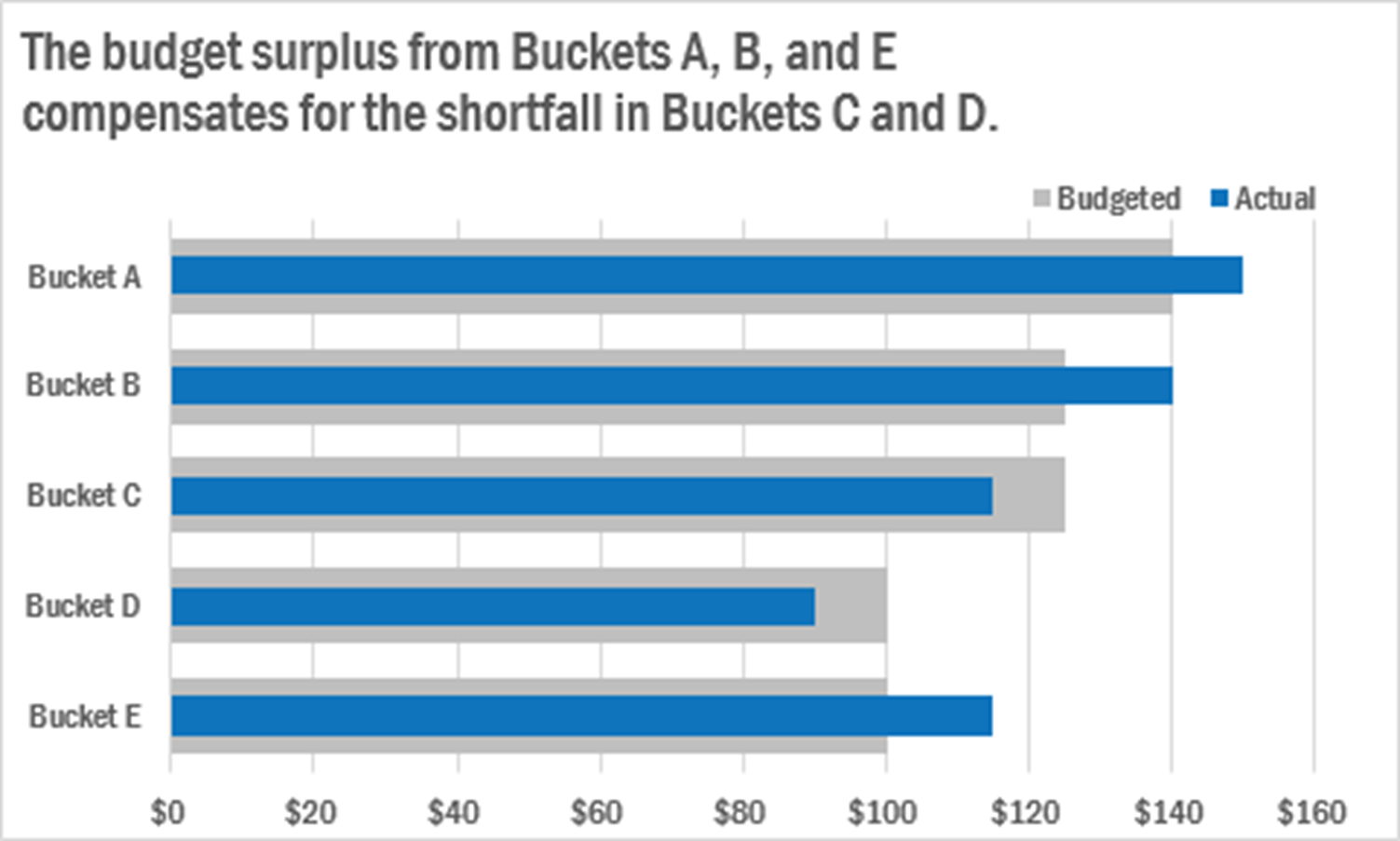
We are often in these situations where we are trying to compare two things, but one of the things is inherently a part of the other thing. When we just put them in a bar or column chart side-by-side, we are treating them like they are to two distinct independent entities in the world when they are not – they are related. There are so many cases where I think this is true. For example, when comparing residents of San Francisco against residents of California. Those aren’t two distinct things! San Francisco is a part of California. When the bars are overlapping, where we have one set of bars inside another set of bars, it helps us tell a story about the relationship between the two things.
Any exciting projects you’re working on?
In 2018 I’ll be writing the second edition of my book Effective Data Visualization. It will include some new graph types, I’ll talk a bit about dashboards, show some time-saving tips, and the visuals will be in full color. In the coming year, we will also be concluding some research on data visualization. We have some super exciting results – stay tuned!
 Dr. Stephanie Evergreen is an internationally-recognized data visualization and design expert. She has trained future data nerds worldwide through keynote presentations and workshops. She writes a popular blog on data presentation at StephanieEvergreen.com. Her book, Effective Data Visualization, was published in Spring 2016. Her other book, Presenting Data Effectively: Communicating Your Findings for Maximum Impact, was just published in its second edition in June 2017. Both books hit #1 on Amazon bestseller lists.
Get data visualization tips every week:
New features, special offers, and exciting news about the world of data visualization.