09.06.2015 by roberts
Infographics are a powerful way of communicating information since they combine data and visual images – left brain and right brain – thereby making it easier to digest, remember and share information. But what makes a good infographic? In this article we’ll explain:
- How to find a good topic for your infographic.
- Where to find good data and how to analyze and present data in an appealing way.
- What tools exist out there to make infographics.
Why infographics are so powerful, or how your brain works
Are you left-brained or right-brained? As I was growing up, this seemed to be a recurring question. The answer was supposed to determine whether you were a creative or rational individual. Luckily we have moved away from such narrow typecasting, but nonetheless, the fact remains that certain parts of our brains are wired to process certain type of information.

Your brain is divided into four lobes: frontal, parietal, occipital and temporal.
The frontal lobe is responsible for what we normally understand as “rational” activities: logic, planning, problem-solving, short-term memory and pattern recognition among others. This is also the part of the brain you use to process complex quantitative information.
The occipital lobe, in the back of your head, has a direct connection to the nerves in your eyes, and is responsible for processing visual information (images). It also has a nifty function: it connects visual stimuli to images stored in your long-term memory. This is why many people find it easier to remember information when they link it with a mental image.
Infographics are, in essence, visual representations of data. Or, in other words, a way of building a connection between the frontal and occipital lobes. One of the beauties of infographics is that they allow the publisher to present rational information in a visual way, thereby increasing its likelihood of being remembered.
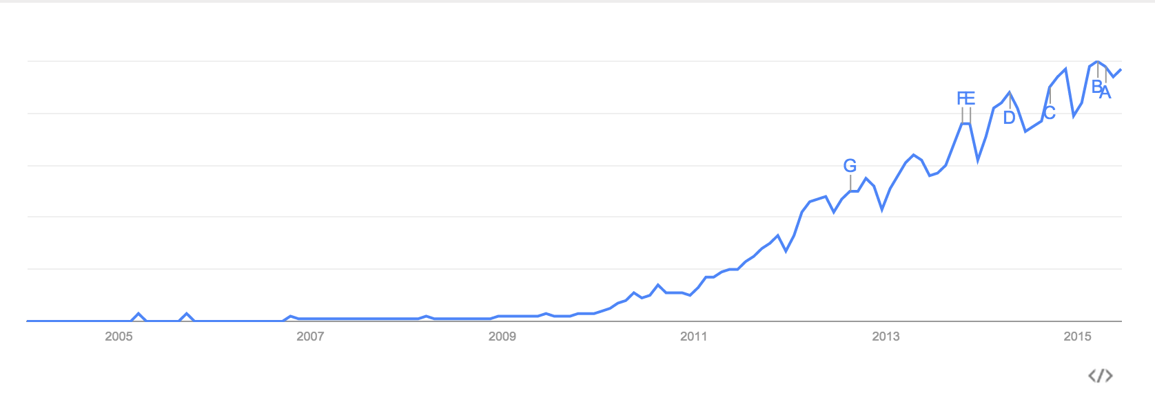
In the last few years, we have seen a significant increase in popularity of the term “infographic”, as you may see in this chart.
But infographics have been around for a long time. One of the oldest historical records in modern times of an infographic dates back to 1626 when Christoph Schneier published an infographic about the rotation of the sun in his book Rosa Ursina sive Sol. Since then, several people, such as Charles Joseph Minard (in the 1860’s) and Edward Tufte (in the late 90’s), have researched and developed theory around data visualization. In the following section, we’ll describe some of the key elements of a good infographic: finding the topic and presenting the data.
How to find a good topic
Every good infographic starts with good data. There are several sources you can find online, from social media sites like Twitter and Google Trends, to governmental portals like data.gov or open-data.eu.
*Infographic created by Mention
But there’s another good source of information that people tend to forget: your own data. What kind of content have you published recently that has driven the most engagement? Do you get comments or feedback from your readers? What are they asking? How do your users engage with you (product usage, site visits, etc.)? Those are all good sources of information for your topic.
*Infographic made by Catalina Albeanu
Once you’ve chosen a subject, the next step is to decide how you’re going to talk about it. Three frequently used ways of structuring your topic are:
Trends: describe something that is happening in the world or your industry (as I’m doing here), and show that there’s a tendency that will likely become the norm.
Contrast: compare two sets of data to drive your point across.
Outliers: talk about something or someone that doesn’t follow the norm. Why is it so and what can your readers learn from that?
How to work with data
Remember that the whole point of infographics is to present data in a visually appealing way. Data lends credibility to your content and makes it trustworthy. The challenge lies in presenting data in such a way that it’s easy to understand, hard to forget, and likely to be shared.
When working with data, the key thing to remember is that less is more. You must summarize and digest the information for your reader (aka do the legwork for them) – without oversimplifying it. So if you’re working with large data sets, find a way to group the information into 4-6 cohorts. While sometimes this might seem really hard to do, it’s easier if you keep in mind what the the data insight is. Group the data in such a way that helps the reader instantly understand the takeaway.
Choosing the right chart type is a big part of it.To illustrate this, lets take a look at the following charts:
Chart (A)
Chart (B)
Both contain the same information but presented in different ways. All I did was flip the rows and columns in my spreadsheet, but chart B is a lot easier to understand than chart A.
Here are some tips that will help you choose the right chart:
Bar charts: the most frequently used chart type. Utilize it to show numerical comparisons among categories. Be careful not to have a large amount of bars, or labeling becomes problematic and your chart will be hard to read.
Bubble charts: used for displaying three or more variables in a Cartesian coordinate system. The X and Y axis each represent one variable, and the size of the bubble represents a third. Other variables can be added through the use of interactive charts, where the color and size of the bubbles can be used to show changes in time. Watch out for the sizes of the bubbles: make sure you maintain area proportions, or it may lead to misinterpretation by the reader.
Pictorial charts: present data through the use of icons and simple images. They are a great way to make data engaging, and help overcome language and education barriers. As with bar charts, they work better with small sets of data when you’re making side-by-side comparisons of 2-3 groups.
Treemap: these diagrams are a good way to compare data by the size of the area of each block. Data becomes easy to understand because proportions are visually comparable.
Tools and available resources for making infographics
Hopefully, by now I’ve convinced you that infographics are a powerful way of communicating with your readers. And, maybe, now you’re wondering where you’ll find the tools and resources needed to create one. Broadly speaking, there are two routes you can take: hire a graphic designer or use tools that are available online.
Hiring a designer will give you lots of flexibility and will ensure that you have an appealing, visually effective, infographic. A designer will create unique images and will work with you to create an end-product that looks exactly like you imagined. The downside is that it will require a bit more time and economic resources, and you will likely need to hire a developer as well, if you want to make them interactive.
Online tools
There are several data visualization tools out there that you can use for free or at a low price to create effective infographics.
Infogram provides an easy way to generate beautiful and interactive charts and infographics, that can easily be embedded on blogs, websites, and social media. Responsive design makes them look exactly as intended across devices, while the native interactivity helps boost audience engagement. Infogram is free to use but Pro, Business and Enterprise accounts allow you to download and print charts, plug-in live data feeds and use your own logo.
Silk is a data publishing and data hosting platform that quickly and easily converts spreadsheets into live online databases. Silk makes it simple for anyone to analyze their data and generate mobile-ready maps, charts and other visualizations.
Tableau is a powerful analytics tool. If you’re working with complex data, or want to create sophisticated visualizations, this might be a good tool for you. The downside is that the learning curve is somewhat steep and their infographics are not responsive. They have a free version, but if you want the see the full power off the product you’ll need to use the paid version.
CartoDB lets you create amazing maps, that are easy to share and embed. They are interactive and you can get started in minutes. You can filter and slice the data right there, helping you explore and refine large amounts of data. CartoDB is free and has a paid enterprise version.
The Takeaway
If you want a good infographic, make sure to choose the right topic and present data in a way that is easy to understand and share. Whether you hire a designer or use an online tool, infographics should become a regular element in your communication mix. There are several tools out there that will make your life easier; just choose the one that fits your needs.
Would you like to experience the full power of data visualization? Try Infogram for Teams or Enterprise for free! With a Team or Enterprise account, you can create up to 10,000+ projects, collaborate with your team in real time, use our engagement analytics feature, and more. Request your free demo here.
Get data visualization tips every week:
New features, special offers, and exciting news about the world of data visualization.