24.01.2024 by Infogram
The way we showcase geographical data has immensely changed in the last decade. And the use of maps has grown and become a key part of showing election data, population differences, temperature changes, the spread of diseases, and so much more. To showcase all this diverse information, there are different types of maps. But if you want to showcase population density, election results, or economic diversity, you should opt for choropleth maps.
Choropleth maps are powerful visual tools that use color-coded regions or areas to represent and communicate data. These maps provide a spatial perspective on information that might otherwise be challenging to understand. To better understand what is a choropleth map, what are its use cases, and how to create one, we’ll dive into each of these questions in this article. Plus, we’ll list great choropleth map examples and provide tips on creating a highly engaging choropleth and other types of maps on Infogram.
Click to jump forward:
- What is a choropleth map?
- What does a choropleth map show?
- What is a choropleth map used for?
- Choropleth map example
- Creating a choropleth map with Infogram
- Last thoughts on choropleth maps
What is a choropleth map?
A choropleth map is a type of thematic map that employs color variations to showcase data distribution across geographic regions. The term “choropleth” is derived from the Greek words “choros,” meaning region, and “plethos,” meaning multitude. This type of map uses a strategic placement of color to convey information, transforming numerical data into a compelling visual narrative. As a result, choropleth maps allow viewers to quickly grasp patterns, trends, and variations across different areas.
In simpler terms, a choropleth map is a map where areas are shaded or patterned in proportion to the value of a variable being represented. The intensity of color reflects the magnitude of the data, allowing viewers to spot high and low values within specific regions.
What does a choropleth map show?
Choropleth maps are quite versatile and can display a wide range of data, including population density, income levels, educational attainment, climate patterns, and more. For example, when showcasing population density, darker shades on the map might indicate areas with higher concentrations of residents, while lighter shades signify less dense populations. Similarly, when illustrating income levels, varying colors could represent different income brackets, allowing viewers to analyze economic differences across regions at a glance.
When using choropleth maps, the key is to choose a variable that is relevant to the geographic areas being represented, providing meaningful insights into spatial patterns and disparities.
What is a choropleth map used for?
Choropleth maps are used in many different fields, including economics, sociology, public health, and environmental science. These maps can provide crucial insights into the diverse needs of decision-makers, researchers, and educators.
In economics, choropleth maps help policymakers and businesses in strategic planning by visualizing regional variations in economic indicators such as GDP, unemployment rates, or consumer spending. This geographic perspective helps to identify areas of economic growth or decline, guiding resource allocation and shaping informed economic policies.
In sociology, choropleth maps are used to showcase demographic trends, social disparities, and migration patterns. By mapping variables like population distribution, educational attainment, or cultural diversity, sociologists gain a spatial understanding of societal structures. As a result, they help to facilitate interventions and social policy initiatives.
Public health professionals benefit from choropleth maps by visualizing and analyzing the prevalence of diseases, health outcomes, and healthcare access across different regions. This spatial representation is crucial for identifying health issue areas and allocating healthcare resources efficiently.
Environmental scientists can use choropleth maps to illustrate climate patterns, biodiversity, and ecological trends. These maps help in assessing the impact of environmental changes on specific regions, guiding conservation efforts, and informing sustainable development practices.
Beyond research, choropleth maps play a crucial role in education, helping students and the general public grasp complex data sets through visual representations. The accessibility of information makes these maps effective tools for improving public awareness and understanding.
Governments and businesses often rely on choropleth maps for strategic decision-making, resource allocation, and policy development. By presenting data in a geospatial context, these maps help stakeholders make informed decisions that consider the unique characteristics of different regions.
Ultimately, choropleth maps can help us transform complex and overwhelming data into visually engaging narratives, becoming a vital data visualization tool in various fields.
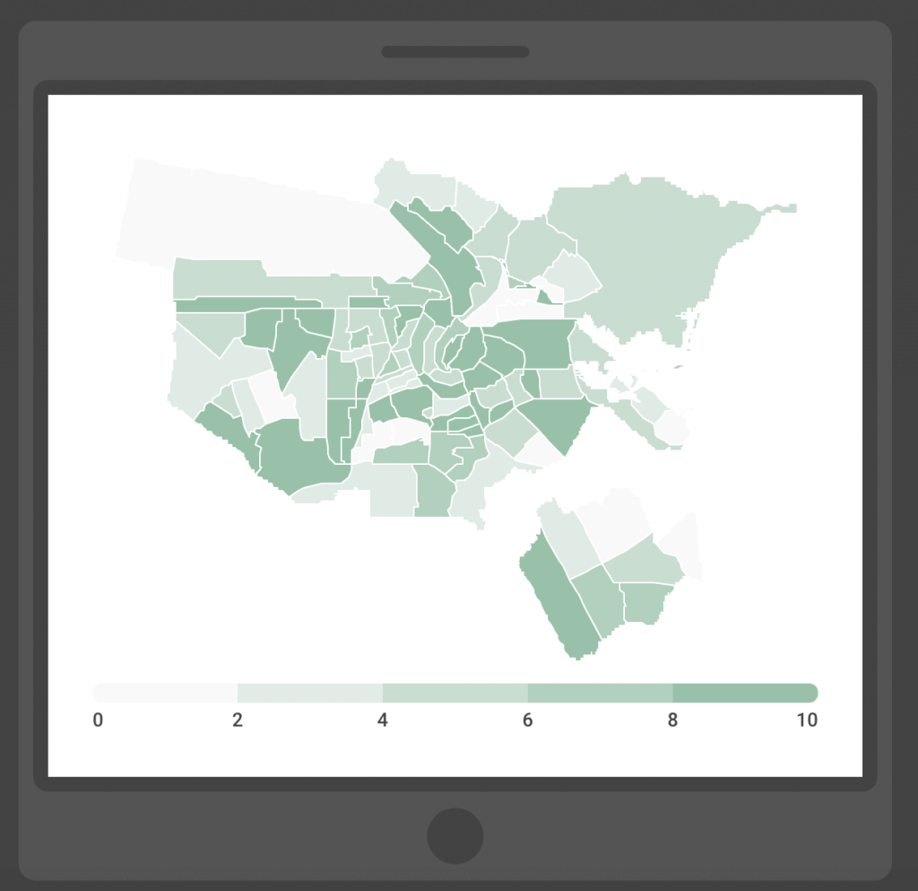
Choropleth map example
To better understand what is a choropleth map and how it works, let’s consider an example. Imagine a choropleth map of the United States depicting unemployment rates by state. Darker shades might represent higher unemployment rates, while lighter shades indicate lower rates. This visual representation makes it easy to discern which states are experiencing economic challenges and which ones have healthier employment rates.
Another great example is imagining a map designed to portray the U.S. presidential election results. In this scenario, the choropleth map would use two different colors to represent the two political parties. One color might signify votes for one political party, while the other color could indicate a competing political party.
This visual representation allows us to better understand the election results, allowing viewers to quickly grasp which states are leaning towards a specific candidate or political ideology. By using color gradients on the map, available on Infogram, you can differentiate political preferences and voting patterns across the nation. Ultimately, choropleth maps provide a dynamic and accessible means for citizens, analysts, and political strategists to interpret the geographic distribution of electoral support.
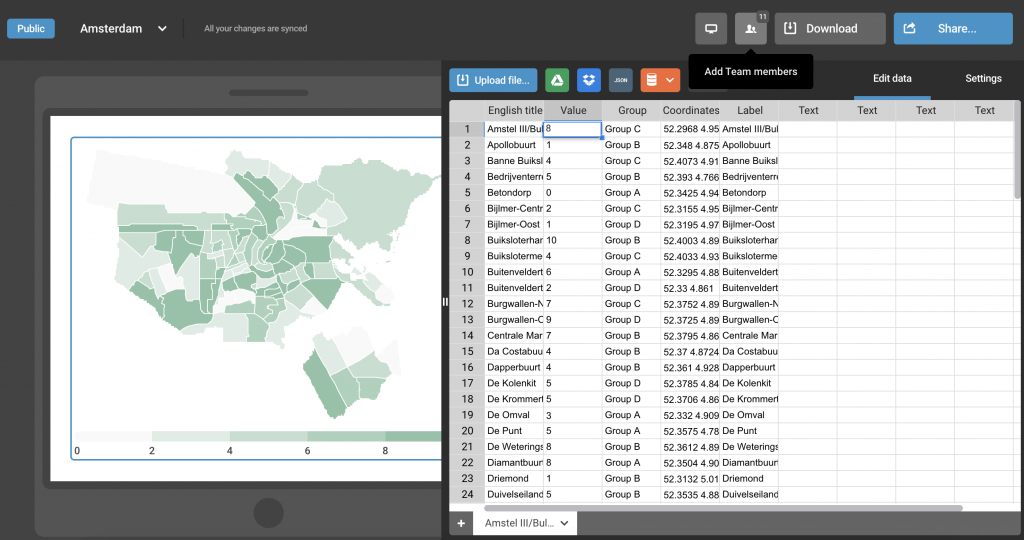
Creating a choropleth map with Infogram
Now that you know what is a choropleth map, creating it using Infogram is easy. Infogram’s user-friendly interface and diverse functionalities make the process straightforward and engaging. Follow these steps:
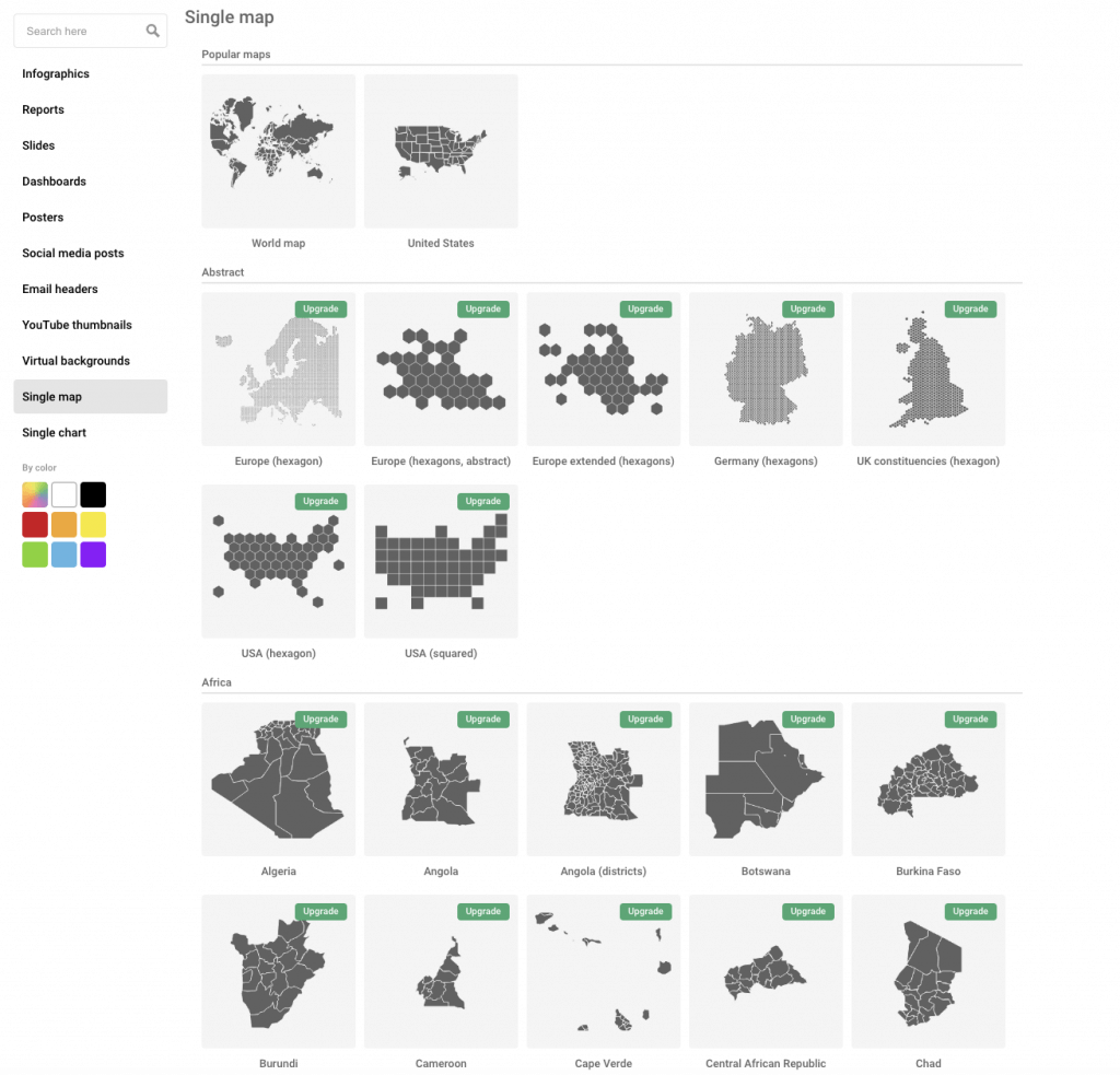
- To get started, simply choose the “Single map” category within Infogram’s template library.
- Next, you’ll either need to login or sign up.
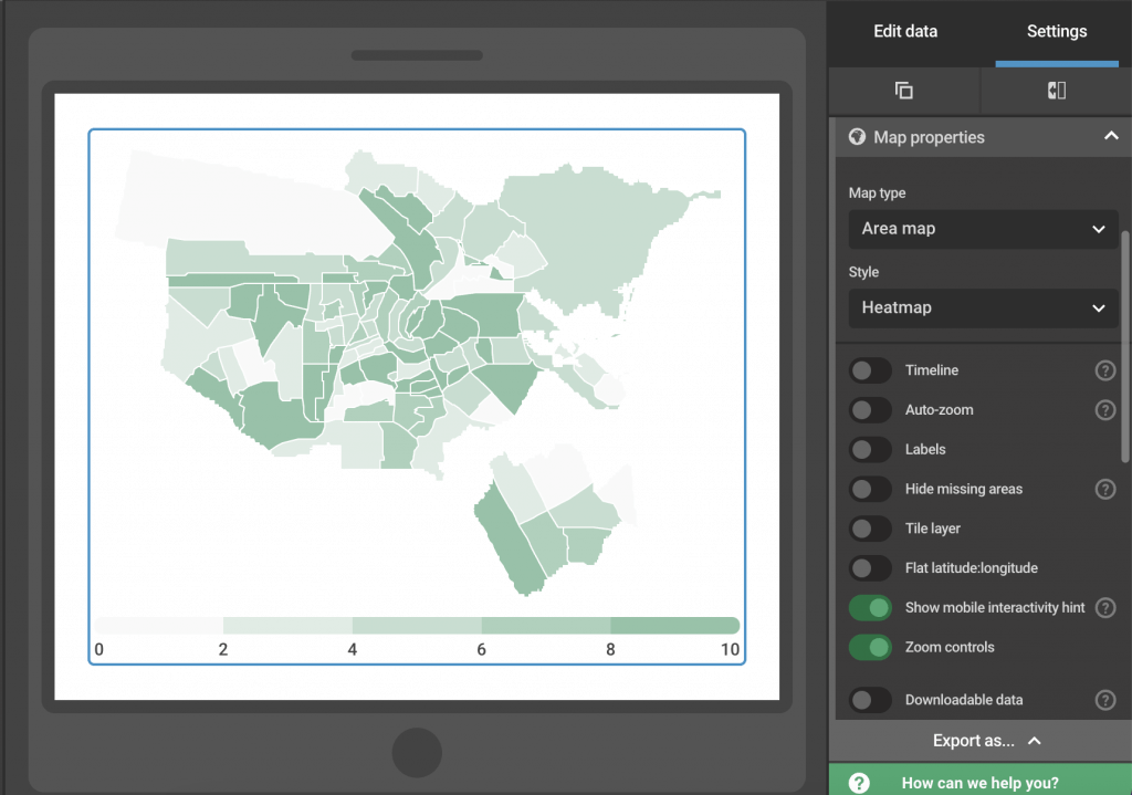
- Once you’re taken to the editor, you can start editing your map. For a choropleth map, you’ll need to choose the “area map” option under “map types” on your right-hand side.
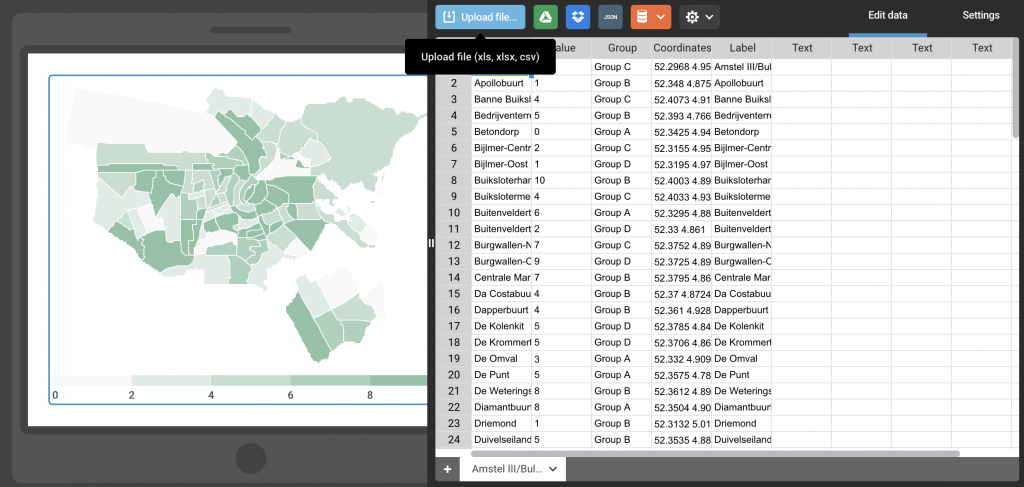
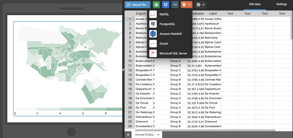
- Now you’ll want to import your dataset, and Infogram supports a variety of data formats, making this process easy for you.
- Once your data is imported, you can start editing your map even more, selecting your map style, colors, label display, and so much more!
Discover more information on how to create a map on Infogram.
Creating a map: Key functionalities
Whether you’re creating a choropleth map or any other type of map, Infogram offers a diverse set of functionalities that make this process easy and enjoyable.
Map customization
Infogram provides an extensive library of maps, allowing you to browse and select the geographic region you want to visualize. Whether it’s countries, states, or even custom regions, Infogram accommodates diverse mapping needs. You can customize the map’s appearance by choosing color schemes, adjusting boundaries, modifying labels, creating a timelapse, and more.
Data import and visualization
Infogram simplifies the process of importing data by supporting various formats such as Excel spreadsheets, Google Sheets, and CSV files. Users can easily link their datasets to the map, associating specific data values with corresponding regions. The platform’s intuitive data visualization tools allow users to assign colors to different data ranges, making sure information is communicated clearly.
Interactivity
We all know that Infogram excels in creating interactive visualizations, and choropleth maps are no exception. You can enhance your maps with interactive elements, allowing viewers to hover over regions for detailed information or click for additional insights. This dynamic feature engages audiences and provides a more immersive experience.
Real-time data updates
Infogram enables you to link your choropleth maps to live data sources. This functionality is particularly useful for situations where data is subject to frequent changes. The map can automatically update in real time, making sure that viewers always have access to the latest information.
Sharing and collaboration
Once the choropleth map is created, you can easily share it across various platforms or embed it on websites. Infogram supports collaboration, allowing multiple users to work on a project simultaneously. This feature is beneficial for teams working on data-driven projects.
Responsive design
Infogram’s choropleth maps are responsive, ensuring a consistent and engaging experience across different devices. Whether viewed on a desktop, tablet, or smartphone, the map maintains its visual appeal and functionality.
Ultimately, the combination of user-friendly design, customization options, and interactive features makes Infogram a powerful tool for individuals and teams looking to create interactive choropleth maps. Whether for educational purposes, presentations, or data-driven storytelling, Infogram provides the tools necessary to transform complex data into visually compelling narratives.
Diverse map types in Infogram
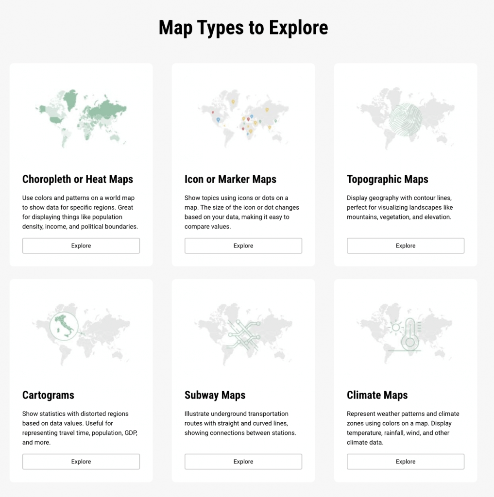
Infogram supports the creation of various map types beyond choropleth maps, including icon maps, heat maps, and bubble maps. This versatility allows users to choose the most suitable representation for their data, improving the effectiveness of data visualization.
Last thoughts on choropleth maps
When looking for a choropleth map definition or how to create one, we hope you’ll find this informative article useful. In essence, choropleth maps are valuable tools for visualizing and understanding spatial data. With Infogram’s intuitive interface and diverse map types, you can go beyond traditional static maps and create interactive visualizations that enhance data exploration and communication.
Whether you’re a researcher, educator, or business professional, using choropleth maps and interactive features in Infogram can elevate your data storytelling to new heights. Get started today and create a choropleth map to make your data shine!
Get data visualization tips every week:
New features, special offers, and exciting news about the world of data visualization.