20.12.2018 by Infogram
A beautiful visualization is the perfect blend of data, story, and design. But make no mistake – it isn’t easy to effectively combine emotion with cutting-edge technology. Sometimes you need a little inspiration. The works of art on this list are fun to look at and demonstrate how to push the boundaries of what’s possible.
Take some time out this holiday season to enjoy the best data visualizations of 2018:
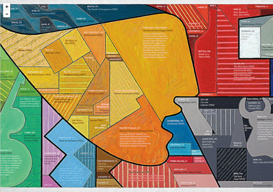
8,000 of Picasso’s Works
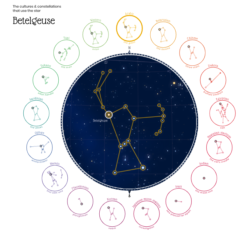
Figures in the Sky
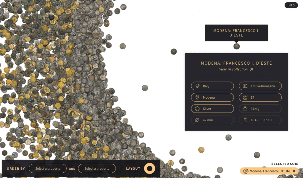
500,000 Coins at the Münzkabinett Berlin
By University of Applied Sciences Potsdam
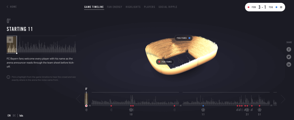
Reimagine the Game
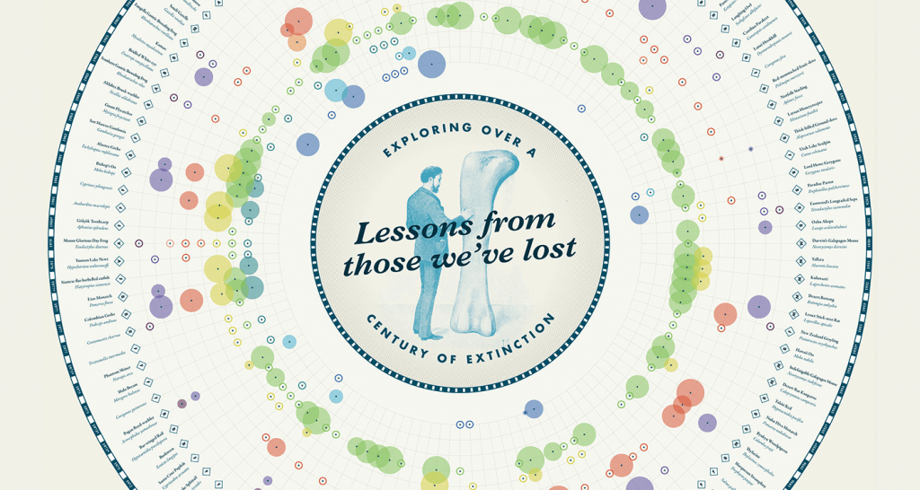
Lessons From Those We’ve Lost
By James Round
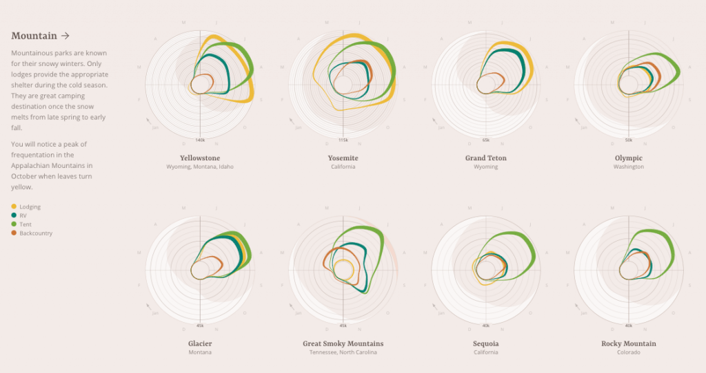
A Night Under the Stars at US National Parks
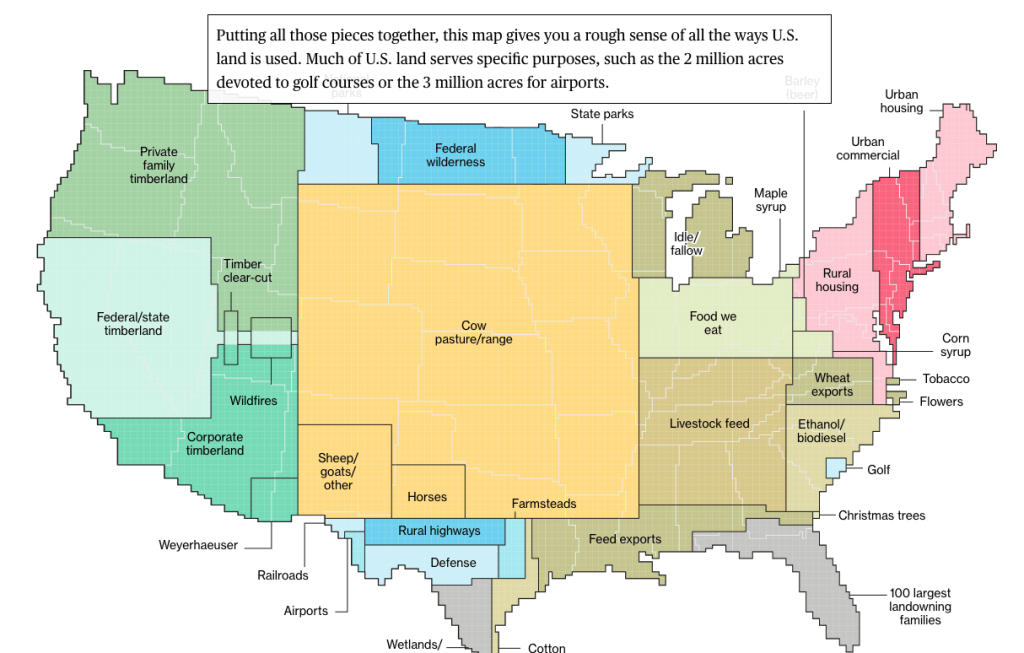
How America Uses Its Land
By Dave Merrill and Lauren Leatherby – Bloomberg
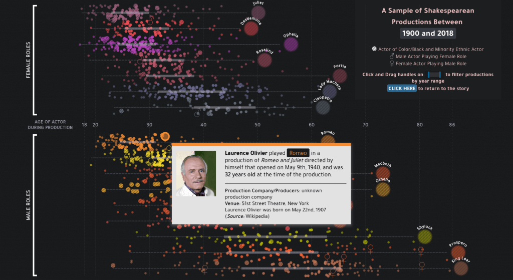
Casting Shakespeare
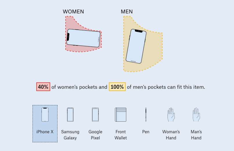
Women’s Pockets
By Jan Diehm + Amber Thomas – The Pudding
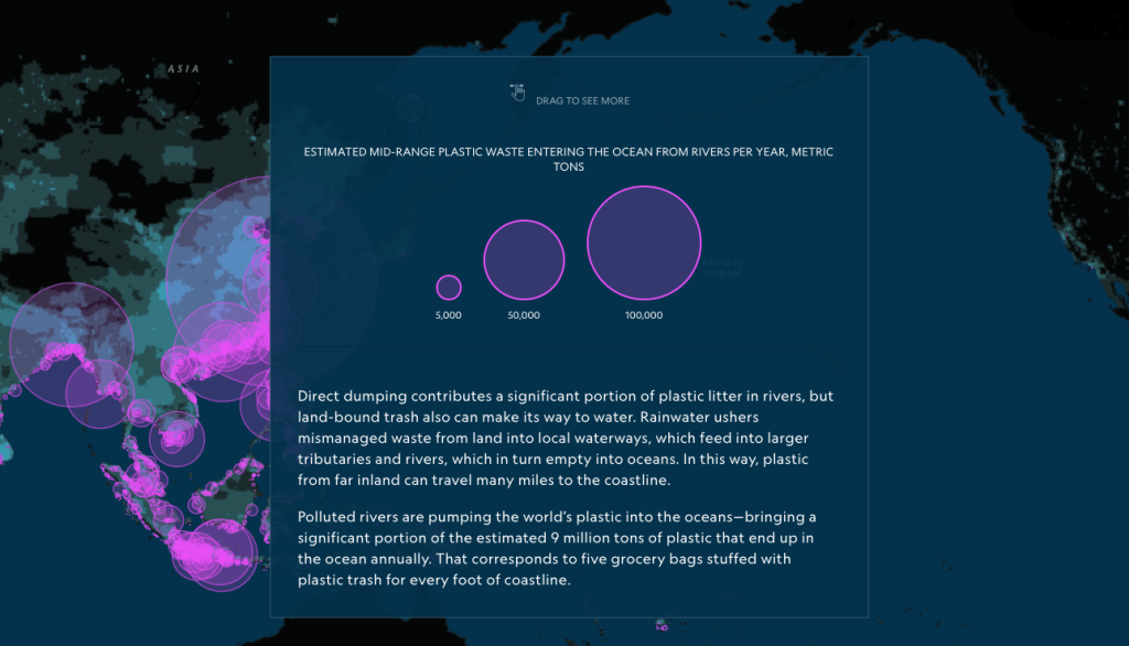
What Happens to the Plastic We Throw Out?
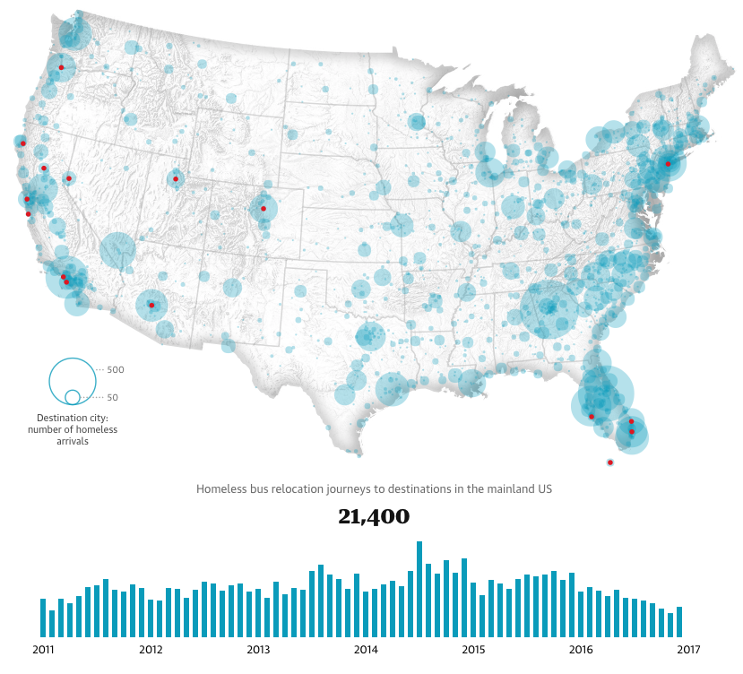
Bussed Out: How America Moves Its Homeless
By Nadieh Bremer – The Guardian
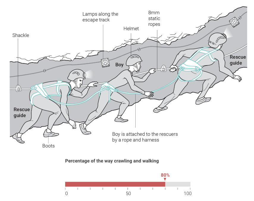
The Thai Cave Rescue Mission
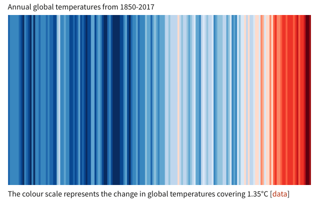
Climate Change: Warming Stripes
By Ed Hawkins – Climate Lab Book
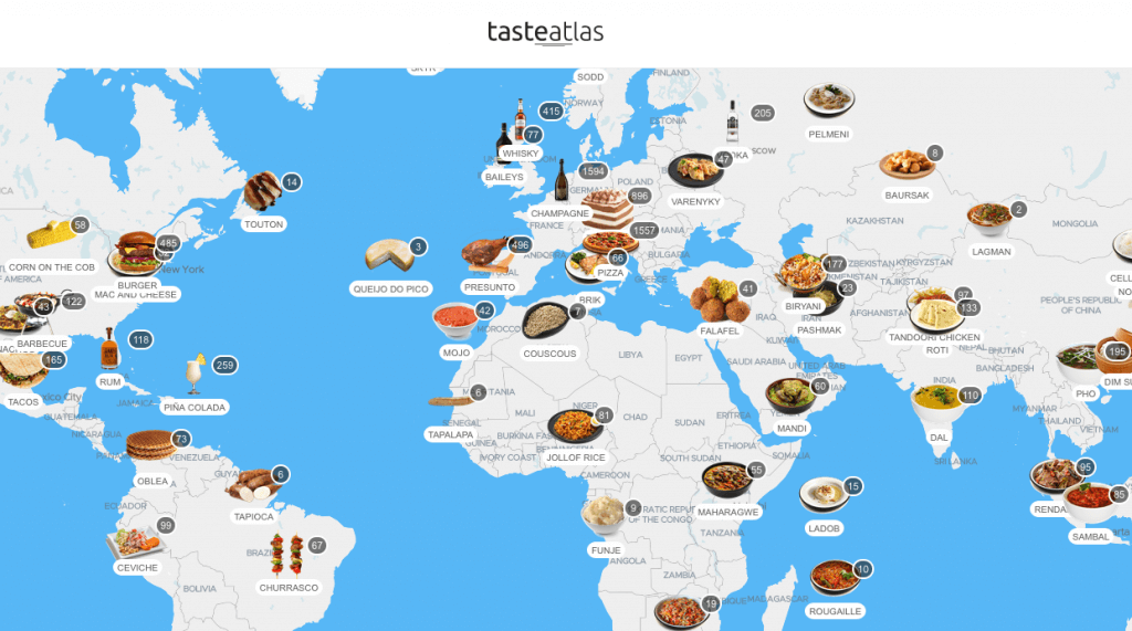
TasteAtlas
By TasteAtlas
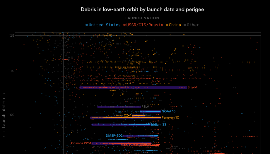
Space Debris
By Axios
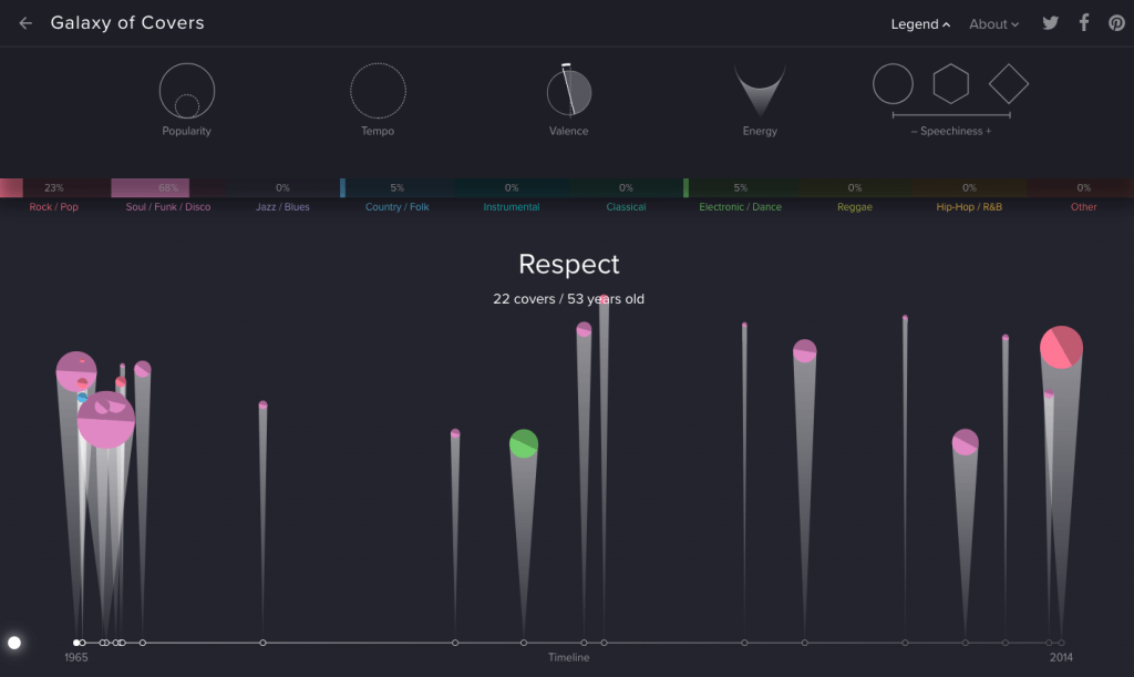
Galaxy of Covers
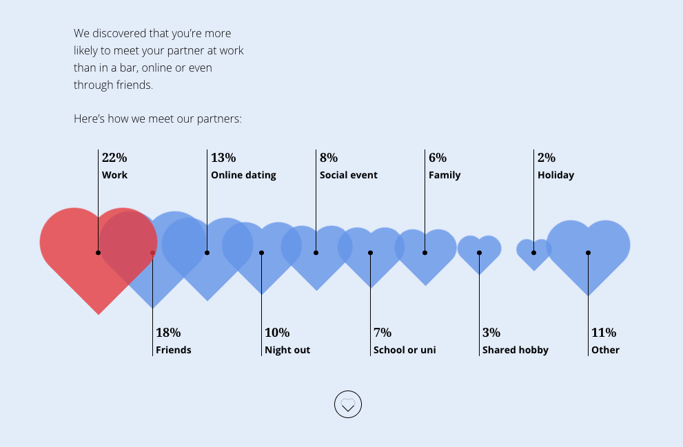
How Love Works
By Totaljobs
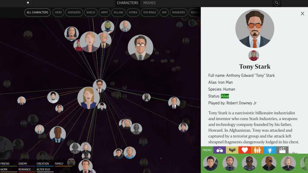
Who’s Who Guide to the Marvel Cinematic Universe
By Billy Ker, Chee Wei Xian, and Denise Chong – The Straits Times
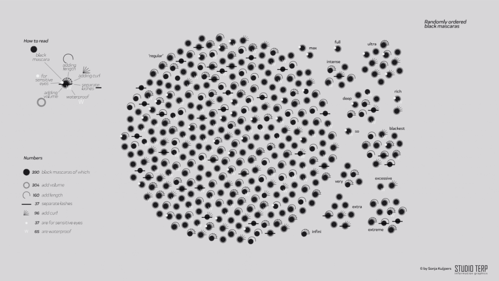
Searching for the ‘Correct’ Mascara
By Sonja Kuijpers – Studio Terp
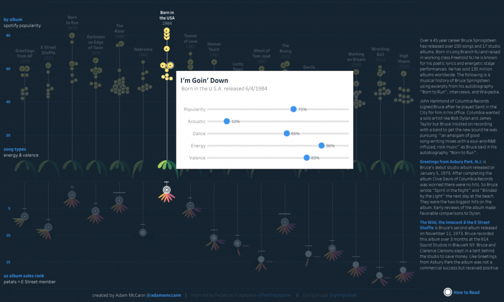
History of Bruce Springsteen
By Adam McCann
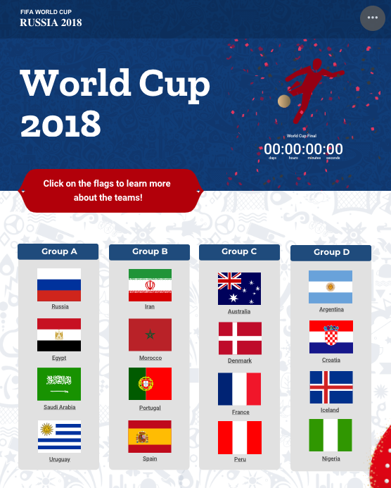
BONUS: The Ultimate World Cup Infographic
By Infogram
This year, we introduced scrolling animations, engagement analytics, real-time collaboration, powerful integrations, premium templates, and so much more. Keep up with us in 2019 and get a head start on your next visualization project.
Do you want to win your audience’s attention? Learn how visual storytelling can help you to create engaging images and powerful presentations.
Interested in discovering how Infogram can enhance your team’s work? Join a brief Zoom session with our Infogram representative to explore key features, get answers to your questions, and understand how we can assist. It’s quick, informative, and just like a coffee break chat. Schedule your call now!
Get data visualization tips every week:
New features, special offers, and exciting news about the world of data visualization.