17.02.2016 by Infogram
Data visualizations do a fantastic job of showing data in a clear and engaging way. If they are made correctly, that is. Unfortunately, there are many times charts and graphs are poorly crafted, leading to data visualizations that are misleading or downright deceptive.
We’ve selected four common mistakes that often lead to deceptive dataviz and offered solutions to fix them – with a little help from Infogram.
Truncated Y-axis
The truncated y-axis might be the biggest offender when it comes to bad or misleading charts. Not starting the y-axis at zero can create the impression of important change where there is relatively little change. While there are times this method is appropriate for illustrating small differences, it is often used to give the illusion of something bigger.
We have created two column charts to illustrate this point. The column chart on the left shows what happens when you truncate the y-axis and start above zero. The chart on the right is a corrected version that shows how little the data actually increases over time.
Misusing the Dual-Axis
Dual-axis charts can be tricky. They are used to compare two variables with different magnitudes and scales of measurement, in hopes of proving or disproving a trend. The problem is that dual-axis charts can alter the perception of the viewer, leading them to make the wrong conclusions.
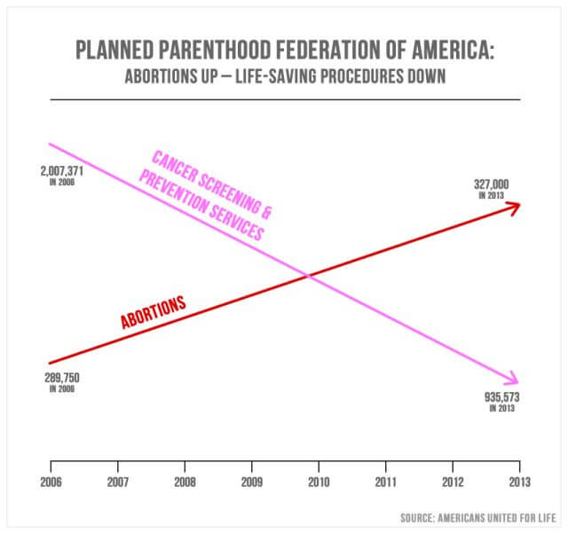
The dual-axis chart below, which was presented to the U.S. Congress in September 2015, is widely considered one of the most deceptive charts made last year for multiple reasons.

The problem with this chart is that it has no discernible y-axis, so the placement of the lines is arbitrary. The cancer screening line is scaled in the millions, while the abortion line is scaled in the hundreds of thousands. This chart makes it look like abortions have skyrocketed and cancer screenings have plummeted, which isn’t the case.
We decided to remake this as a line chart, with both data sets on the same scale. The number of cancer screenings and preventative services has clearly gone down, that’s for sure. But there are still many more of those procedures performed than abortions. Click here to learn more about how to properly use dual-axis charts.
Improper Scaling and Use of Illustrations
Our eyes are very sensitive to the volume and area of shapes on a chart. Our brains make instant assumptions about the data presented, without thinking about what the data actually says.
The chart below makes a few fatal mistakes. First, it uses illustrations instead of proper columns. This is distracting and hard to read. It also truncates the y-axis, as we mentioned above, which distorts the scale of the graph.

We decided to take this data and turn it into a proper column chart, with the appropriate scale. As you can see the change isn’t quite so dramatic. But, since the chart is trying to highlight Obama’s contribution, we chose to make that data a different color so it stands out. You still make the same point, without skewing the facts.
Side Note: We strongly discourage the use of 3D charts and graphs. They may confuse the viewer, misrepresent your data, and look unprofessional.
Comparing Pie Charts
Comparing pie charts that look fairly similar is just poor form. This practice can be misleading because people can’t accurately compare the area of circles. Our brains don’t easily compare angles the way we can quickly judge the length of bars on a column chart.
We took the exact same data sets and created two column charts instead. See how much easier it is to compare the bars instead of the pie charts above?
It’s time to put an end to charts and graphs that misrepresent data for good. Feel free to use these tips, along with our complete data visualization chart guide, to create your own charts today!
Get data visualization tips every week:
New features, special offers, and exciting news about the world of data visualization.