18.08.2015 by roberts
Finding the right chart to visualize your data is easier said than done. And having the correct data is important, especially if it complements a number-heavy story. Make it easy for the audience to understand and enjoy the data that you are showing them. It should not be a jigsaw puzzle where readers are trying figure out what the data is trying to convey.
Here are four data visualization mistakes that people often make, and how to avoid them. Click on each image to see the interactive version.
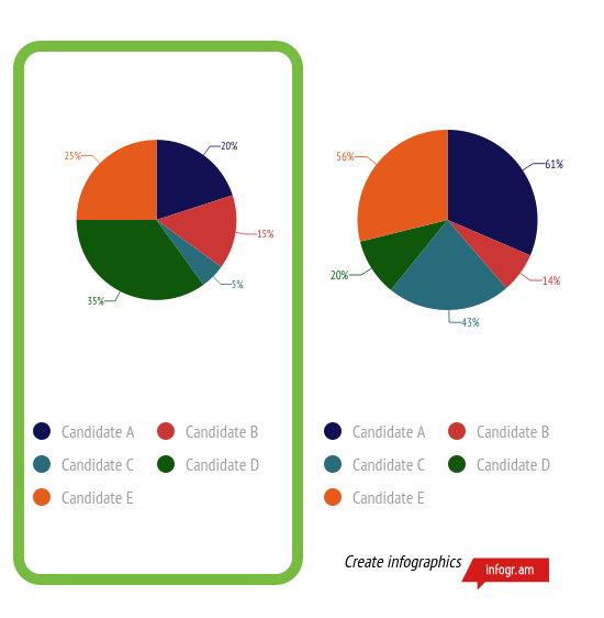
Math Doesn’t Add Up
When it comes to a pie graph, usually the entire pie equals 100%. Let’s say you have five candidates in the pie graph. You split up each candidate by the percentage of votes they are getting in an election. The total amount should equal to a hundred and not some other number that is larger or smaller. Double check the data that you have and your addition because it will be confusing to a reader to see that the entire graph does not equal to a 100.
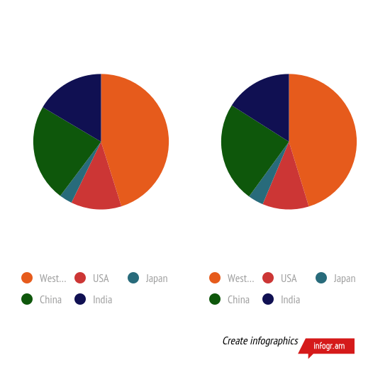
Comparison Looks Similar
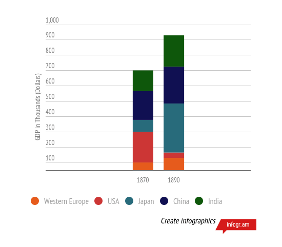
Stay away from a pie graph when comparing. If you are trying to show the readers that there is a major difference between two things during a certain time period, just use a bar chart. They can easily convey comparisons, and it’s better than having two graphs that look identical. The reader would be spending too much time trying to see what you are trying to compare, rather than be blown away by substantial differences in quantities.
Here’s the better version of a comparison:
 Too Much Going On
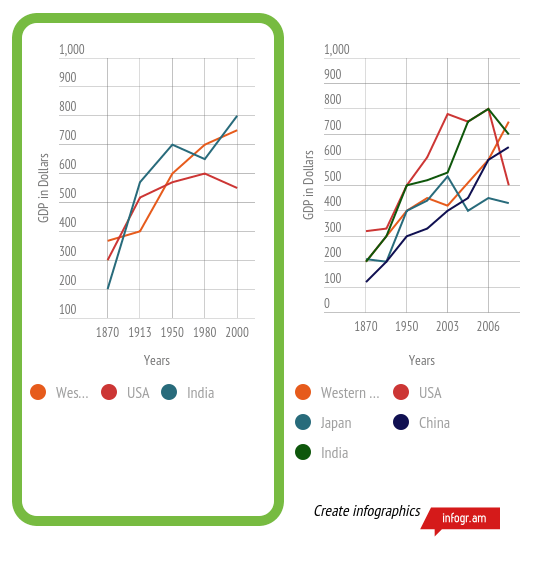
Sometimes the data you want to share might be too much. If you have too much going on, the reader will get lost in the data. When it comes to this showing data, simpler is better. You want your data to be just the right amount, but still have a strong impact. Your data visualization to be clear and concise.
 Forget to Label
Labeling the axis on a graph shows the audience what you are talking about. For example, if you are trying to show how much a small business has made in the span of five years, you want to make sure and label both years and dollars on both side of axises. If you do not have labels, it will be difficult to understand what you are trying to say.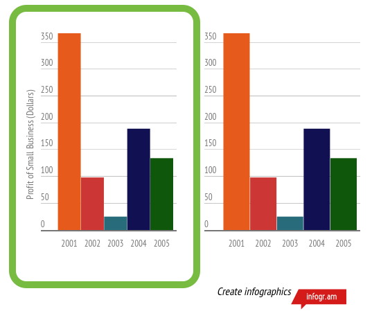
These mistakes can be easily fixed with some extra steps in creating your data visualization. Make sure that the data is clear to the reader and it complements the story correctly.
Share with us the worse charts you have found!
Would you like to experience the full power of data visualization? Try Infogram for Teams or Enterprise for free! With a Team or Enterprise account, you can create up to 10,000+ projects, collaborate with your team in real time, use our engagement analytics feature, and more. Request your free demo here.
Get data visualization tips every week:
New features, special offers, and exciting news about the world of data visualization.
