13.10.2020 by Infogram
(This article has been created by a guest writer)
There is a huge amount of data being generated every single moment at unbelievably rapid speeds across the world. The global annual rate of data production has been high over the last couple of years. In fact, the total amount of data created, captured, copied, and consumed in the world reached about 41 Zettabytes in 2019 compared to just two Zettabytes in 2010.
However, with all the data being created worldwide, it doesn’t provide the decision-makers with useful insights on its own. The data must be gathered and organized to make it easier to interpret and provide executives with meaningful value.
This is where the importance of data visualization steps in. It allows the company organizational executives to access and interpret real-time data to make informed decisions swiftly.
Bad data (data that is either inaccurate or incorrectly analyzed) has led to the downfall of many major businesses, costing them as much as 25% of their revenue at times. Luckily, it doesn’t have to turn out this way for your company. In most cases, getting the most out of analyzed data is understanding its visualization.
Data visualization tools and techniques are the holy grail for organizational leaders. It offers them new approaches to undertake if they want to grasp the essential bits hidden in their data.
What is data visualization?
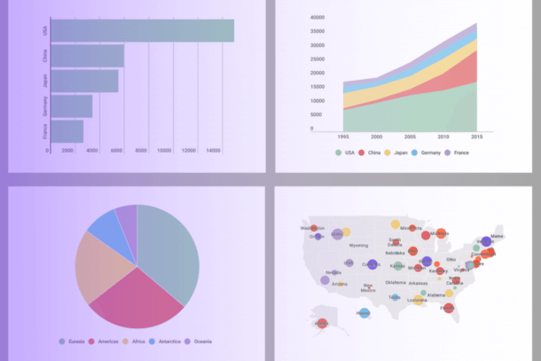
Data visualization is basically the use of visual elements used to portray the importance of data. It is an essential part of business analytics and can take the form of tables, charts, graphs, etc. Data visualization makes it possible for business executives and key decision-makers (more so those without a background in computer science or statistical analysis) to comprehend data much faster.
Interactive visualizations allow policymakers to drill down through the layers of the details, helping them make the right decisions. This also helps change the perspectives since the users can now review the facts behind the analysis.
Here are 7 key ways interactive data visualization impacts decision-making and changes in organizations:
1. Faster action
The human brain tends to process visual information faster than written reports. 93% of human communication is visual, meaning we process images 60,000 times faster than we do on the text. This means that it is unlikely that people would comprehend whenever you share complex data concepts using written words.
According to the Wharton School of Business, data visualization can shorten business meetings by up to 24%. Making swift decisions is a highly valued element for successful enterprises. Slowed decision-making is often blamed for inefficiencies in businesses and can sometimes even account for direct losses.
Timely action helps companies stay ahead of the competition at all times by averting losses and also by capitalizing on any unexpected market conditions.
2. It can reveal patterns and trends
Data visualization is crucial in the identification of patterns and trends. Being aware of any changes in the business spectrum is valuable to organizations that want to survive in the ever-changing market. These trends can be shown through data visualization, which spells out the difference between maximized gains and increased losses.
It would be right to point out that without knowing the current patterns and trends, businesses would be operating in the dark. It would be challenging for them to make their decisions based on hard facts, therefore they’d resort to assumptions. Using data visualization helps companies see untapped data, which can be used to find clarity through patterns and trends.
3. Quick access to relevant business insights
Visual data discovery helps businesses and organizations improve their ability to find the information they need whenever they need it. This helps them do so productively and better than other companies.
According to a recent study, businesses that use interactive data visualization tools are 28% more likely to find timely information than those that only rely on dashboards. Moreover, with the use of visual data discovery tools, about 48% of business users can find and analyze information without getting help from IT staff.
4. It is engaging and goes beyond traditional methods
One of the most obvious, transformative benefits of interactive data visualization is that it is engaging and transforms data into various visualizations. This is different from traditional data visualization methods such as spreadsheets, PowerPoint, etc.
The functions are more intuitive, and the users can easily adjust the data into their desired configurations. This aspect of interactive data visualization helps create a better attitude by the users for the use of analytics.
5. Understanding the connection between operations and results
Big data visualization enables the users to track the connection between operations of the business and its overall performance. Getting a correlation between business functions and results provides essential information in the competitive market.
By putting more focus on specific metrics, key decision-makers can identify the cause-and-effect relationships and timeframes that would have otherwise been overlooked.
6. Create new discussions
Big data visualization provides the means to tell stories from the data. Human beings are linear creatures, and data presented in a string of numbers doesn’t generally go well with the human linearity.
By interacting with data in a clear visual manner, there can be a possibility of a data-intensive story to come up, which becomes an easier way of sharing and interpreting the data. Good data visualization is created when communication and great design collide.
Here’s an insightful data visualization by UNICEF that’s sure to raise important questions:
7. Data visualization enhances communication and collaboration
Data visualization is a useful communication tool that brings both employees and decision-makers together in a much faster way, unlike the previous methods of reports and spreadsheets.
Effective communication and collaboration are crucial parts that determine the success of any company by improving the productivity and effectiveness of operations. Additionally, it also enhances the job satisfaction levels of employees, resulting in lower turnover rates.
The importance of interactive data visualization is growing
The role of big data has exponentially grown in affecting business decisions, hence the increasing need for interactive data visualization. Organizations can now drill into the true potential of their data quickly and effectively. And many businesses are already doing so – just take a look at these data visualization examples created by enterprises, non-profits, media professionals, and others worldwide.
So, do you also want to communicate data and complex ideas in a better way? Get your organization to harness the power of interactive data visualization today. Sign up or log in to Infogram to see the full impact of data visualization.

Lidia S. Hovhan is a part of the Content and Marketing team at OmnicoreAgency. She contributes articles about how to integrate digital marketing strategy with traditional marketing to help business owners to meet their online goals. You can find really professional insights in her writings.
Get data visualization tips every week:
New features, special offers, and exciting news about the world of data visualization.