29.12.2015 by Anete Ezera
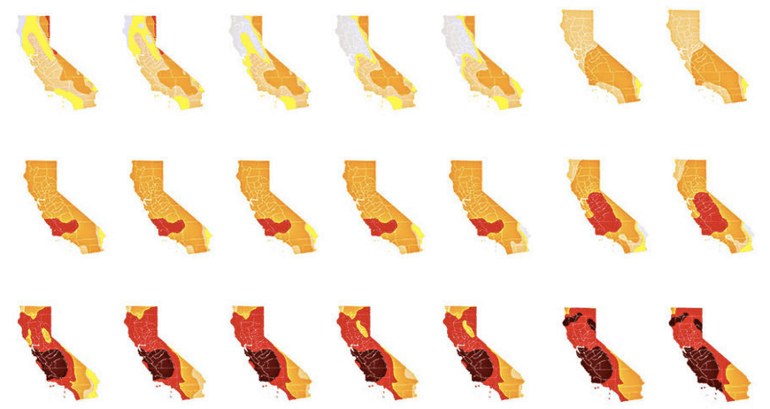
1) California Drought (LA Times)
Most of California is experiencing severe drought. The LA Times collected data from 50 different weather indicators to show how dry California has become since 2011. The contrast of yellow and red, plus the multitude of maps side by side, do a great job of showing the extreme effect the drought has had on the state – making it one of our best maps of 2015.
2) Spotify Play (Kyle McDonald)
Every second, a few people hit “play” on the same track at the same time using Spotify. This fast paced interactive map lets you see which songs are being selected and where on the globe in real-time. You can jump around or hit pause to enjoy the track yourself!

3) Refugees’ Benefits Around Europe (Euronews)
This educational map created with Infogram shows the rights and benefits of people seeking refugee status in Europe across the EU. Hover your mouse over the map to see what each country offers beyond the basics. It’s everything we love in a map: It’s beautiful, interactive, and topical.
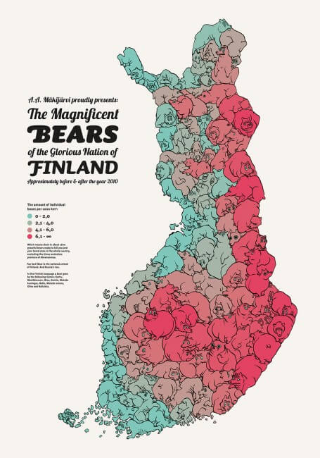
4) Bears of Finland (Annukka Makijarvi)
This map showing the distribution of bears in Finland is playful and creative. The simple color palette and fun illustrations make this map one of our favorites. The data is from 2010, but this image made the rounds online within the dataviz community this year. We hope you enjoy!
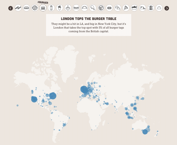
5) Instagram Food Capitals (Photo World)
We all know people love posting pictures of their food on Instagram. But, thanks to this crafty map, we now know where certain dishes are most popular around the globe as tagged on Instagram. Which snack is your city known for?
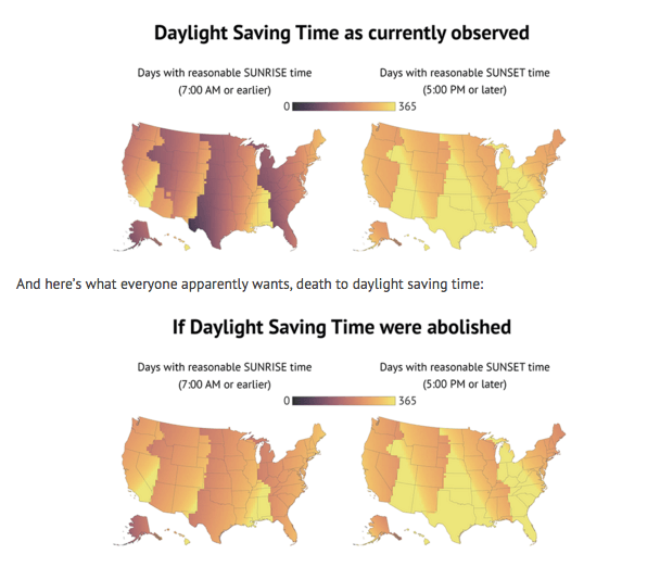
6) Daylight Savings (Keith Collins)
We love when cartographers and journalists use maps to educate and get a laugh. Andy Woodruff used these maps of the United States to show why daylight savings is actually the worst – based on ‘reasonable’ sunrise and sunset times.
7) The New New York Skyline (National Geographic)
Manhattan is in the midst of an unprecedented boom in tall buildings. This highly interactive article shows standard maps along with a moving map of the New York skyline to show the changes we can expect to see this year.

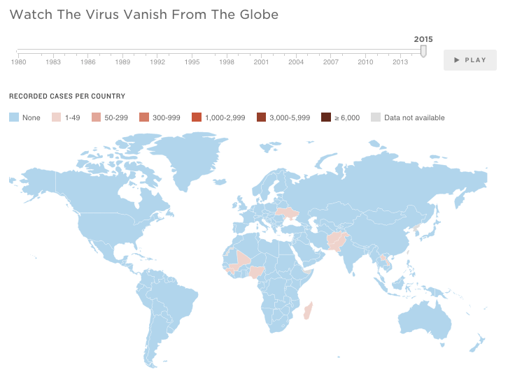
8) The End of Polio (NPR)
This map from NPR does an amazing job of visualizing the end of Polio. You can literally watch the virus vanish from the globe by sliding the bar left and right. Watch how the world switches from red to blue with the click of a mouse.
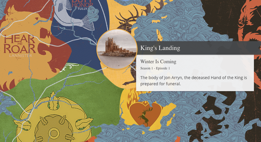
9) Game of Thrones (Direct TV)
Are you in love with the HBO series Game of Thrones? Then this incredible map is perfect for you! It allows you to pick any episode, and chronologically follow the characters and events that took place at every location featured in that episode. The beautiful illustrations and high level of interactivity make this map a joy to navigate.
Get data visualization tips every week:
New features, special offers, and exciting news about the world of data visualization.