28.10.2015 by roberts
When you think about bubble charts you probably imagine the interactive motion chart created by Swedish global health expert and data visionary Hans Rosling. The chart visualizes the wealth and the health of each country of the world over 200 years showing strong correlation between these two variables. After this famous TED talk in 2006 we started to see many good and bad examples of bubble charts in the Internet. Here’s a guide to help you correctly use this chart type in your content.
Visualizing the third dimension
Most of the commonly used charts are capable of visualizing one or two data dimensions. Bubble charts are capable of visualizing over 3 related dimensions of data.
Bar charts let you compare data in one dimension, for example, the number of cars sold in July.
Line charts compare data in two dimensions, like the number of cars sold each month over the last ten months.
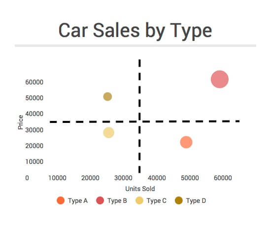
The next step would be to compare how car prices (y axis) correlate with units sold (x axis) and which combination results in a higher revenue. A bubble chart would do the job nicely by incorporating the third dimension into the size of the bubble.
You can even assign different colors to each car type to show, for example, that despite the fact that fewer units of premium cars get sold, the overall revenue they generate is higher. With animated motion charts you can go even further and display car sales trends over time.
When to use a bubble chart
Bubble charts can facilitate the understanding of social, economical, medical, and other scientific relationships. No wonder Rosling used it to explore how development factors impact health. In the same way, we can show if putting a higher price on cigarettes has prevented people from smoking and decreased the lung cancer cases per capita. Or we can find out what products a company should focus on, as we previously explained with the car sales example.
As you see static bubble charts are good for visualizing situations, patterns and correlations, but they can’t explain the why of the situation, and how it occurred. You should always provide some background information before presenting a bubble chart to explain the issue.
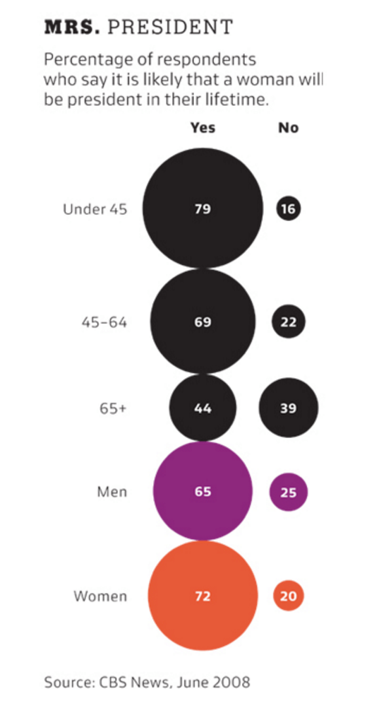
It might be tempting to use fun bubbles rather than boring bars, but there is nothing worse than using charts just because of how they look, like in this example explained by research scientist Robert Cosara:

The use of bubbles in this chart doesn’t add any additional information. There is no “third dimension” here to visualize. Furthermore the size of the bubbles is really hard to compare, thus making it hard to understand. A “boring” column chart would have done a much better job here.
We redid this example using Infogram. As you can see, we also split the categories into two groups, age and gender, taking advantage of the interactivity of Infogram’s charts. By doing this, we avoided mixing categories that are not necessarily mutually exclusive; a person could fall under the ‘Under 45’ bucket and also under the ‘Women’ bucket.
How to make bubble charts more readable
- Split them into imaginary quadrants
Bubble charts are powerful yet they require a certain level of data literacy. The most convenient way to “read” a bubble chart is to split it into imaginary quadrants. Let’s take the car sales example. If we split the chart into imaginary quadrants, we can tell which car type performs best.
Quadrant 1 – Expensive cars, low sales
Quadrant 2 – Expensive cars, high sales
Quadrant 3 – Cheap cars, high sales
Quadrant 4 – Cheap cars, low sales
Both the placement and the size of the bubble tells us that type B generates the most revenue.

- Keep bubbles transparent
Another good practice to follow is to keep bubbles transparent to make “hidden” bubbles visible and help detect the center of each circle. Luckily with Infogram you can’t go wrong as bubbles are made transparent by default.
- Less is more
Bubble charts allow you to compare more data, but the number of categories you can “map” on it is limited. Too many bubbles in one chart may look chaotic. Remember, less is more. Show only the categories that are indispensable for your story.
Summing up
Bubble charts are powerful yet prone to be used incorrectly. Please consider these pros and cons before choosing them:
Pros
- Allows readers to process large amounts of numeric information quickly
- Shows relationships between three or more variables
Cons
- Requires a data literate audience
- Having too many bubbles can make the chart hard to read, so the dataset size is limited.
Would you like to experience the full power of data visualization? Try Infogram for Teams or Enterprise for free! With a Team or Enterprise account, you can create up to 10,000+ projects, collaborate with your team in real time, use our engagement analytics feature, and more. Request your free demo here.
Get data visualization tips every week:
New features, special offers, and exciting news about the world of data visualization.