Create Interactive Bubble Charts

Create interactive bubble charts to identify patterns, correlations, and outliers.


4.7 out of 5 stars


Overview
Why
Examples
Reviews
Tips
FAQ
Present Complex Data Sets Effectively
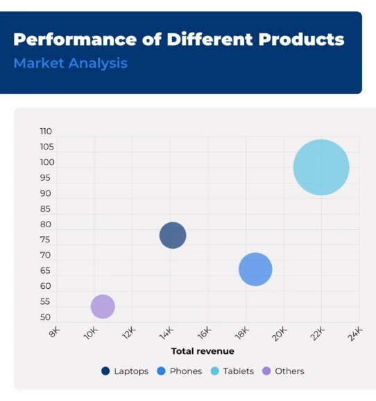
Bubble charts are a type of data visualization that displays data points as bubbles (or circles) on a two-dimensional graph. They are similar to scatter plots but add an additional dimension of information through the size of the bubbles.
In a bubble chart, the x and y axes represent different variables, such as time, categories, or numerical values. Each data point is represented by a bubble located at specific x and y coordinates. The size of the bubble represents a third variable, often a numerical value, providing an additional dimension of information. The larger the bubble, the higher the value associated with it.
Bubble charts are useful for visualizing and analyzing datasets with three variables. They allow you to identify patterns, correlations, and outliers within the data. They are often used in fields such as finance, economics, social sciences, and market research, where multiple variables need to be considered simultaneously.
Additionally, bubble charts can be enhanced by using different colors or shades to represent a fourth variable, adding even more information to the visualization. Overall, bubble charts provide a visually appealing and intuitive way to present complex data sets and explore relationships between multiple variables in a single graph.
Explore Why Bubble Charts Are Useful
Explore the power of visual storytelling and understand why bubble charts are a must-have.

Detect Outliers
Bubble charts are effective in identifying outliers, which are data points that significantly deviate from the norm. By examining the size and positioning of bubbles, you can quickly identify unusual or exceptional data points.
For instance, if you are analyzing a dataset of company profits, a bubble that stands out as significantly larger or smaller than the others might indicate a particularly successful or struggling company worth investigating further.

Examine Correlations
Bubble charts allow you to analyze correlations between variables. By observing the positioning of bubbles relative to the x and y axes, you can identify patterns and relationships.
For example, if you are examining the relationship between advertising expenditure (x-axis) and sales revenue (y-axis) for various products, you can assess whether increased advertising spending correlates with higher sales by observing how the bubbles cluster or disperse on the chart.

Visualize Magnitude
The size of the bubbles in a bubble chart provides a visual representation of the magnitude or weight of a specific variable.
For instance, if you are comparing sales data for different products across regions, the larger bubbles indicate higher sales figures, while smaller bubbles represent lower sales. This makes it easy to understand the relative scale of the data points at a glance.
Customer Reviews
Here is what our customers have to say about us.


2022 Summer & Fall and 2023 Winter leader in Data Visualisation Software 4.7 out of 5 stars
See reviews on G2 ›Empowering 30,000+ Companies Worldwide
From startups to established enterprises, our platform has been embraced by a diverse range of businesses seeking to captivate audiences and simplify complex data. Here are just a few examples of the 30,000+ companies that use Infogram.


Learn More Practical Tips
Marketing
Brand storytelling: 4 brand story examples to inspire you
Business
Best Ways to Visualize and Analyze Polling Data
Marketing
5 tips on writing online articles that people actually want to read
Marketing
3 Unique Ways to Optimize Your Landing Pages with Charts
Business
Best Ways to Visualize and Analyze Polling Data
Data
How to choose the right chart for your data?
Frequently Asked Questions
Where to use interactive bubble charts?
This type of chart is often used in business to compare and visualize relationships between specific projects. They can also demonstrate investment alternatives across various dimensions, such as cost, value, and risk.
Bubble charts can improve understanding of social, economic, and other scientific relationships. For instance, by plotting the effects of increased cigarette prices, one can assess whether it has deterred people from smoking and led to a decrease in lung cancer cases per capita. A bubble chart can easily and effectively convey that data story.
Overall, bubble charts are effective for visualizing situations, patterns, and correlations, but they cannot explain the reasons behind a situation or how it occurred. Bubble charts are ideal for conveying limited data points and should not be used when there is a large amount of data to present.
What are the best practices for creating bubble charts?
- Bubble charts enable you to compare more data, but the number of categories you can 'map' on it is limited. Too many bubbles in one chart may look chaotic. Remember, less is more. Show only the categories that are important.
- Enhance chart readability by keeping bubbles transparent, making 'hidden' bubbles visible and aiding in the detection of the center of each circle.
- Ensure that the sizes of the circles are drawn based on the circle’s area, not its radius or diameter. Not only will this method accurately represent the data, but it also avoids misinterpretations.
For a visual guide on creating effective bubble charts, you can watch the video tutorial here: https://youtu.be/bwQfdABJTCE
What are different types of bubble charts?
- Basic bubble chart. The basic bubble chart represents data points with bubbles on a two-dimensional graph. The x and y axes represent two variables, while the size of the bubbles represents a third variable. This type of bubble chart is suitable for visualizing relationships and patterns among three variables.
- Bubble map. A bubble map is a type of bubble chart that uses geographical regions or locations as the backdrop. Bubbles are placed on the map based on their corresponding coordinates or regions. This chart is helpful for visualizing data related to specific geographic areas, such as population density, economic indicators, or sales distribution across regions.
- Bubble matrix. In a bubble matrix chart, bubbles are arranged in a grid or matrix format, with two variables represented by the x and y axes. The size of the bubbles still represents a third variable. This chart is useful for comparing data points across different categories or dimensions. For example, it can be used to compare the market share of products across different regions or the performance of different teams across multiple metrics.
- Multi-series bubble chart. A multi-series bubble chart allows you to plot multiple sets of data points using different bubble colors or shapes. This chart enables you to compare and contrast multiple variables or datasets in a single visualization. It's useful for analyzing trends, similarities, and differences across different categories or time periods.
- Bubble heatmap. A bubble heatmap combines the concept of a heatmap with a bubble chart. Instead of using a uniform grid, the heatmap is represented by a set of bubbles of varying sizes and colors. The size of the bubbles indicates the magnitude of a variable, while the color intensity represents the intensity or value range of another variable. This chart is beneficial for visualizing two continuous variables simultaneously and identifying areas of high or low concentration.
These are just a few examples of different types of bubble charts. The choice of the chart type depends on the specific data you want to represent, the relationships you want to highlight, and the insights you aim to communicate.
How to create a bubble chart?
You can make a bubble chart in 5 easy steps:
- Join Infogram to make your own bubble chart design.
- Select the bubble chart.
- Upload or paste your data.
- Customize colors, fonts, and labels.
- Download your bubble chart or embed on your website.
What kind of integration is Infogram providing to create live-updating charts and maps?
With Infogram, you can create dynamic charts and maps that update live and in real time. We support two integrations for live updates:
- Google Sheets
- JSON feeds
As soon as the data changes in the Google Sheet or JSON file, the chart or map it is linked to will automatically update, even when embedded.
Note: Infogram doesn't support formulas, only raw data. If you use formulas or other scripts in your Google sheet, the calculations may not show on Infogram after the import.
How do I create a live-updating chart or map via a JSON feed?
- Add a chart or map to your project canvas by clicking the Add chart or Add map buttons in the left side panel.
- Double-click the chart to open its editor. Above the data table, you will see data import buttons. Choose the Add JSON feed option.
- Now, when you edit the information in your JSON feed, it will automatically update in your Infogram chart. The chart refreshes data every 30 seconds to a minute. These changes will automatically apply to your embeds and shared URL link.
Didn't find the answer? Check our FAQs

Try Infogram Now
Are you ready to unleash the power of data visualization? Get started with Infogram today and create stunning, interactive content that captivates your audience. Elevate your projects and bring data to life.


