29.05.2025 by Infogram
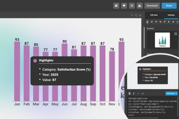
We’re excited to share that Infogram’s popular custom tooltip feature has now been extended to support a broader range of chart types. Initially available only for line charts, this much-requested feature is now compatible with grouped and stacked column and bar charts, 100% stacked charts, pie charts, and standard bar and column charts.
As part of our June product update, the list of supported chart types has grown even further. Custom tooltips are now also available for treemap, grouped line & line, slope chart, line with error margin, population pyramid, grouped column & line, stacked column & line, doughnut, semi-pie, irregular pie, and bar radial charts.
With custom tooltips, you can display detailed information when users hover over a chart, making your visuals cleaner, more interactive, and easier to understand. Whether you’re working on reports, dashboards, infographics, or slides, you now have more flexibility to tell rich, data-driven stories.
What You Can Do with Tooltip Customization
Custom tooltips give you plenty of ways to make your charts stand out:
- Add extra context. Include text to explain trends, insights, or key points.
- Show additional data points. Display X-axis labels, categories, or related metrics for deeper insights.
- Format with bold and italics. Highlight details for better readability.
- Add line breaks. Organize text into readable sections.
- Insert horizontal lines. Separate content for clearer structure.
- Build lists. Use bullet points or numbered steps to group details.
- Show source information. Embed data sources or references directly in the tooltip.
- Create colored headers. Use color to guide attention or categorize information.
- Use emojis for emphasis. Make data storytelling more engaging.
- Customize with HTML. Fine-tune appearance to match your brand or creative vision.
Why Custom Tooltips Matter
Custom tooltips let you surface the right information at the right moment – exactly where your audience is looking. Whether you’re visualizing survey results, demographic breakdowns, or financial KPIs, this feature helps you go beyond the basics.
- For researchers and writers, that means adding definitions, notes, or sources directly in the tooltip, without needing cluttered footnotes.
- Designers can style tooltips to match the brand, creating more polished and cohesive visuals.
- And analysts and managers can use tooltips to quickly highlight takeaways, trends, or metrics for faster decision-making.
Examples of tooltips in use. Hover over a data point to see the tooltip.
Ready to make your charts more interactive? With custom tooltips now working across more chart types, you can share data in a clearer, more creative way. Whether you’re putting together a quarterly business review or designing an interactive infographic, this update helps your data stories hit home.
Try the feature today! Log in to Infogram and start adding custom tooltips to your charts.
Get data visualization tips every week:
New features, special offers, and exciting news about the world of data visualization.