Create Interactive Treemaps in Minutes
Identify patterns and spot trends with interactive treemaps.


4.7 out of 5 stars


Overview
Why
Types
Examples
Reviews
Tips
FAQ
Identify Patterns and Spot Trends with Treemaps
Creating engaging reports, dashboards, or infographics can be a daunting task, especially when the data is complex or hierarchical. Many of us struggle to present layered information in a clear, concise way that highlights relationships without overwhelming the audience. Infogram tackles this challenge head-on by turning complex datasets into visually intuitive layouts using treemaps.
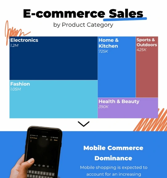
Treemaps are essential for visualizing hierarchical data, allowing you to explore the relationships between categories and subcategories within a dataset. With treemaps, entire datasets can be represented through nested rectangles, where each rectangle’s size and color reflect the significance or value of its category. This makes it easier for viewers to instantly identify patterns, spot trends, and understand the data structure.
For content writers, journalists, and analysts, treemaps can clarify intricate stories hidden within the data. Marketers, sales teams, and consultants can leverage treemaps to display financial data, product hierarchies, or market segments in a way that’s both insightful and easy to digest. Educators can use treemaps to help students better understand complex topics, while government employees and researchers can communicate insights that drive better decision-making.
Infogram's treemaps stand out with their interactivity, making it possible for audiences to explore data by hovering over sections and diving deeper into details. Unlike other tools, Infogram’s user-friendly platform simplifies the design process, allowing even non-designers to create polished, professional treemaps in minutes.
Interested in bringing your data stories to life? Dive into the power of interactive treemaps and see how Infogram can transform your next project.
Explore Why Treemaps Are Useful
Discover the benefits of treemaps for visualizing data.

Represent Hierarchical Data
Treemaps are highly effective for visualizing hierarchical data, such as organizational structures, file systems, or product categories. By arranging data into nested rectangles, treemaps allow you to see the relationships between main categories and their subcategories at a glance. This layout makes it easy to understand the overall structure and see how individual elements fit within larger groups.
Treemaps are particularly useful for breaking down complex hierarchies in a simple, intuitive format. Whether you’re visualizing company departments, categorizing products, or organizing project components, treemaps provide a clear, visual representation of data relationships.

Efficient Space Utilization
One of the major advantages of treemaps is their efficient use of space. By filling the entire visualization area with rectangles that represent different data points, treemaps can display large datasets in a compact format. Each rectangle's size is proportional to a specific attribute, such as revenue, quantity, or another measurable value.
This design allows you to represent a vast amount of data within a limited space, making it easier for viewers to understand without feeling overwhelmed. When screen real estate is limited, treemaps offer an excellent way to present data in a visually comprehensive and organized manner, helping you communicate information effectively even with space constraints.

Identifying Patterns and Outliers
Treemaps are great for identifying patterns and outliers within data groups. By grouping related categories together in a structured layout, treemaps enable you to quickly spot areas of interest, such as trends, anomalies, or significant variances. For instance, if you’re analyzing a financial portfolio, a treemap can help you see which asset classes are overperforming or underperforming at a glance.
The relative sizes and positions of the rectangles make it easy to recognize which categories dominate or lag behind. This visual grouping facilitates faster insights, allowing you to pinpoint potential issues or opportunities in your data and take targeted actions based on those findings.

Incorporate Color Encoding
Treemaps often incorporate color to convey additional layers of information, such as performance metrics, categories, or hierarchical levels. By applying different colors to rectangles based on specific values, you can add an extra dimension to the visualization, making it easier to differentiate between data points or highlight important details.
For example, you could use color to represent sales performance, customer satisfaction levels, or risk factors within a dataset. This color coding helps guide the viewer’s eye to key areas, providing a more nuanced understanding of the data.
Treemap Types to Explore

Area or Region Treemaps
When comparing different groups feels complicated, area treemaps use rectangle sizes to make it easier to see how groups stack up and explore details interactively.

Population Treemaps
For a quick look at where people live or how many there are, these treemaps use rectangle sizes to show population levels and patterns across different areas.

Category Treemaps
When you need to look at different groups in data, these treemaps use colors or patterns to separate categories, making it simple to see how they relate.

Yearly Treemaps
When it’s important to track changes over time, yearly treemaps show data by year or period, helping you spot patterns and changes over time.
Customer Reviews
Here is what our customers have to say about us.


2022 Summer & Fall and 2023 Winter leader in Data Visualisation Software 4.7 out of 5 stars
See reviews on G2 ›Empowering 30,000+ Companies Worldwide
From startups to established enterprises, our platform has been embraced by a diverse range of businesses seeking to captivate audiences and simplify complex data. Here are just a few examples of the 30,000+ companies that use Infogram.


Learn More Practical Tips
Marketing
Brand storytelling: 4 brand story examples to inspire you
Business
Best Ways to Visualize and Analyze Polling Data
Data
How to choose the right chart for your data?
Data
The complete guide to different types of charts
Media
From data to story: Data journalism definition & examples
Data
AI for charts: Get AI-powered suggestions for the best chart type
Frequently Asked Questions
How does Infogram make interactive maps easy to create?
Infogram’s 800+ maps and simple tools let you build dynamic maps quickly. A data journalist can create a clickable election map, while a market researcher can plot customer locations, all without design skills. Import data from spreadsheets or PDFs, and add features like tooltips or animations. It’s fast, intuitive, and needs no coding.
How do I create a live-updating chart or map via a JSON feed?
- Add a chart or map to your project canvas by clicking the Add chart or Add map buttons in the left side panel.
- Double-click the chart to open its editor. Above the data table, you will see data import buttons. Choose the Add JSON feed option.
- Now, when you edit the information in your JSON feed, it will automatically update in your Infogram chart. The chart refreshes data every 30 seconds to a minute. These changes will automatically apply to your embeds and shared URL link.
Where to use an interactive treemap?
Treemaps essentially show parts of a whole, and how everything is divided. They display hierarchical information as a cluster of rectangles varying in size and color, depending on their data value. The size of each rectangle represents a quantity, while the color can represent a number value or a category. Simultaneously, they also show how data is organized. Treemaps are best used when there is a large amount of data to share. Global populations organized by countries or statewide voting records organized by county would greatly benefit from a treemap. If the data is very balanced, a treemap is not recommended; it works best with more varied data points. It’s recommended to use an interactive treemap when there are more than two or three levels of organization to display.
How do I create a treemap chart?
You can make a treemap chart in 5 easy steps:
- Join Infogram to make your own treemap design.
- Select the treemap chart type.
- Upload or paste your data.
- Customize the colors, fonts, and labels.
- Download your chart, embed it on your website, or share it directly on social media platforms. You can also export it as a PDF, PNG, or JPG for presentations, or create a link for live updates.
How do I create charts in minutes?
This video will get you on your way to creating awesome charts, reports, maps, and infographics! https://youtu.be/5P5dVD_nozI
What are some best practices for creating treemaps?
- Label each region appropriately with text or numbers.
- Use bright, contrasting colors, so each region is easily defined.
- Avoid labeling every box if you have a lot of data.
- Don’t clutter your treemap with too many boxes – treemaps can contain any number of boxes, but space is limited! You don’t want your treemap to be hard to read.
What kind of integration does Infogram provide to create live-updating charts and maps?
With Infogram, you can create dynamic charts and maps that update live and in real time. We support two integrations for live updates:
- Google Sheets
- JSON feeds
As soon as the data changes in the Google Sheet or JSON file, the chart or map it’s linked to will automatically update, even when embedded.
Note: Infogram doesn't support formulas, only raw data. If you use formulas or other scripts in your Google sheet, the calculations may not show on Infogram after the import.
How do I create a live-updating chart or map via Google sheets?
- In a project, click the Add chart (or Add map) button on the left side panel and choose the chart type that best fits the information you want to display. If you’re not sure which one to pick, try adding any chart type to your project and double-click it to review the example data. Use this data layout in the Google sheet you want to import into a chart.
Tip: Most Infogram charts can only display numeric data (line, column, bar, pie, bubble charts, etc.). However, some are designed to display textual information as well (word cloud, treemap). If your data source contains some columns with numbers and some with text, you’ll need to:
- separate textual ones and visualize them in a separate text-based chart or
- import the data into a table chart that supports numbers + text inside one chart.
- Double-click the chart to open its editor. Above the data table, you’ll see data import buttons. Choose to Add a Google Drive document.
- Connect your Google Drive account. All Google sheets will be displayed in the list.
- Choose the spreadsheet with the data you need from your Google Drive.
- When you edit information in your Google sheet, it’ll automatically update in your Infogram chart. The chart refreshes data every 30 seconds to a minute. These changes will automatically apply to your embeds and shared URL link.
- Pro tip: You can remove the Google Drive and Infogram integration via the Google account settings. When you do, existing live-updating charts will lose their connection.
Note: When changing the order of tabs in a Google sheet, the tabs will not automatically shift in your Infogram project. Each data tab of your Infogram project draws information from the numerically corresponding tab in the Google sheet, therefore you have to manually rename the tabs in your Infogram chart.
Didn't find the answer? Check our FAQs

Try Infogram Now
Are you ready to unleash the power of data visualization? Get started with Infogram today and create stunning, interactive content that captivates your audience. Elevate your projects and bring data to life.


