22.09.2022 by Infogram
Illustrating a country’s population or a change in population over time is best done with a population pyramid.
Population pyramids, also known as age structure diagrams, are great for visualizing a population in a country, city, region, or time period. An age structure diagram visualizes two variables, age and gender, so you can analyze the population based on these two variables. This population pyramid illustrates the distribution of ages amongst males and females. Since the pyramid is divided in half at the center between the genders, you can easily compare the variables side by side.
To note: the oldest age groups are at the top while the youngest are at the bottom. Learn more about creating population pyramids with Infogram.
Creating a population pyramid doesn’t seem too difficult. After all, you just need qualitative data and common knowledge about population pyramids. However, there are a couple of dos and don’ts that strongly influence how your population pyramid will look and how comprehensively you’ll be able to explore it.
To make sure your age structure diagram is on point, discover what to do and what not to do when creating a population pyramid.
Click to jump ahead:
#1 Choose contrasting colors
#2 Define the values of numbers
#3 Check your sources
#4 Add interactive elements
#5 Recognize limitations
#1 Choose contrasting colors
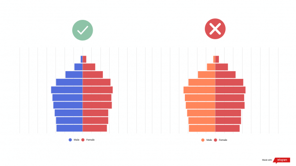
In a population pyramid, the male population is placed on the left, and the female population is on the right. Since you’ll compare the two sides, choose contrasting colors for female and male bars.
If you choose similar colors, it will be difficult for the viewer to compare the two sides and make conclusions about the visible differences. In the population pyramid example below, you can see the difference the color scheme makes.
When creating a population pyramid on Infogram, you’ll see that there are pre-set default colors. Use those or simply change the colors under the color section in the chart settings. You can also change the colors in the editing area of the chart.
#2 Define the values of numbers
In a population pyramid, the population numbers you see at the bottom of the chart can either be absolute numbers or percentages of the population. Make sure to choose the option that works best for your chart.
Also, remember to stay consistent. If you’re comparing different populations, choose either absolute numbers or percentages for both of them. As a result, you’ll be able to better compare the populations and draw conclusions.
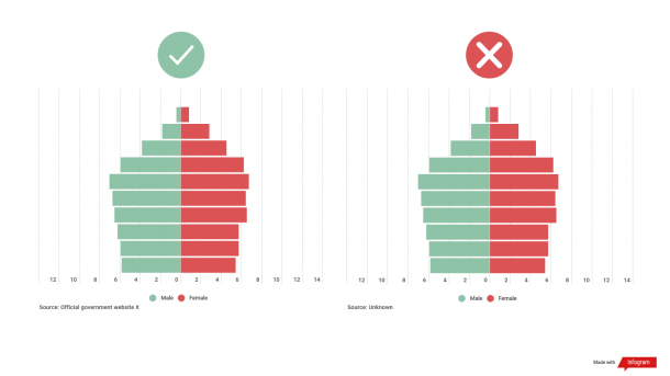
#3 Check your sources
As with any data source, remember to cite it in the caption area or elsewhere next to the chart. Also, use credible and trustworthy sources, especially if you’re sharing your population pyramid with others. The last thing you want is confusing or contradictory data that doesn’t represent a real-life situation.
On that note, use topical data if you’re trying to illustrate the current population in a country or region. According to the International Labour Organization, in most countries, information about the population is collected every 10 years at a minimum, so your data source shouldn’t be older than 10 years to assess the current situation properly.
#4 Add interactive elements
To make a population pyramid more visually appealing, hide the values under chart properties on Infogram. The values will appear as the viewer hovers over the bars in the chart. This feature will make the data discovery process more engaging for viewers and declutter the bar chart.
You can also add other interactive elements, such as animations, transitions, and more. As a result, your data visualization will become more engaging to view.
#5 Recognize limitations
The population pyramid is great for recognizing apparent trends in different populations. For example, you can determine if a population is expansive, constrictive, or stationary, depending on the shape of the pyramid. Read more about population pyramid types you can make with Infogram[link to population pyramid landing page].
However, there are limitations to a population pyramid where you’ll need additional information to properly assess and analyze the causes and effects of a specific population.
For example, you’re trying to understand why the upper half of the pyramid shows rapidly declining numbers. In this case, there are multiple possible causes you might not be able to figure out just by looking at the pyramid. High mortality or migration rates are both possible reasons, and you’ll need more data to conclude which one justifies the trend.
Population pyramids allow you to visualize current and historical populations and compare genders. With the use of population pyramids, you can illustrate trends in a format that’s easy to understand. You can use the age structure diagram for sales, marketing, and other purposes, but to make the most of your population pyramid, make sure that you follow the dos and don’ts we covered in this article.
Recap:
- Make your age structure diagram easily to digest with contrasting colors and defined value
- Create a visually appealing pyramid with interactive elements
- Comprise your diagram of qualitative data from reputable sources
Start creating your first population pyramid with one of our templates.
Interested in discovering how Infogram can enhance your team’s work? Join a brief Zoom session with our Infogram representative to explore key features, get answers to your questions, and understand how we can assist. It’s quick, informative, and just like a coffee break chat. Schedule your call now!
Get data visualization tips every week:
New features, special offers, and exciting news about the world of data visualization.