05.12.2023 by Infogram
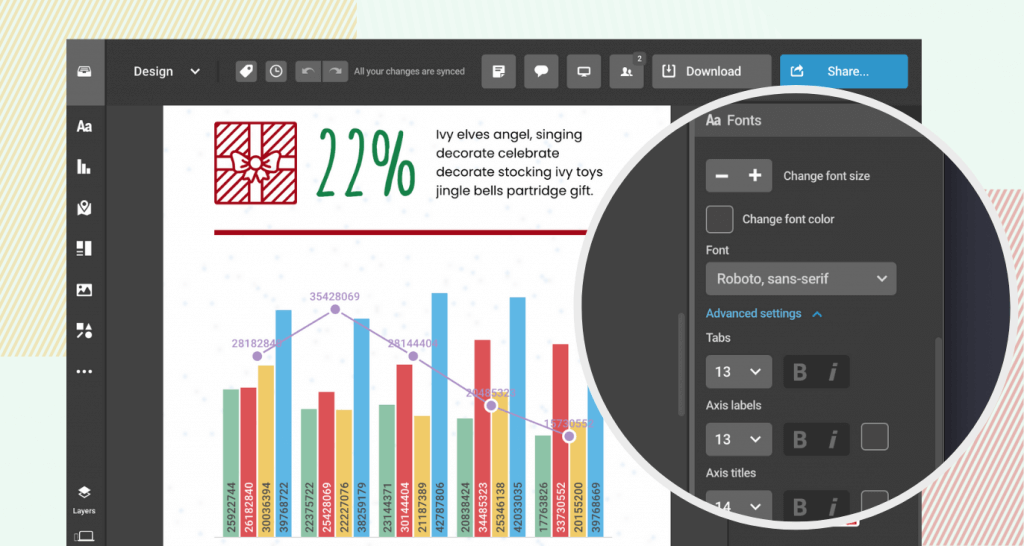
We’re excited to announce an enhancement to our multiple-axis charts: the ability to display values for columns. This update introduces a versatile feature that allows you to control the location of these values inside the column, offering options such as bottom, middle, top, or outside placement. This improvement will enhance the clarity and effectiveness of data visualization in your projects.
How does it benefit you? Now, with the flexibility to display values in various positions within your multiple-axis charts, you can:
- Enhance readability. Positioning values strategically makes your charts easier to read and understand, allowing your audience to quickly grasp the key data points.
- Customize for clarity. Tailor the placement of values to suit the specific needs of your data set, ensuring that no important information is overshadowed.
- Elevate aesthetics. This feature not only improves functionality but also adds an aesthetic edge to your charts, making your visualizations more appealing.
What can you achieve with it?
- Craft compelling stories by presenting data in a clear and concise manner. Highlight critical statistics effortlessly to support your narratives.
- Elevate your projects with interactive charts that not only inform but also engage your audience.
- Make your content stand out with visually stunning data presentations.
- Dive deeper into data exploration with enhanced chart functionalities. Present complex data sets in a more digestible format, making your analysis accessible to a broader audience.
How to?
For a step-by-step guide, please read our instructional article.
Get data visualization tips every week:
New features, special offers, and exciting news about the world of data visualization.