18.10.2024 by Infogram
Ever wondered why certain brands feel so familiar and appealing? The answer often lies in their color palette. Colors can evoke powerful emotions and associations, shaping how people perceive brands and products. That essentially makes it a crucial element in marketing and branding decisions.
But how do you select your brand colors? And, most importantly, how can your brand leverage the psychology of color to create a lasting impression? That’s what we’re going to explore in this article. We’ll explore what exactly brand colors are and the importance of them. We’ll also provide insights into color psychology and offer practical tips for choosing the best brand color schemes for your brand.

What are brand colors?
Brand colors serve as the visual language of your brand. They are more than just aesthetics; they are powerful tools that can evoke emotions, create associations, and help your brand stand out from the competition. Think of them as the personality of your brand, expressed through color.
By carefully selecting brand colors, you can communicate your brand’s values, create a memorable impression, and build a strong emotional connection with your target audience.
Brand color psychology: The science behind color choice
Brand color psychology is the study of how colors can influence human emotions, perceptions, and behaviors. It explores the psychological impact of colors on consumers and how these associations can be leveraged to build a strong brand identity.
The Importance of brand color psychology
- Emotional connection: Colors can evoke specific emotions and create a lasting impression. For example, blue often conveys trust and reliability, while red can symbolize passion and excitement. By choosing colors that resonate with your desired emotional response, you can foster a deeper connection with your target audience.
- Brand recognition: Consistent use of brand colors across all marketing materials helps to create brand recognition and recall. When consumers see your brand’s colors, they should immediately associate them with your products or services.
- Brand personality: Colors can help to define your brand’s personality and values. For example, a vibrant and energetic color palette might be suitable for a youthful and innovative brand, while a more subdued palette might be appropriate for a luxury or traditional brand.
- Target audience: Understanding your target audience’s color preferences is crucial. Different demographics and cultures may have varying associations with colors. By choosing colors that resonate with your target audience, you can increase the effectiveness of your marketing efforts.
- Cultural associations: Colors can carry different cultural meanings. It’s essential to be aware of these cultural nuances to avoid misunderstandings or negative connotations. For example, in many Asian cultures, red is associated with good luck, joy, and celebration. However, in some African cultures, red can symbolize danger or mourning.
Color psychology and consumer behavior
Have you ever wondered why you’re drawn to certain products over others? Color might play a bigger role than you think. There’s research that shows that colors can influence consumer behavior in various ways.
A study found that color can impact product selection and purchase intent. For example, a red product might be perceived as more exciting or urgent, while a blue product might be seen as more trustworthy and reliable.
Also, colors can shape consumers’ perceptions of a brand’s quality, reliability, and trustworthiness. A well-chosen color palette can improve a brand’s reputation and credibility.
Furthermore, colors can evoke specific emotions and create a positive or negative association with a brand. For example, a warm color like orange can create a sense of friendliness and enthusiasm, while a cool color like blue can inspire feelings of calm and trust.
By understanding the principles of brand color psychology, you can make more informed decisions about your brand’s color palette and create a strong, memorable, and effective visual identity.
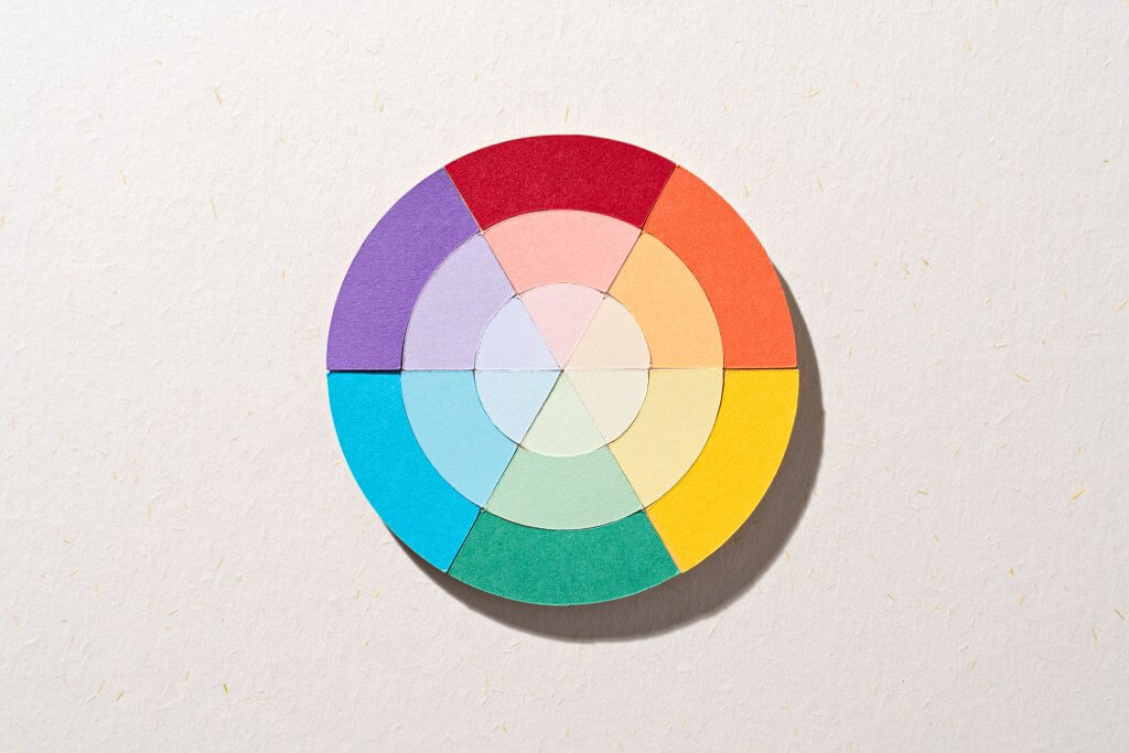
The meaning of colors
Now let’s explore each color’s meaning that’s commonly recognized as so in Western society. Here’s a breakdown of some popular brand colors and their connotations:
Red: Passion, energy, excitement, urgency.
Blue: Trust, reliability, stability, authority.
Green: Growth, nature, harmony, freshness.
Yellow: Happiness, optimism, creativity, warmth.
Orange: Enthusiasm, friendliness, confidence, affordability.
Purple: Royalty, luxury, wisdom, creativity.
Pink: Femininity, sweetness, tenderness, compassion.
Black: Elegance, sophistication, mystery, power.
White: Purity, simplicity, cleanliness, perfection.
How to choose your brand colors
Now that we’ve explored the psychology of color, let’s outline the key steps in choosing your brand colors. While it may be overwhelming to try to pinpoint colors that best describe your brand, by answering each question and defining the core building blocks of your brand, the guidelines will put you on the right path.

Define your brand personality
What emotions do you want your brand to evoke?
First, it’s important to identify your brand’s core values. What are the fundamental beliefs and principles that guide your brand? Here, you should consider your brand’s mission and vision.
Ask yourself, what does the brand aspire to achieve? Think about your target audience’s desires and aspirations.
For example, a brand focused on sustainability might want to evoke feelings of hope, responsibility, and connection to nature. So, the brand’s colors should reflect and facilitate these emotions.
Consider your target audience
What colors resonate with your ideal customer?
Here, it’s vital to research your target audience’s demographics. Starting with age, gender, and location, then moving to interests, motivations, challenges, cultural preferences, and more. Ask, what colors are associated with positive connotations in their culture?
What’s more, it’s important to also analyze their online behavior. Here, you can determine the colors they would gravitate toward on social media or websites.
For example, a brand targeting young adults might consider using bright, energetic colors that appeal to their vibrant lifestyle.

Research your competitors
How do your competitors use color, and how can you stand out?
Researching your competitors is a vital step before landing on a brand color palette. By doing your research, you’ll not only start to paint a better picture of the direction you could go into, but also spot ways you can stand out.
Research what kind of shades dominate your competitor’s brand colors. Also, consider the personality their brand projects and how their color choices reinforce that image. Then, look for ways to differentiate your brand visually. What colors could set you apart from the crowd?
For example, if most competitors favor blue, you might opt for a contrasting hue like orange to ensure your brand catches the eye and creates a unique identity.
Create a color palette
Does this color palette effectively reflect the mood and personality of my brand?
Building your brand’s color palette is more than just picking colors you like—it’s about creating a visual identity that resonates.
Here, start by experimenting with different combinations using a color wheel. This will help you explore options like complementary, analogous, or monochromatic color schemes. Don’t forget to think about contrast, which can make your palette more dynamic and attention-grabbing.
For example, if your brand is centered around luxury and sophistication, you might choose a monochromatic palette of golds and blacks to create a sleek, elegant feel.

Test your choices
How well does my color palette resonate with my target audience and stakeholders?
Once you’ve developed a potential color palette, it’s important to gather feedback to refine it further. Seek out ways to test your color palette, whether by conducting surveys or holding focus groups with your target audience and ask for their impressions.
Also, look for input from colleagues and stakeholders to gain additional perspectives.You can also use online tools to test color combinations and gather insights more efficiently.
Consider accessibility
Does my color palette provide enough contrast and accessibility for all users, including those with visual impairments?
It’s crucial to make your color choices accessible to everyone, including people with visual impairments. Here, it’s key to docus on color contrast to ensure readability, and avoid relying solely on color to communicate important information.
By providing alternative text for images and graphics, you’ll reach a wider audience and create a more inclusive brand experience.
There are several online tools available to check color contrast and ensure your palette is accessible. For example, you can use WebAIM’s Color Contrast Checker to evaluate the readability of your text against background colors.
Avoid color overload
Is my color palette clear and simple enough to communicate my brand effectively without overwhelming the design?
A simple color palette can be much more effective than a busy one. Limit your palette to three or four primary colors and use accent colors sparingly to create visual interest without overwhelming the design. Prioritizing clarity will make it easier for people to understand and engage with your brand.

For example, a brand focused on minimalism might use just two colors: a primary color and a neutral accent to maintain a clean, straightforward look.
Think about cultural associations
How might the colors I’ve chosen be interpreted differently by various cultures, and are they appropriate for my global audience?
Colors can have different meanings in different cultures, so it’s important to be mindful of these associations when choosing your palette. Research cultural color symbolism to avoid potential faux pas, and be sensitive to how your target audience might perceive certain colors. Adapting your choices for cultural appropriateness can strengthen your brand’s global reach.
For example, while red symbolizes good luck and prosperity in some cultures, it may evoke danger or anger in others.
Ensure consistency
Are my brand colors being used consistently across all platforms and by everyone on my team?
Consistency is key when it comes to establishing a strong brand identity. That’s why it’s important to develop a brand style guide that clearly outlines your color choices and how to use them.
This guide should ensure your brand colors are applied consistently across all platforms—whether it’s your website, social media, packaging, or advertising. Also, make sure your team is trained on these guidelines to maintain brand cohesion.

Stay up-to-date with color trends
Am I staying up-to-date with color trends?
To keep your brand fresh, it’s helpful to stay informed about emerging color trends in your industry. Follow design blogs, attend industry events, and use online forecasting tools to keep an eye on what’s trending. Staying updated allows you to adjust your brand’s look in ways that feel modern while staying true to your core identity.
For example, subscribing to design newsletters or following influential designers on social media can help you stay current with the latest color trends.
Brand color dos and don’ts
The processes of picking the right brand color palette can vary depending on the brand. However, there are some key dos and don’ts you should keep in mind when establishing and using your brand color scheme across the board.
Do use colors consistently
To make your brand identity recognizable, make sure to use your brand colors consistently across all marketing materials.
Ensure that your color palette reflects your brand’s personality and values, helping to evoke the right emotions in your audience. Here, it’s important to apply these colors across digital and print platforms, from social media graphics to packaging, for a unified and professional appearance.
Don’t overuse colors
While your brand could be colorful, avoid using too many contrasting or clashing colors, as this can overwhelm and confuse your audience. It’s important to stick to a few core colors that complement each other to maintain visual harmony and brand clarity.
Do consider color accessibility
To ensure that your brand is inclusive and accessible to everyone, including those with visual impairments, consider color accessibility.
Use tools like contrast checkers to verify that text and background colors are easy to read for people with color blindness or low vision. Incorporating high-contrast colors and clear visuals will help make your content more inclusive, improving your brand’s reach and impact.
Don’t choose colors that clash with your brand’s personality
Your colors should reflect your brand’s values and messaging. Selecting colors that don’t align with your brand can confuse your audience and weaken your brand identity. Avoid trendy or random colors that may feel out of place, and instead choose shades that reinforce the tone and emotion you want your brand to convey.
Do test your color choices
To ensure your brand colors resonate with your target audience’s preferences and emotions, make sure to test your color choices.
Gather feedback through surveys, focus groups, or A/B testing to see how your audience reacts to different color schemes. This will help you fine-tune your choices and ensure that your colors effectively connect with your audience’s expectations and feelings.
Don’t ignore cultural associations.
Be mindful of how colors are perceived in different cultures to avoid misunderstandings or negative connotations.
Here, it’s important to do your research and explore the cultural significance of your chosen colors. This is especially crucial if your brand operates globally or targets diverse audiences.
Misinterpreting color meanings can lead to unintended messages or even offend certain groups, so it’s important to choose colors that align with cultural sensitivities.

By following the dos and don’ts of brand colors, you’ll be able to create a brand color scheme that best communicates your message and resonates with your target audience.
Infogram: Data visualization tool with branding features
Now, if you’re looking to create visuals that reflect your brand’s identity, Infogram offers powerful tools to make the process seamless. Whether you need infographics, reports, charts, maps, slides, or other visuals, Infogram provides excellent branding features that simplify both creation and publishing.
Infogram can help you visualize your brand colors in stunning designs. With Infogram, you can streamline branded project creation, collaborate with your team, and ensure all visual materials are well-branded.

Brand your visuals
- Infogram provides a variety of ready-to-use templates that can be easily customized to match your brand’s style.
- Easily upload your brand’s specific color palette, and Infogram will automatically apply it to your designs.
- Easily incorporate your brand’s logo into your visuals, ensuring it’s prominently displayed.
- Access a collection of icons and illustrations that can be tailored to your brand’s aesthetic.
Enjoy consistent typography
- Choose from a vast library of fonts, including popular options and custom fonts that align with your brand’s voice.
- Apply consistent font styles, such as headings, subheadings, and body text, to maintain a cohesive look.
Improve brand storytelling
- Enrich your visuals with interactive elements, such as animations, tooltips, and hyperlinks, to engage your audience and tell your brand’s story effectively.
- Use Infogram’s powerful data visualization tools to present your brand’s data in a visually compelling and informative way.
Collaborate
- Create and share your brand kit with your team to ensure everyone is using the same colors, fonts, and elements.
- Track changes and collaborate seamlessly with your team, maintaining brand consistency throughout the process.
Export and publish
- Export your visuals in various formats, including PNG, JPEG, PDF, and HTML, to use in different contexts.
- Easily embed your visuals on your website or share them on social media platforms.
By leveraging Infogram’s branding features, you can create visually stunning and consistent materials that resonate with your target audience and strengthen your brand identity.
Note: Some of the aforementioned features are only available to specific subscription plans. For more information, visit our pricing page.
Final thoughts on choosing your brand colors
Color is a powerful branding tool that attaches a wealth of emotions and associations to the brand. That’s why it’s crucial to pick and choose a brand color palette that not only communicates what your brand is about but also represents the values, characteristics, and personality of the brand.
By carefully considering the factors outlined in this article, you can choose brand colors that effectively convey your brand’s identity, resonate with your target audience, and contribute to your overall marketing success.
And if you’re looking for a visualization tool that helps your maintain your brand identity across your visuals, Infogram is a must-try. Sign up today and try it out!
Get data visualization tips every week:
New features, special offers, and exciting news about the world of data visualization.