27.02.2026 by Infogram Team
Interactive maps have become essential for presenting geographic data in a clear and engaging way. Whether you are visualizing sales regions, campaign performance, customer distribution, or market expansion, the best interactive maps do more than show locations. They reveal patterns, trends, and opportunities that drive smarter decisions.
If you want to create the best interactive maps, follow these practical steps.
1. Define the Purpose First
The best interactive maps always start with a clear objective. Decide what question your map should answer. Are you comparing regions, identifying growth areas, or highlighting performance gaps?
When building maps in tools like Infogram, defining the objective early helps you select the right structure before uploading your dataset. A focused goal ensures your final output stays clear and strategic.
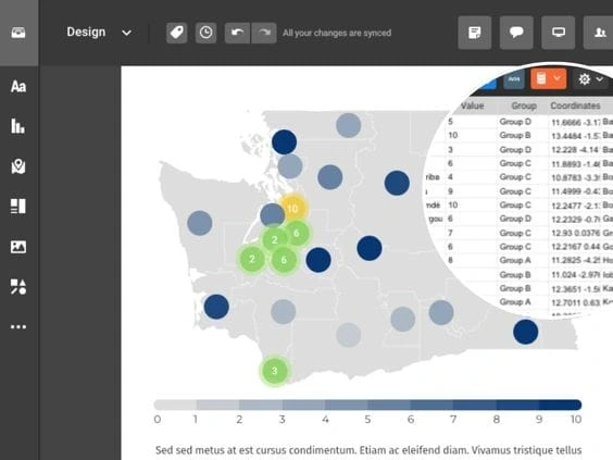
2. Select the Right Map Type
Different data requires different formats. Choropleth maps work well for regional comparisons, while marker maps are better for pinpointing specific locations.
Interactive maps align the map type with the dataset, and some tools can offer multiple map types, including world maps, country maps, and region-specific visualizations, making it easier to match structure to purpose.
3. Clean and Simplify Your Data
Overloaded visuals reduce impact. The best interactive maps prioritize essential metrics and remove unnecessary information.
Before importing data into your visualization tool, refine your dataset. Infogram supports spreadsheet uploads and external data integrations, but clarity begins with thoughtful data preparation.
4. Use Color With Intention
Color communicates meaning instantly. Well-thought-out interactive maps use consistent gradients to show intensity and clear contrasts to maintain readability.
Platforms like Infogram allow users to customize color palettes and adjust gradients so that values are visually intuitive. Consistent color logic strengthens interpretation and improves accessibility.
5. Add Meaningful Interactivity
Interactivity should enhance exploration, not overwhelm users. The best interactive maps include hover tooltips, filters, zoom capabilities, and clickable regions that provide deeper context.
With Infogram, interactive elements such as custom tooltips and clickable map areas can be configured without complex coding. This makes it possible to add depth while keeping the interface clean and user-friendly.
6. Provide Clear Legends and Labels
Context is critical. Readable legends, descriptive titles, timeframes, and data sources should be present.
Clear labeling features within tools like Infogram help maintain visual consistency while ensuring that users immediately understand what they are viewing.
7. Focus on One Core Insight
Trying to communicate too much at once weakens the message. Highlight one primary takeaway and support it with structured data layers.
Templates and layout controls available in platforms such as Infogram make it easier to design maps that emphasize a single message instead of overwhelming viewers.
8. Optimize for Mobile and Embedding
Interactive maps are often shared in reports, dashboards, and websites, and are responsive and easy to embed across platforms.
Infogram allows users to publish and embed interactive maps seamlessly, ensuring geographic insights remain interactive whether viewed on desktop, tablet, or mobile devices.
9. Test the User Experience
Before publishing, review usability. Are interactive elements intuitive? Is navigation clear?
Interactive maps should feel natural to explore. Preview modes and sharing options within tools like Infogram make it easier to test functionality before distributing your map publicly.
10. Keep Your Maps Updated
Geographic data evolves. These types of maps should remain accurate through regular updates.
By connecting external data sources or updating datasets directly, platforms such as Infogram help maintain relevance without rebuilding visualizations from scratch.
Turning Geographic Data Into Actionable Insights
Effective interactive maps transform raw geographic data into decision-ready insight. They help organizations identify regional opportunities, communicate performance clearly, and support strategic planning.
By combining thoughtful design, purposeful interactivity, and intuitive tools such as Infogram’s map creation capabilities, teams can create the best interactive maps that go beyond simple visualization. They become powerful communication assets that inform, engage, and drive action.
Get data visualization tips every week:
New features, special offers, and exciting news about the world of data visualization.