06.09.2017 by Infogram
Maps are incredibly versatile visualizations, capable of simplifying complicated geographic data in seconds. You can create and customize your own interactive maps using Infogram. It’s the perfect visual to enhance articles, blog posts, presentations, social media, and marketing campaigns.
Would you like to experience the full power of data visualization? Try Infogram for Teams or Enterprise for free! With a Team or Enterprise account, you can create up to 10,000+ projects, collaborate with your team in real time, use our engagement analytics feature, and more. Request your free demo here.
Our sophisticated mapping tool is constantly evolving as we add powerful new features, at your request. We put together a helpful video tutorial to explain all of our latest updates, including the fun additions listed below:
1) Region Names
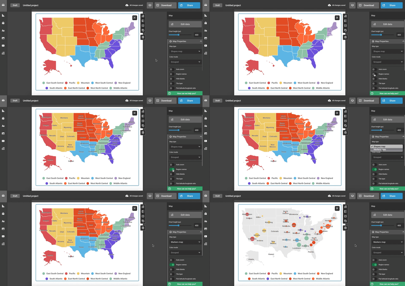
You can now add region names to Infogram maps. This gives your map clarity and depth. Simply turn on ‘Region names’ under the map settings. Region names apply to both Shapes and Markers maps.

2) Map Legend Customization
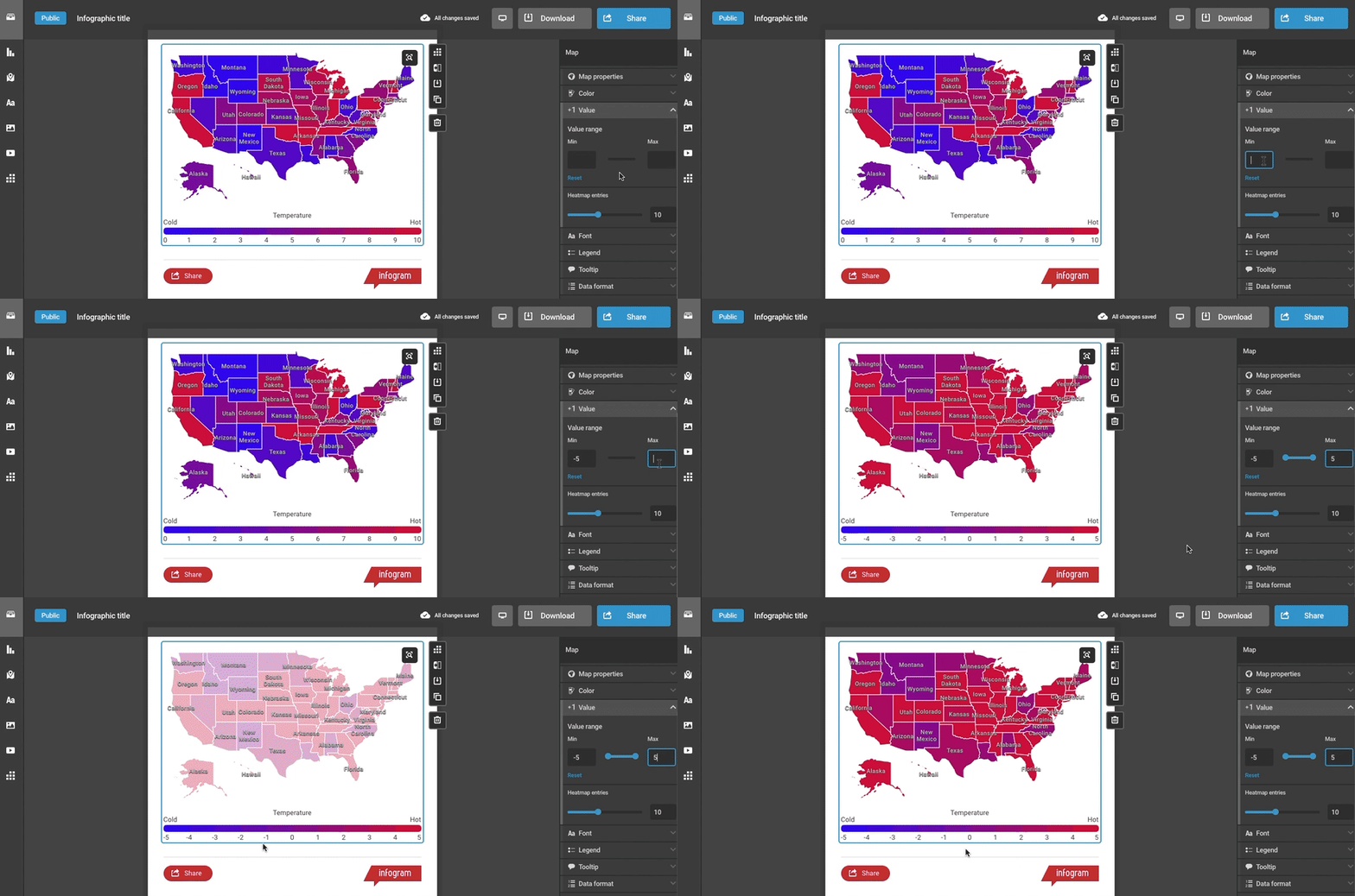
Legends are a great way to give your heatmap context. They make your data beautiful and easy to read. We’ve made it possible to label your legend and control the range of the data that appears. If you’ve embedded an interactive map, your viewer can hover and click on the legend to select specific data they want to see.

3) Font Edits
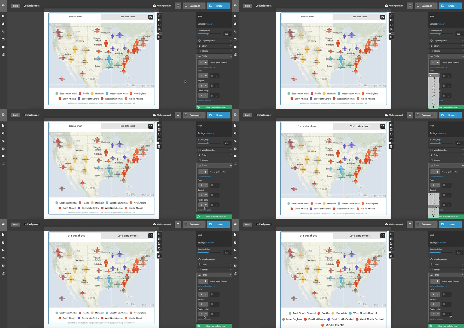
Control the font size and style of text located in tabs, tooltips, region names, and map legends. This will make your data easier to understand at a glance. Change the font size and appearance under Font settings.

4) Tile Layer Transparency
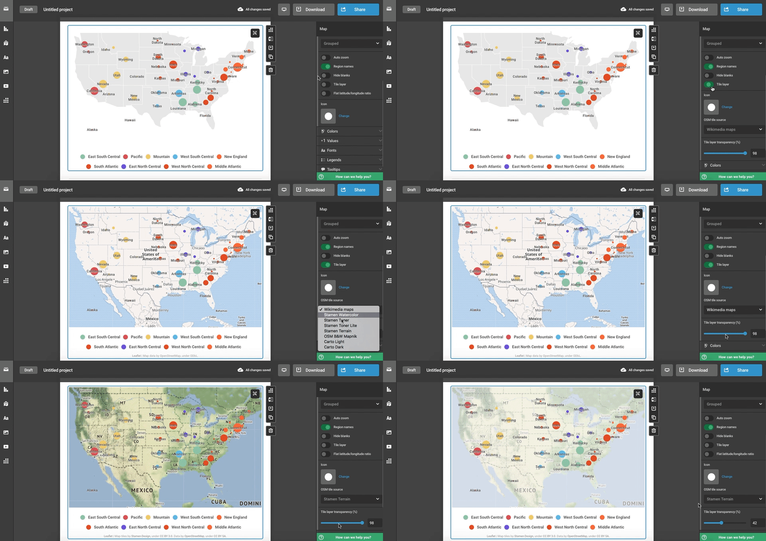
Tile layers dramatically change the look and feel of your map. Adjust the transparency of the tile layer you’ve selected to make your data stand out. Turn on ‘Tile layer’ under Map properties, and the transparency bar will appear underneath.

Click to Watch:
Are you ready to make a map? Sign up or log in to Infogram. We have over 500+ regional maps for you to choose from. Pick a map, import data, and customize!
Do you want to make Infogram maps like an expert? Then watch the webinar about maps.
Get data visualization tips every week:
New features, special offers, and exciting news about the world of data visualization.