14.01.2016 by Infogram
Interactive data visualizations are growing in popularity online everyday. This is because they take the viewer past the basic static chart or graph, and allow them to interact with the data. The viewer can learn more about a topic on their own by simply swiping, hovering, zooming, scrolling, or clicking their way through data-driven visuals.
“Interactivity allows you to explore multiple levels of data in a way that static infographics simply can’t. For me that’s a major aspect – if not the most important, since the basic rules for good visuals still apply.” – Tiago Veloso, founder of Visual Loop.
While it’s tough to dispute the value of interactivity, some people in the data visualization community are weary of flashy visuals because they can become distracting and potentially cloud the most vital part – the data. But, if interactivity is done well, it can subtly provide more information, quickly engage the viewer, and make any article or report richer.
Also, programmers and designers are often needed to create these in-depth visuals, which can be time consuming and difficult. But, it doesn’t need to be that hard. Online dataviz tools like Infogram make it easy to add multiple levels of data and interactivity to your work – no coding or design skills required.
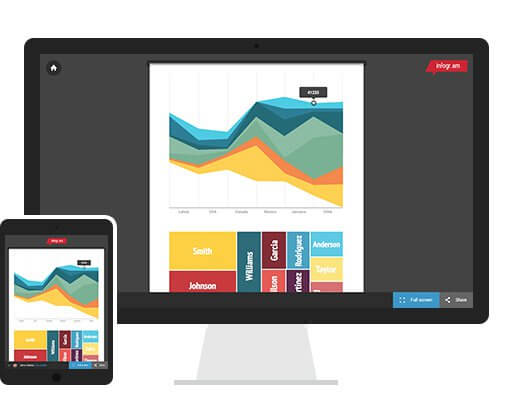
Interactivity with Infogram
Infogram is a platform for interactive data visualization, reporting, and analysis. We offer over 30 chart types, 350+ regional maps, and pre-designed infographic themes for you to make your own. Here are a few ways Infogram makes your charts and graphs interactive, informative, and shareable.
Add Map Text
Maps are great way to visualize geographical information in an engaging way. The text columns allow you to assign text to each region on the map, giving your map an added layer of depth and interactivity. Viewers simple need to hover their mouse over the map to see the details you’ve added to your project.
Sheets and Radio Buttons
Responsive Embed Codes
Make the most out of your interactive infographic by easily embedding your project on your website or blog, or posting to WordPress. Copy and paste the responsive embed code if you want your infographic to adapt to all desktops, tablets, mobile devices.
Animations
Once your project is embedded on your website or blog, it will incorporate subtle movement when loaded on your page. These animations include line graphs connecting the dots, columns bubbling up from the bottom, or treemaps appearing block-by-block.
Interactive data visualizations made with Infogram are effortless, beautiful and easy to embed. Sign up for a free account below or visit our tutorials page for more information.

Get data visualization tips every week:
New features, special offers, and exciting news about the world of data visualization.