
Build Interactive Reports That Drive Insights
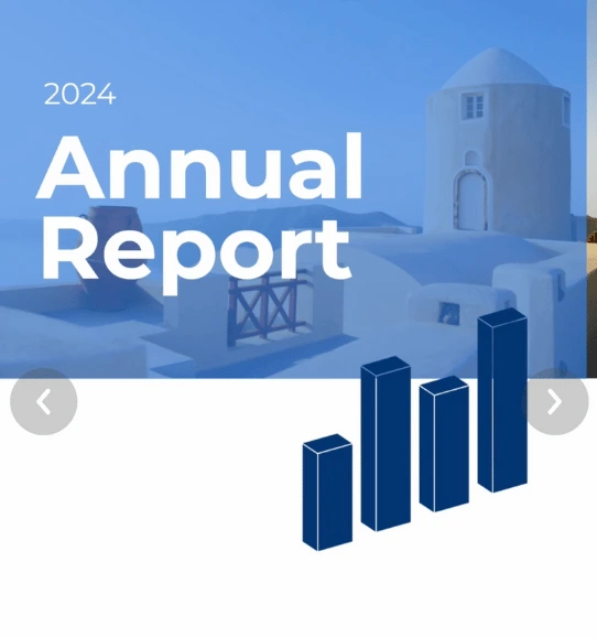
Create dynamic, data-driven reports that make complex insights clear and engaging - no advanced skills needed.


4.7 out of 5 stars


Overview
Why
Types
Examples
Reviews
Tips
FAQ
Deliver Reports That Stand Out
As a data journalist, content marketing manager, market researcher, fundraising manager, or business analyst, you need reports that turn complex data into clear, actionable insights. Infogram helps you craft interactive reports that tell a story, whether you're presenting market trends, fundraising impact, or news analysis.
Data journalists can build clickable reports or even dashboards for investigative stories. Content marketing managers can create reports to showcase campaign performance. Market researchers can visualize survey results for clients, fundraising managers can highlight donor impact, and business analysts can map business metrics for stakeholders.
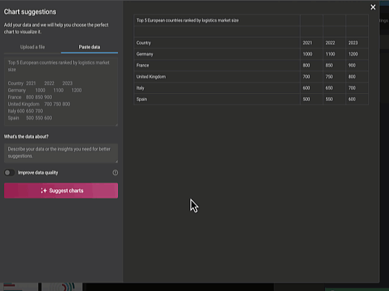
Import data from spreadsheets, PDFs, or databases, and let AI suggest the best charts to fit your narrative. Add interactive elements like clickable charts or animated visuals to engage your audience. Share reports on websites, presentations, or social media with no coding required - they’re responsive and update automatically. Infogram saves you time, letting you focus on delivering insights that inform decisions and spark action.
Why Pros Choose Infogram for Interactive Reports
Here’s how Infogram makes your reports shine, saving you time and grabbing your audience’s attention.
Hook Your Audience with Interactivity
Make your reports come alive with clickable charts and animated visuals that pull people in. Picture a data journalist crafting a report where readers can explore election data or a fundraising manager showing donor trends with an animated graph that pops during a board meeting.
Infogram’s library of over 35 chart types and 800+ maps gives you endless ways to make data engaging. Plus, content engagement analytics let you see what’s clicking - literally - so you can tweak your approach for maximum impact.
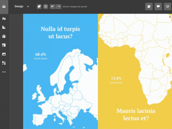
Make Complex Data Crystal Clear
Turn messy datasets into reports that anyone can follow. A market researcher can create a clean chart showing customer preferences for a client pitch, while a business analyst can map revenue trends for the C-suite.
Infogram’s AI picks the best chart types for your data, and you can pull numbers straight from PDFs or spreadsheets. Add hover-over tooltips to explain key points without cluttering the page, ensuring your insights hit home every time.
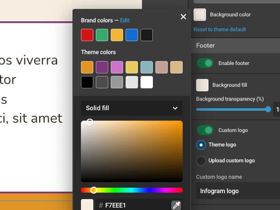
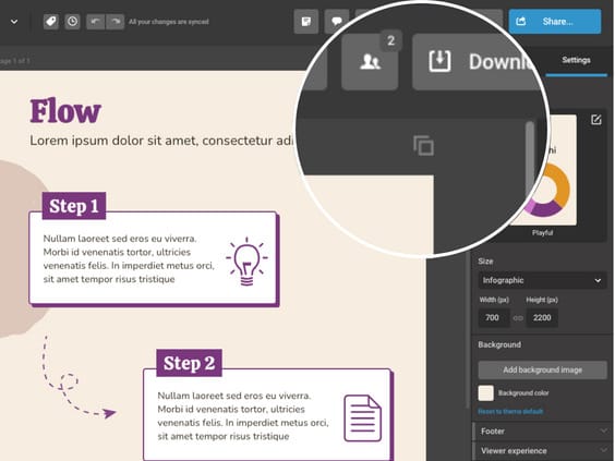
Match Your Reports to Your Style
Keep your reports looking sharp and on-brand with Infogram’s brand kit, letting you add your logo, colors, and fonts effortlessly. A content marketing manager can make campaign reports feel like an extension of their website, while a fundraising manager can design visuals that reflect their nonprofit’s mission.
Tools like color picking and image masking give your reports a polished, professional vibe without any design hassle.
Team Up Without the Fuss
Work together smoothly with real-time collaboration, perfect for tight deadlines. A data journalist can ping an editor for quick feedback on a news report, while a market researcher can share templates with teammates to nail a client deliverable.
Infogram’s team templates keep everyone on the same page, cutting down on back-and-forth and helping you hit your deadlines with consistent, high-quality reports.
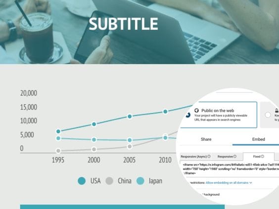
Share Your Reports Anywhere, Anytime
Get your reports out there with no tech headaches - embed them in websites. Use as presentation, or insert in emails with zero coding. Auto-updating visuals keep everything fresh, so a fundraising manager can share live donor stats or a content marketing manager can keep campaign reports current.
Plus you can export a part of report as MP4 or GIF for quick social media posts, making it easy to reach your audience wherever they’re scrolling.
Get Reports Done Faster with AI
Infogram’s AI takes the grunt work out of report-building, so you can focus on the big picture. It suggests the perfect charts, turns images into data, or tweaks visuals for global audiences.
A business analyst can create a financial report in minutes, while a data journalist can pull together a news dashboard on a tight deadline. Plus features like PDF import and auto-alignment make your reports look pro without eating up your day.
Report Types to Explore

Business Reports
Provide insights into business operations, performance, market analysis, finances, projects, aiding decisions and tracking progress.

Research Reports
Unveil findings, analysis of studies, and methods. Detail research approaches, data, and conclusions.

Academic Reports
Share student or researcher findings on academic topics, experiments, structured with intro, methodology, results, discussion, and conclusion.

Technical Reports
Dive into project specifics – experiments, engineering, offering deep analysis, design specs, test results, and recommendations.

Financial Reports
Summarize organizational finances – annuals, statements, showcasing revenue, expenses, assets, liabilities, and equity.

Marketing Reports
Offer metric snapshots for growth. Cover campaigns, conversions, social media, leads, helping refine strategies.
Get Inspired by Infogram User Created Projects
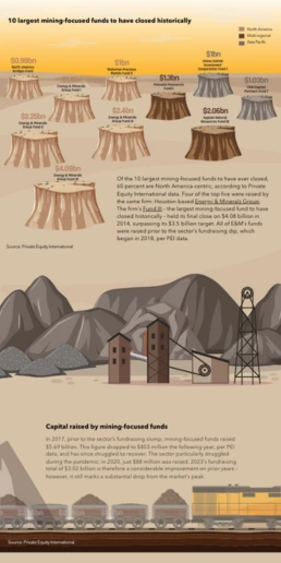
10 Largest Mining-Focused Funds to Have Closed Historically

Health to the plants

Automation & jobs

10 Plus Grands Fonds Axés sur l’Extraction Minière Fermés Historiquement

10 Largest Mining-Focused Funds to Have Closed Historically

Customer Survey Report

The Not Enough Impact Report 2018

The Impact of the Better Care Reconciliation Act on Employment
Customer Reviews
Here is what our customers have to say about us.
2022 Summer & Fall and 2023 Winter leader in Data Visualisation Software 4.7 out of 5 stars
See reviews on G2 ›Empowering 30,000+ Companies Worldwide
From startups to established enterprises, our platform has been embraced by a diverse range of businesses seeking to captivate audiences and simplify complex data. Here are just a few examples of the 30,000+ companies that use Infogram.


Learn More Practical Tips
Business
Best Ways to Visualize and Analyze Polling Data
Design
18 Surprising Data Visualizations in Your Everyday Life
Finance
A Practical Guide to Creating Financial Reports
Business
Comprehensive guide to creating annual business reports
Design
Data visualization trends you should look out for in 2023
Design
Information design: definition, tips & examples
Frequently Asked Questions
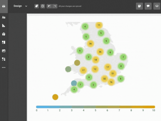
How does Infogram make interactive maps easy to create?
Infogram’s 800+ maps and simple tools let you build dynamic maps quickly. A data journalist can create a clickable election map, while a market researcher can plot customer locations, all without design skills. Import data from spreadsheets or PDFs, and add features like tooltips or animations. It’s fast, intuitive, and needs no coding.
Why are interactive reports effective for engaging audiences?
Interactive reports with clickable charts or animated visuals grab attention and make data easy to explore. They help audiences - like readers, clients, or donors - dive into insights, boosting understanding and engagement for news stories, campaign updates, or funding pitches.
How do interactive reports help professionals in their work?
Interactive reports simplify complex data, making it actionable for stakeholders. A business analyst can clarify financial trends for executives, a fundraising manager can show donor impact to secure funding, and a data journalist can make news stories more engaging, driving decisions and action.
How do I create an interactive report with Infogram?
Pick a report template or start fresh, add charts, maps, or animations, and customize with your data and branding. AI suggests layouts, and features like custom tooltips or zooms add interactivity, creating professional reports that stand out.
Can Infogram simplify complex data for my reports?
Yes, Infogram turns dense datasets into clear visuals. A market researcher can chart survey results, while a fundraising manager can highlight program outcomes. AI chart suggestions and data imports from PDFs or spreadsheets make insights accessible.
How does Infogram support team collaboration on reports?
Real-time collaboration lets teams edit visuals, share templates, and give feedback instantly. A content marketing manager can align with a market researcher on a campaign report, ensuring consistency and saving time, even remotely.
What’s the easiest way to share interactive reports with Infogram?
Embed reports in websites, presentations, or emails with no coding. Auto-updating, responsive designs keep visuals current, perfect for a data journalist sharing live analytics or a fundraising manager updating donor reports.
How can content engagement analytics improve my reports?
Analytics track clicks, views, and shares, showing what grabs attention. A market researcher can refine client reports, while a content marketing manager can optimize campaign visuals for better engagement, using data-driven insights.
How does Infogram ensure my reports align with my brand?
Infogram’s brand kit applies logos, colors, and fonts across reports. Features like color picking and image masking create a cohesive look, whether for a content marketing manager’s campaign reports or a fundraising manager’s donor updates.
Can Infogram save time when creating interactive reports?
Yes, AI tools suggest chart types, convert images to data, and adjust content, while features like PDF import and content auto-align streamline design. This lets a business analyst or data journalist create polished reports in minutes.
How do interactive reports boost stakeholder trust?
Interactive reports present data clearly and professionally, building credibility. A fundraising manager can show transparent donor impact, while a business analyst can deliver reliable metrics, fostering trust and informed decision-making.
Can Infogram make reports accessible to diverse audiences?
Infogram’s visuals are screen-reader friendly, ensuring inclusivity. This helps data journalists reach broader readers and fundraising managers meet accessibility standards, making reports more impactful for all audiences.
Didn't find the answer? Check our FAQs

Try Infogram Now!
Are you ready to unleash the power of data visualization? Get started with Infogram today and create stunning, interactive content that captivates your audience. Elevate your projects and bring data to life.