20.02.2025 by Infogram
We are excited to introduce patterns for column, bar, and pie charts in Infogram! This new feature allows you to choose from 19 different pattern styles to improve chart readability, highlight key data points, and add extra visual impact to your reports, dashboards and infographics.
At Infogram, we believe that data visualizations should be accessible to everyone. Patterns help ensure that information is clear and distinguishable for users with color vision deficiencies or those viewing content in grayscale. By adding texture to your charts, you make sure that insights remain visible to all audiences, regardless of color perception.
Beyond accessibility, patterns provide more creative options for designers, marketers, and analysts. Whether you want to emphasize specific data points or simply make your visualizations more dynamic, patterns allow for greater customization and engagement.
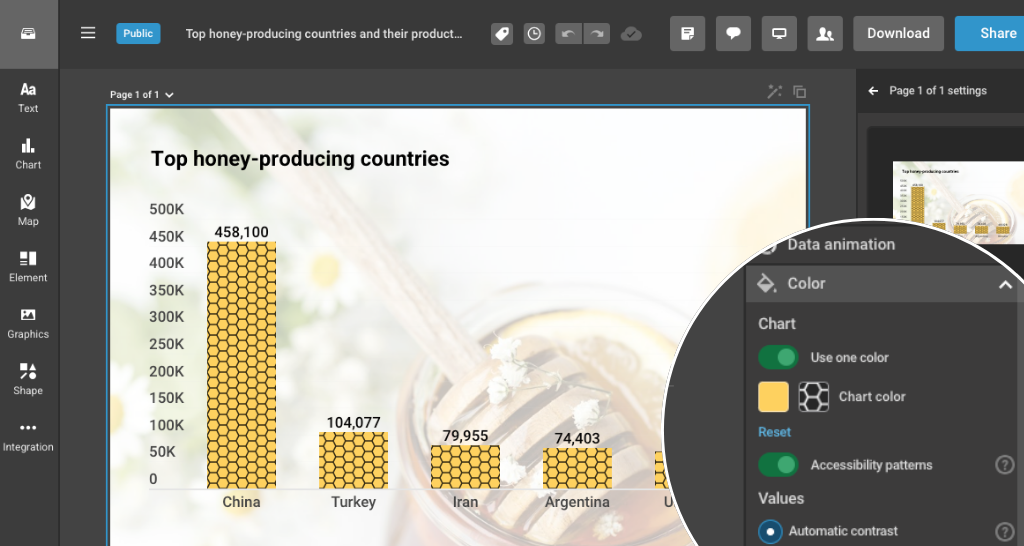
This feature is available for the following chart types:
- Bar charts: bar chart, stacked bar chart, grouped bar chart, 100% stacked bar chart
- Column charts: column chart, stacked column chart, grouped column chart, 100% stacked column chart
- Pie charts: pie chart, doughnut chart, irregular pie chart, semicircle chart
With this update, your data storytelling becomes even more inclusive and visually compelling.
How these features help you:
- Journalists & Reporters: Ensure that audiences can quickly interpret complex data, regardless of visual ability.
- Marketers & Content Creators: Make reports, infographics, and presentations stand out with more distinct data visualizations.
- Data Analysts & Business Professionals: Highlight critical insights effectively without relying solely on color, making dashboards and reports easier to understand.
Start exploring patterns for charts in Infogram today and take your data storytelling to the next level!
Get data visualization tips every week:
New features, special offers, and exciting news about the world of data visualization.