09.07.2025 by Infogram
When working with pie charts, both space and readability matter. Infogram now lets you place data labels directly inside pie chart segments – whether you’re using doughnut, semi-circle, or irregular pie charts. This option helps reduce visual clutter while keeping your data clear and easy to read.
Why It’s Useful
In some visual contexts, external labels can take up too much space or distract from the chart itself. With the option to place labels inside the segments, your pie charts stay visually tidy, especially when working with compact layouts or emphasizing proportions. It also allows your audience to connect values directly with their respective slices, improving clarity and reducing visual clutter.
This feature is ideal for reports, dashboards, or any layout where space efficiency and visual clarity are priorities.
What You Can Do With It
- Writers and researchers can create cleaner, more concise visuals in text-heavy layouts.
- Designers can fine-tune data presentations to better match their overall layout and style.
- Managers and analysts can present performance metrics and comparison data in a more compact, readable way, ideal for dashboards or summaries.
How It Works
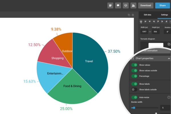
To place labels inside your pie charts:
- Add a pie, doughnut, semi-circle, or pie-irregular chart to your project.
- Click the chart to open the settings panel.
- In the right-hand menu, go to the Chart properties.
- Disable the option “Show labels outside”.
- Adjust other formatting settings (font size, color, etc.) as needed.
Your labels will now appear inside each segment, and the chart will automatically adjust spacing for optimal legibility.
Try It in Your Next Project
This option is available on all supported pie chart types – no extra setup required. Whether you’re working on a presentation, a report, or a data-rich infographic, this small change can help your work look more polished and professional. Give it a try next time you create a chart and see how it improves your layout.
Get data visualization tips every week:
New features, special offers, and exciting news about the world of data visualization.