15.12.2015 by Infogram
Pyramid charts (triangle chart or triangle diagram) are a fun way to visualize foundation based relationships. They appear in the form of a triangle that has been divided into horizontal sections with categories labeled according to their hierarchy. They can be oriented up or down depending on the relationships they represent. The stacked layers can also show the order of steps in a particular process.
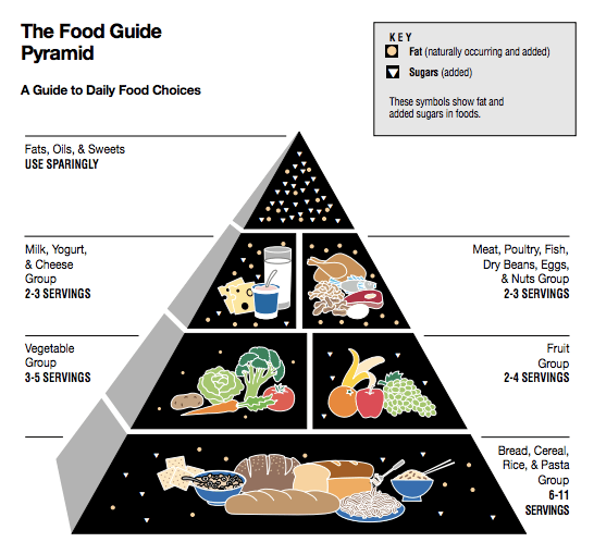
Pyramid charts are often used in marketing and advertising, but they can also be used as educational tools. The USDA’s food pyramid, released in 1992, is easily the most famous example of these types of charts. The food pyramid is a widely recognized nutrition education tool that shows kids what foods they need to eat each day, and more importantly, the portions of each food group they should consume. Let’s go over the different types of pyramid charts and how to create them.

The Food Guide Pyramid, which was released by the USDA in 1992, was replaced on April 19, 2005, by MyPyramid.
Types of Pyramid Charts
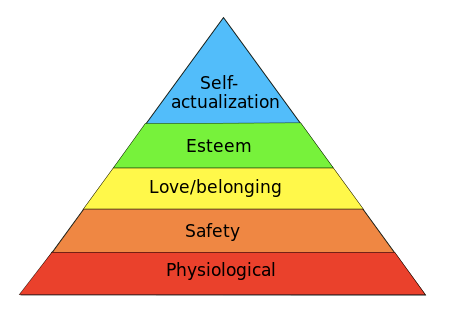
 Classic Pyramid: The classic pyramid chart is a triangle divided into labeled sections facing up. Because of the triangular shape, each section is a different size. The width indicates the level of hierarchy among related topics. For example, the largest section may be related to a general topic, while the smaller sections represent sub-topics of the larger slice.
 Funnel: A funnel pyramid chart displays values of progressively decreasing proportions. The size of the area is determined by the value as a percentage. This type of chart is often used by sales teams to display stages of sales progress or potential sales in the future. It can also just be a way to show a sales report.
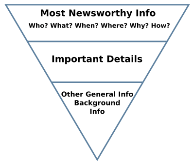
 Inverted Pyramid: The inverted pyramid is a good example of an upside down pyramid chart. It is a common method for writing news stories. The inverted pyramid shows how information should be prioritized and structured in a text article. The most important information in a news story goes at the top, followed by the body of the text, ending with general or background information.
How to Make an Effective Pyramid Chart
- Pick a topic – Decide what story you want to tell, or what information you need to convey, with your pyramid chart.
- Choose your subcategories – Remember to be selective! Too many colors or too many layers can make your pyramid chart cluttered and hard to read. You want to make sure you are being as clear and straightforward as possible.
- Organize your subcategories – Decide the order and value of each section on your pyramid. Organize the subcategories based on their hierarchy.
- Be consistent – Keep the spacing of your sections even and pick a pleasing color palette. You can use different shades of one color or pick a variety of colors that look great together or align with your brand.
- Share your pyramid – Download or publish your finished pyramid chart. It is now ready to be placed in your report, presentation, article, or educational brochure.
You can make pyramid and funnel charts with Infogram! Click below to get started.

Get data visualization tips every week:
New features, special offers, and exciting news about the world of data visualization.