12.06.2023 by Infogram
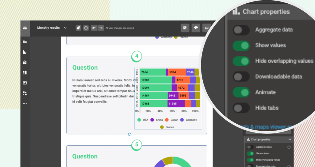
Exciting news for data enthusiasts like you! We’re thrilled to announce our latest update, giving you even more control over your bar charts – introducing the ability to hide or show overlapping values in stacked/100% stacked bar charts!
At Infogram, we understand the importance of clear and accurate data representation. With this new feature, you now have the power to fine-tune your charts to perfection, ensuring precise communication of your data insights.
Key highlights:
Eliminate Overlapping Values: No more confusion caused by overlapping data points in your bar charts. You now have the option to easily decide whether to show or hide them, based on your specific needs.
Tailor for Output Format: Whether you’re preparing a presentation, sharing insights in a report, or publishing online, you can adjust the display of overlapping values to best suit your desired output format.
Empower Data Communication: Clear bar charts enhance your audience’s understanding, making your data storytelling even more impactful.
How to use this feature:

- Select a stacked or 100% stacked bar chart: Choose the bar chart type that best suits your data visualization requirements.
- Access the “Overlapping Values” option: Within the chart customization panel, you’ll find the option to control overlapping values.
- Adjust settings: Simply toggle between hiding or showing overlapping values, depending on how you want your chart to appear.
- Visualize with Precision: Preview your customized bar chart to ensure your data insights are precisely conveyed.
Benefits at a glance:
- Data clarity: Ensure your data is presented clearly, avoiding any ambiguity caused by overlapping values.
- Enhanced flexibility: Tailor your charts to suit different output formats and effectively communicate your insights across various mediums.
- Professional presentations: Impress your audience with visually polished and easily understandable bar charts.
Get data visualization tips every week:
New features, special offers, and exciting news about the world of data visualization.