23.09.2023 by Infogram
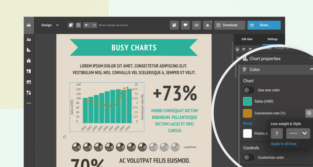
In data visualizations, it’s important to effectively communicate trends and key insights. The introduction of highlighted lines in Infogram makes this goal easily achievable. This feature empowers you to enhance your charts by emphasizing specific data points and trends with customizable highlights, including different colors, line thickness, and styles.

Solving common challenges
Infogram’s highlighted lines feature is designed to solve several challenges that users often encounter when creating data visualization projects:
1. Data emphasis
Highlighting crucial data points is essential for making charts and graphs more informative and impactful. Now you can draw attention to specific trends or data points that deserve special focus, ensuring that viewers immediately grasp the most critical information.
2. Enhanced data storytelling
Data visualization is not just about displaying numbers – it’s about telling a compelling story with data. Highlighted lines enable you to weave narratives that draw the audience’s eye to key moments in the data, creating a more engaging and persuasive experience.
3. Improved clarity
In complex datasets, it can be challenging for viewers to recognize patterns and trends. Highlighted lines provide a visual cue that simplifies the understanding of data, making it easier for your audiences to extract insights quickly and accurately.
4. Customization and creativity
Our customers value the ability to personalize their visualizations to match their brand or message. With highlighted lines, you can choose from a range of customization options, including colors, line thickness, and styles, allowing for creative and tailored data representation.
How to use highlighted lines
Incorporating highlighted lines into your Infogram projects is easy:
- Select the chart or graph you want to edit.
- Access the lines feature within the chart customization options.
- Choose the data points or trends you want to highlight.
- Customize the appearance of the highlights to align with your project’s design.
By following these simple steps, you can elevate your data visualizations and captivate your audiences with compelling insights.
Improve your data visualizations with highlighted lines
Infogram’s highlighted lines feature empowers you to shine a spotlight on critical data trends, making your charts and graphs more informative, engaging, and persuasive. Whether you’re working on infographics, presentations, reports, dashboards, or any other data-driven project, highlighted lines will help you elevate the way you present your data.
Join the Infogram community today and unlock the potential of highlighted lines. Elevate your data visualization projects to new heights, and tell your data stories with clarity and impact.
Get data visualization tips every week:
New features, special offers, and exciting news about the world of data visualization.